Bar charts
Bar charts are used to compare values across categories.
A bar chart is a chart with rectangular bars with lengths proportional to the values that they represent. One axis of the chart shows the specific categories being compared, and the other axis represents a discrete value.
Used for
- Compare discrete data
- Show trends over time
- Change over time
- To express larger variations in data, how individual data points relate to a whole, comparisons, and ranking
Orientation
Horizontal bars
Horizontal bars are mostly used to show Nominal/Categorical datasets. These are generally datasets which can be arranged in any order. Sorting the data can be helpful to bring attention to lowest/highest values.

Vertical bars
Vertical bars are mostly used to show Ordinal/Sequential datasets. These are generally datasets which follow a natural progression or order. These show the change in values w.r.t. the progression/time.

Type
Bar chart
It presents datasets with rectangular bars with heights or lengths proportional to the values that they represent.
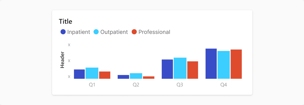
Clustered bar chart
It presents two or more data sets displayed side-by-side and grouped together under categories on the same axis. Note: Use Line chart to compare for trend analysis between categories. Guideline
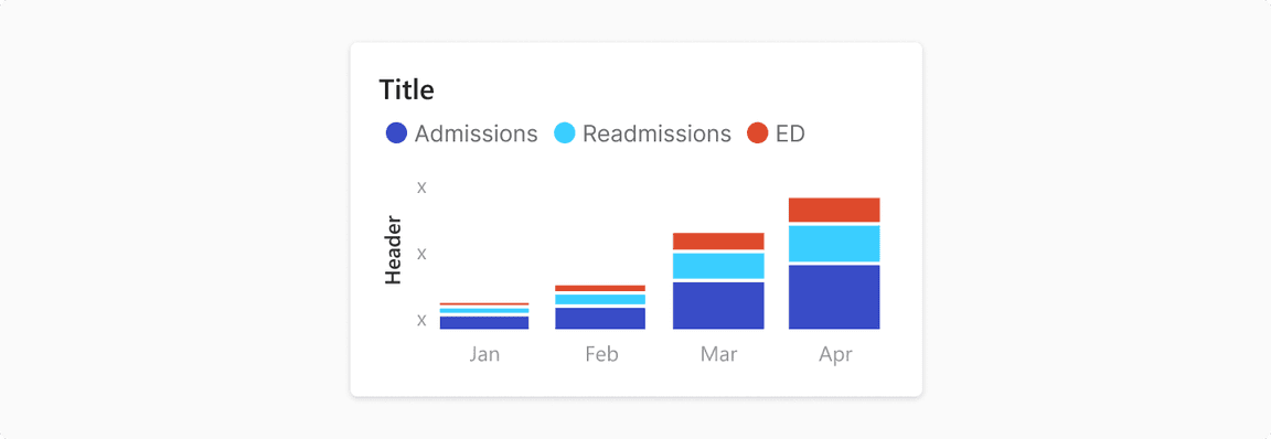
Stacked bar chart
It presents larger category divided into smaller categories and their relations to the total.
Histogram
It presents a grouped frequency distribution with continuous classes. It groups numeric data into bins, displaying the bins as segmented columns. They’re used to depict the distribution of a dataset: how often values fall into ranges.
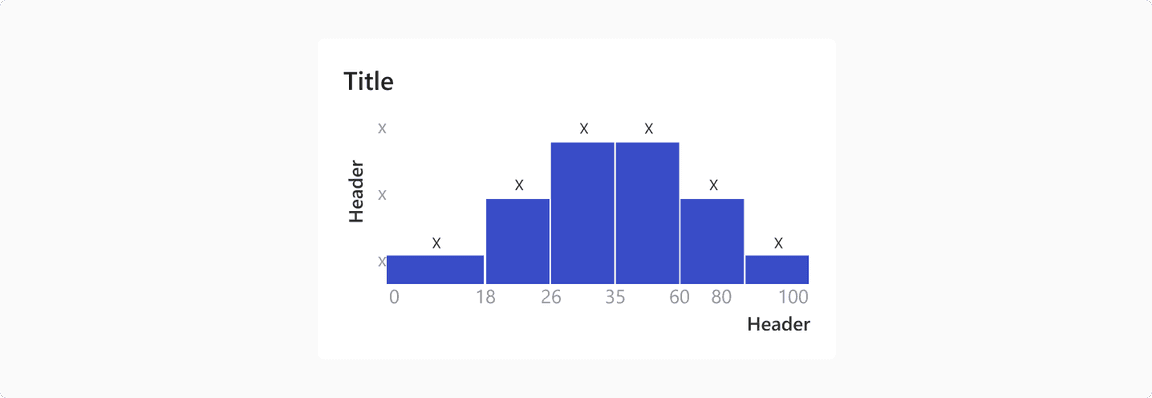
Note: Histogram only has vertical orientation.
Usage
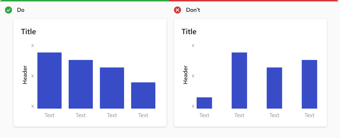
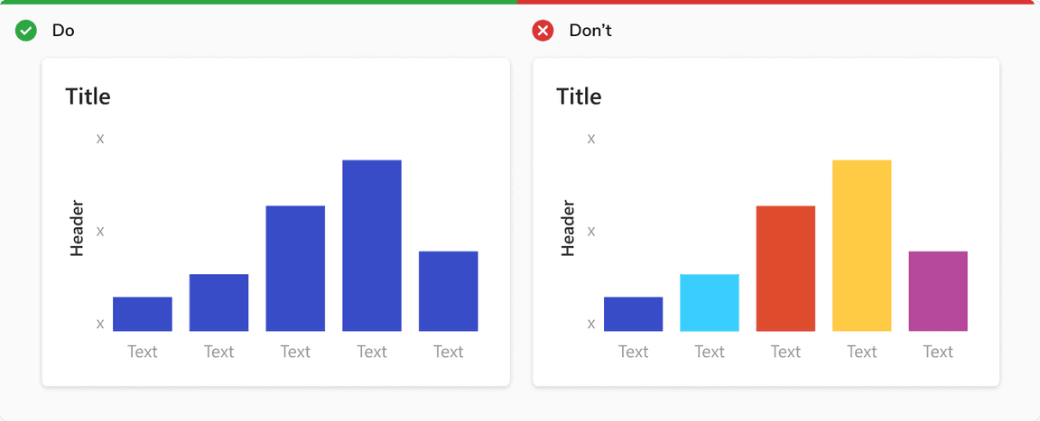
Use single color for single data set
If all the bars measure the same variable, make them all the same color. Different shades have no relevance to the data.
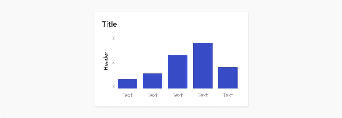
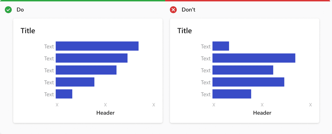
Show nominal/categorical data in ascending or descending order
Sort data sets to make it easier to understand and visualize.
Make the width of each bar about twice as wide as the space between them