
Avatar
Avatar is used to identify users through display pictures or their initials.
An avatar consists of a display picture of the entity that it represents i.e. a user. In case a display picture is not available, it consists of a colored background and the initials of the name that it represents. And if somehow the initials can’t be fetched, a fallback glyph is used.
Appearances
Avatar comes in 9 appearances -
Shapes
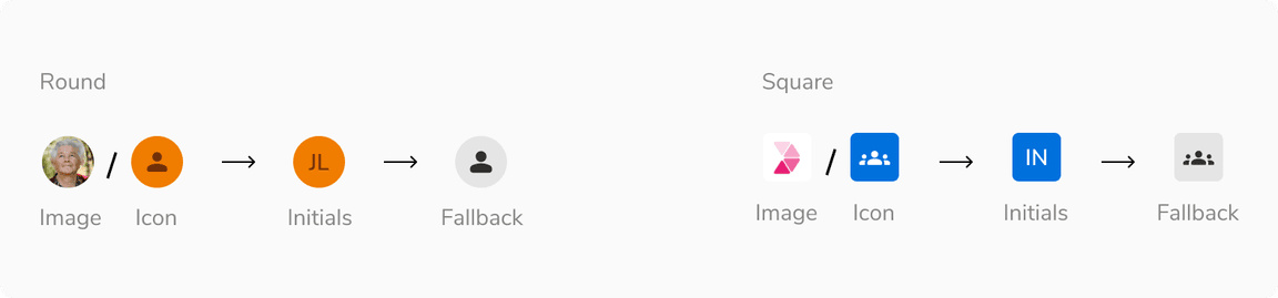
Avatar comes in 2 shapes - round and square.
Round avatar
Round avatar represents a single entity i.e a user, bot or app.
Square avatar
Square avatar represents a group of entities or organization.
Sizes
Avatar comes in 2 sizes - small and regular.
Variants
With Image

With Icon
With Initials

Structure
Round avatar
| Property | Value(s) |
|---|---|
| Size |
|
Square avatar
| Property | Value(s) |
|---|---|
| Size |
|
| Corner radius | 4 px |
Option item
| Padding | Value(s) |
|---|---|
| Top and bottom |
|
| Left and right | 16 px |
Configurations
Round avatar
| Property | Value(s) | Default value |
|---|---|---|
| Appearance |
| - |
| Size |
| Regular |
| Image | Image sub-component | - |
| Icon | Icon sub-component | - |
| First name | <first_name> | - |
| Last name | <last_name> | - |
| Border color | <color> | Namak |
| Additional users | <count> | - |
Square avatar
| Property | Value(s) | Default value |
|---|---|---|
| Appearance |
| - |
| Size |
| Regular |
| Image | Image sub-component | - |
| Icon | Icon sub-component | - |
| First name | <first_name> | - |
| Last name | <last_name> | - |
Option Item
| Property | Value(s) | Default value |
|---|---|---|
| Label | <label> | - |
| Size |
| Compressed |
Popover
| Property | Value(s) | Default value |
|---|---|---|
| Width | <width> | 176px (Customizable) |
| Max height | <max_height> | 256px (Customizable) |
| Min height | <min_height> | - |
Usage
Color assignment
The background color of an avatar should be generated dynamically in such a way that at the time of its creation a random color (from the available options) is assigned. Once assigned, the color should stay the same as long as that particular avatar is in use.
For example, an avatar generated for a user - Franklin Clinton, can look like following and it should look the same wherever it is used.
 Color assignment
Displaying Name
Since an avatar can only show an image or the initials, there should be an option to show the full name of the entity. This is achieved by hovering over on the avatar to display a tooltip containing the full name.
 Hovering on an avatar
Fallback hierarchy
This is the fallback order defined for avatars:
 Fallback hierarchy
Square avatar vs Round avatar group
Square avatars and round avatar group are both used to group entities. Square avatar is ideal for presenting a group as a unified entity, while round avatar group facilitates an interactive and visually cohesive representation of individual members within the group.
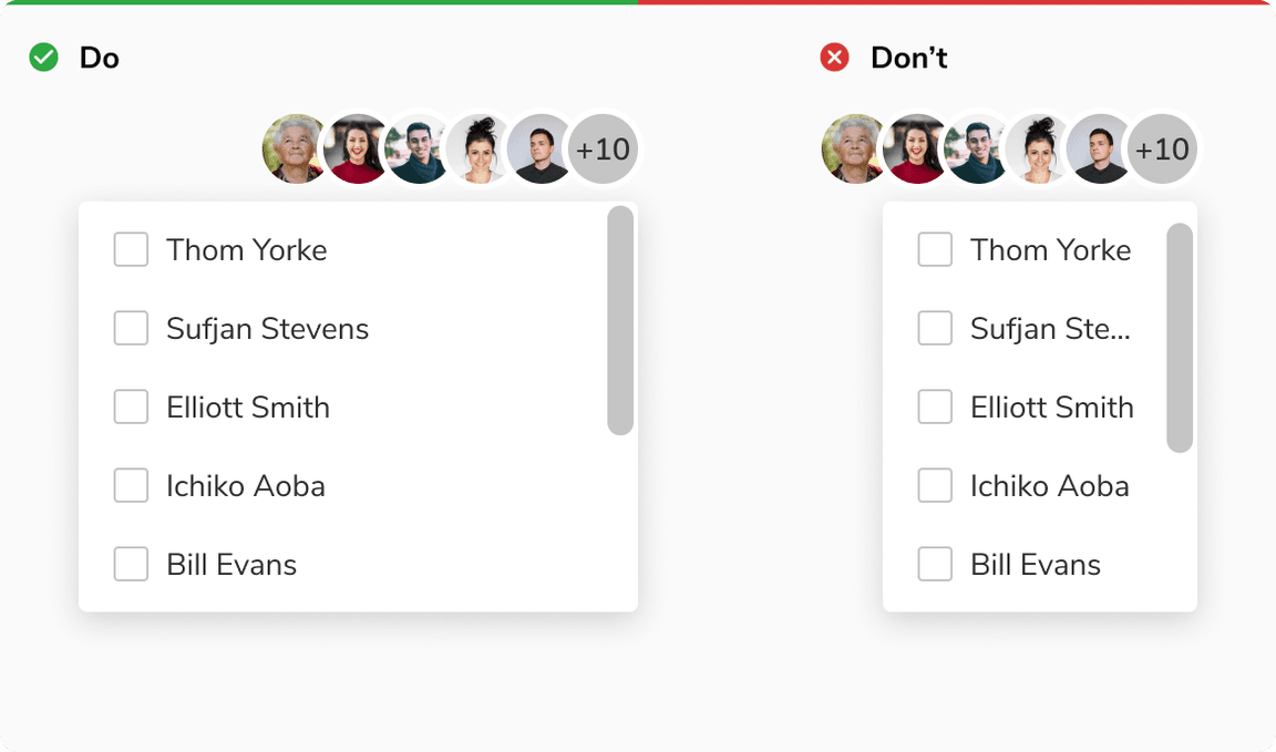
Avoid square avatar with icon button
It is recommended to not use square avatar in conjunction with an icon button as users may mistake the avatar for a button.
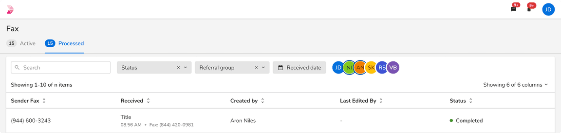
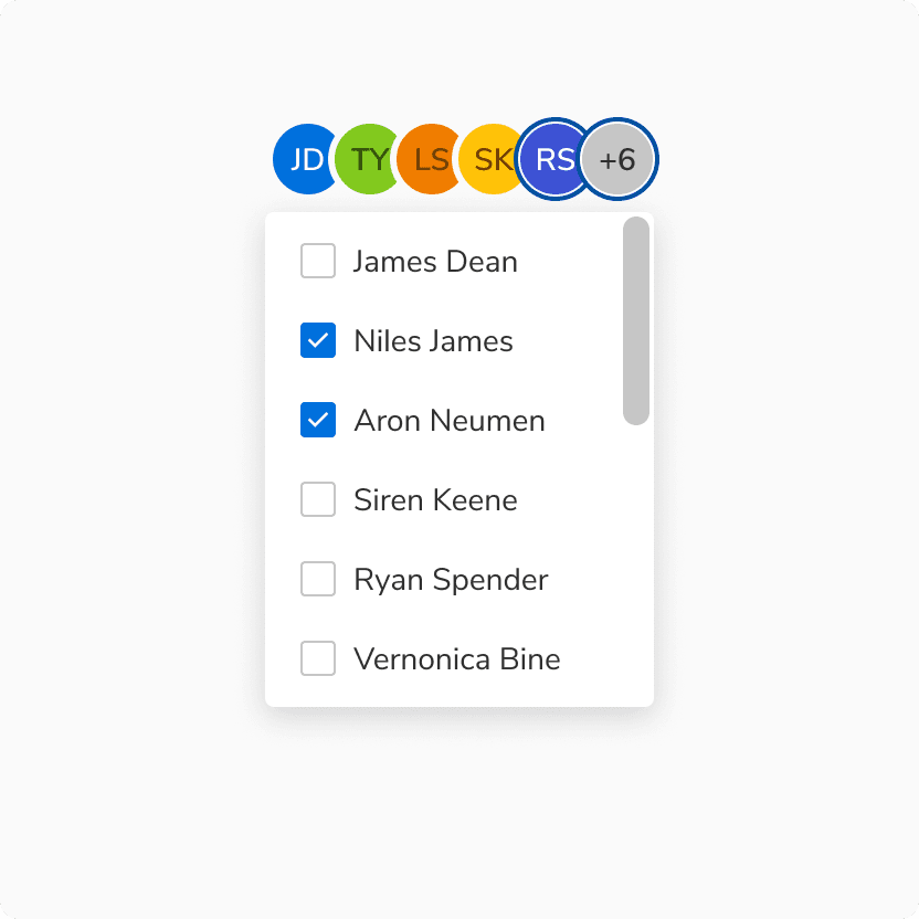
Selection using avatars
Avatar group can also be used to make selection which can help in filtering data.
Number of avatars
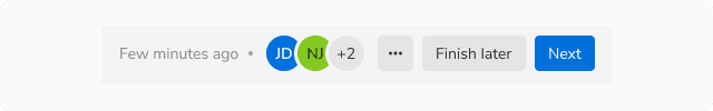
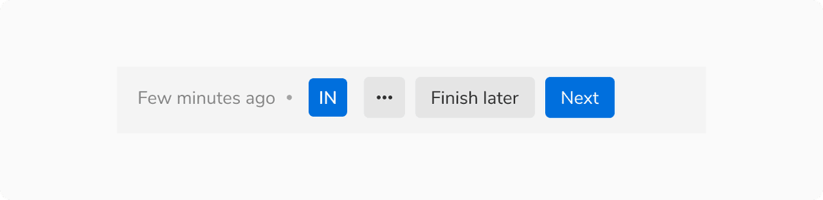
Avatars can be used individually or as a group if required. For example - if an activity is being performed by 4 users, an avatar group should be used to represent them.
To be specific, an avatar can be used in 3 ways as -
Single entity
Single avatar
Two/Three entities
 Two/Three entities
More than three entities
 More than three avatars
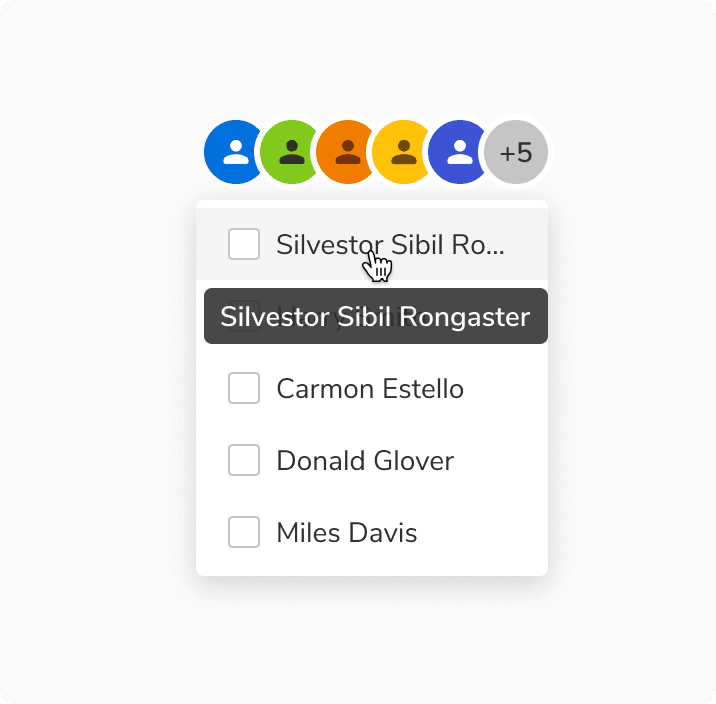
In order to show the additional entities that are not visible upfront, a popover having the list of full names of those additional entities is shown on hover.
 Showing list of names in an avatar group
Selection in avatar
Up to six entities
Avatar group can accommodate up to six avatars to facilitate data filtering and alleviate cognitive overload.

More than six entities
In case of selection to show additional entities that are not visible upfront, a popover having the checklist of full names of those additional entities is shown on clicking the avatar.
Selection avatar group vs Select
It is recommended to use selection avatar group for fewer entities, and select for a larger number of options.
Using PNG and SVG in avatar
It is recommended to use stone light or a suitable background color that ensures enough contrast between the image and its backdrop when using PNG or SVG formats without a background.
 Using PNG and SVG in avatar
Width of popover
While the popover’s width is flexible and can vary, it is advisable to maintain a size that is equal to or larger than the avatar group.
 Width of popover
Overflow behavior of items
In case of overflow, the items will get truncated and can be viewed inside a tooltip on hover.
 Overflow behavior of items