
Menu
Menu is used to display actions like navigation and page actions such as edit, export, delete, etc.
Types
Default
Default option type is used for neutral actions.
Destructive
Destructive option type is used for destructive actions. It does not support nesting.
Variants
Standard
This variant comes with just text. Both default and destructive option type support this variant.
With icon
This variant comes with an icon preceding the text. Both default and destructive option type support this variant.
With sub info
This variant comes with sub-info beneath the text. Both default and destructive option type support this variant.
With check
This variant comes with a check which acts like a switch introducing immediate change once toggled. Only default option type supports this variant.
With keyboard shortcut
This variant comes with a keyboard shortcut used for expediting common actions in a menu. Only default option type supports this variant.
With chevron
This variant comes with a chevron used for introducing nesting in a menu. Only default option type supports this variant.
Sizes
Trigger size
Menu triggers can vary in size, with 2 default sizes: regular and small.
States
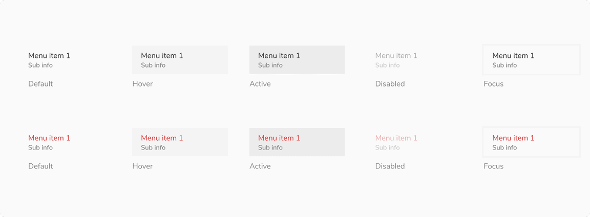
Option states
The options are built using the option list and has 5 valid states - default, hover, active, focus and disabled. Users can also use the up/down arrow key to traverse the options.
 Option states
Structure
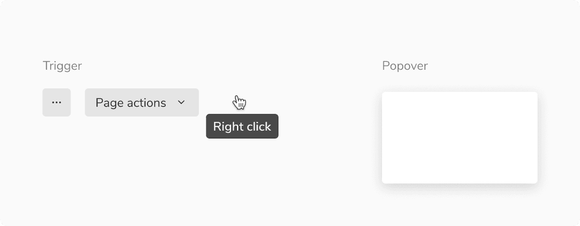
A menu is made up of two key components: a trigger, which can be in the form of an icon button, basic button, mouse right-click, etc., and a popover, which acts as a container for the menu items.
 Structure of menu
Trigger
Trigger can be in the form of an icon button, basic button, mouse right-click, etc.
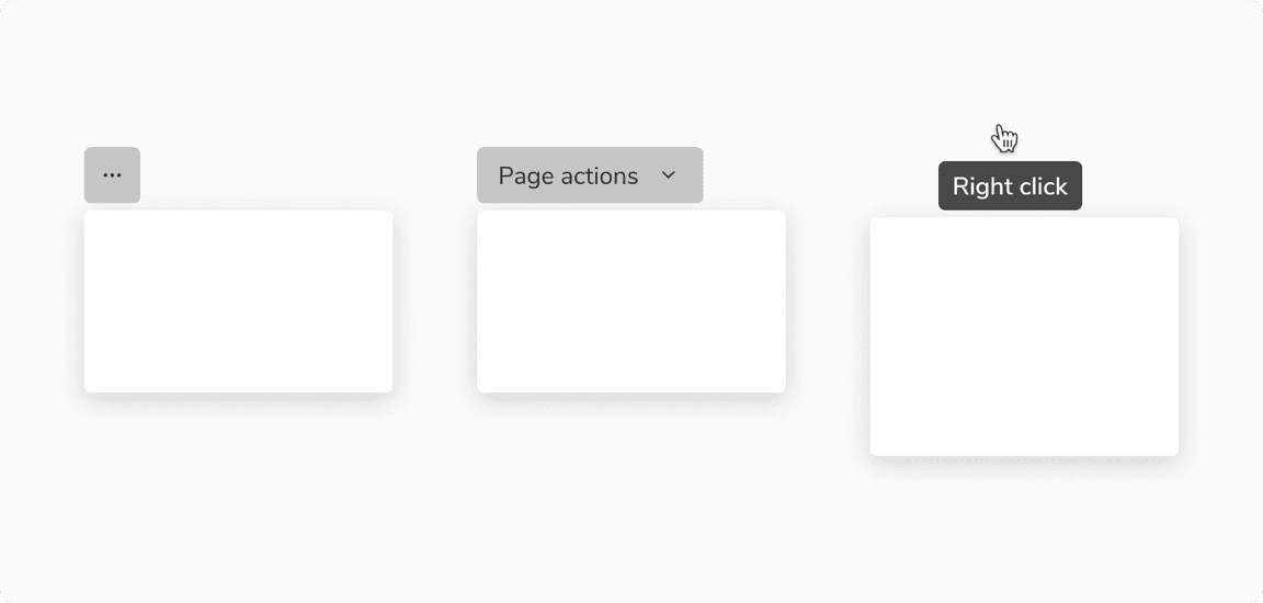 Some common triggers for menu
Option items
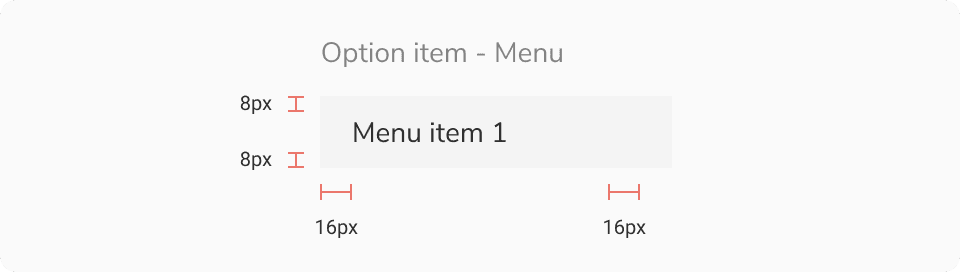 Option item - Menu
| Padding | Value(s) |
|---|---|
| Top and bottom |
|
| Left and right | 16px |
Configurations
Option types
Default
| Property | Value(s) | Default value |
|---|---|---|
| Label | <label> | - |
| Size |
| Compressed |
| Left icon (optional) | <icon name> | - |
| Sub info (optional) | <sub info> | - |
| Chevron (optional) |
| False |
| Check (optional) |
| False |
| Keyboard shortcut (optional) | <Shortcut name> | - |
Destructive
| Property | Value(s) | Default value |
|---|---|---|
| Label | <label> | - |
| Size |
| Compressed |
| Left icon (optional) | <icon name> | - |
| Sub info (optional) | <sub info> | - |
Popover
| Property | Value(s) | Default value |
|---|---|---|
| Width | <width> | 176px (Customizable) |
| Max height | <max_height> | 256px (Customizable) |
| Min height | <min_height> | - |
Usage
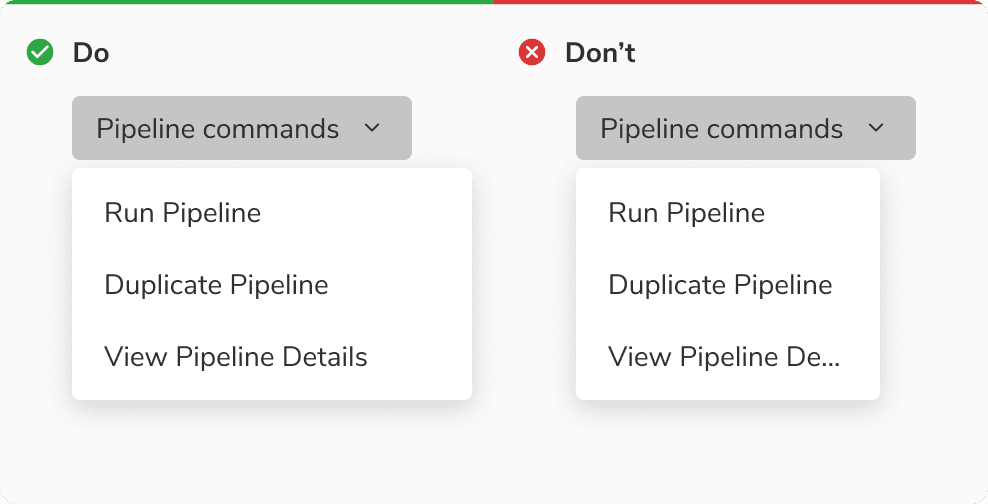
Width of popover
While the popover’s width is flexible and can vary, it is advisable to maintain a size that is equal to or larger than the trigger of menu.
 Width of popover
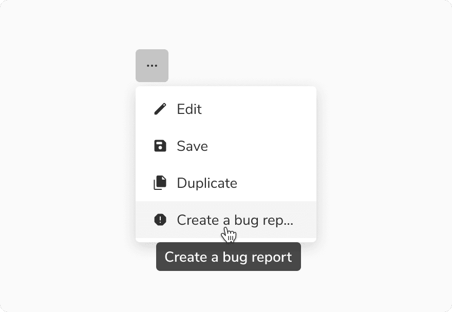
Overflow behavior of items
In case of overflow, the items will get truncated and can be viewed inside a tooltip on hover.
 Overflow behavior of items
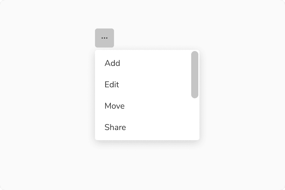
Scrolling inside menu
Menu allows scrolling inside it when a substantial number of options are present.
 Scrolling in menu
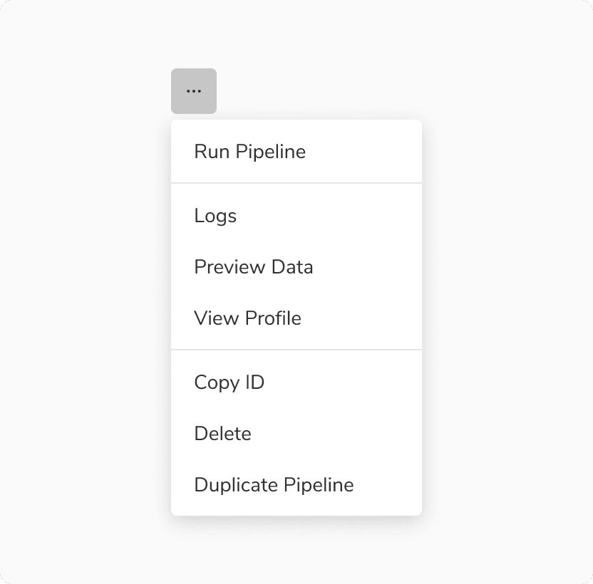
Grouping
With Divider
Divider in menu is used to group simple options into different sections or categories. It also creates a visual distinction between actions of different natures.
 Dividers in menu
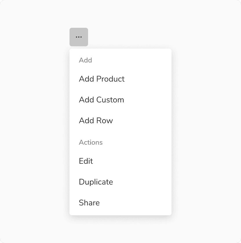
With Sub heading
Sub heading in menu is used to group complex options into different sections or categories.
 Sub heading in menu
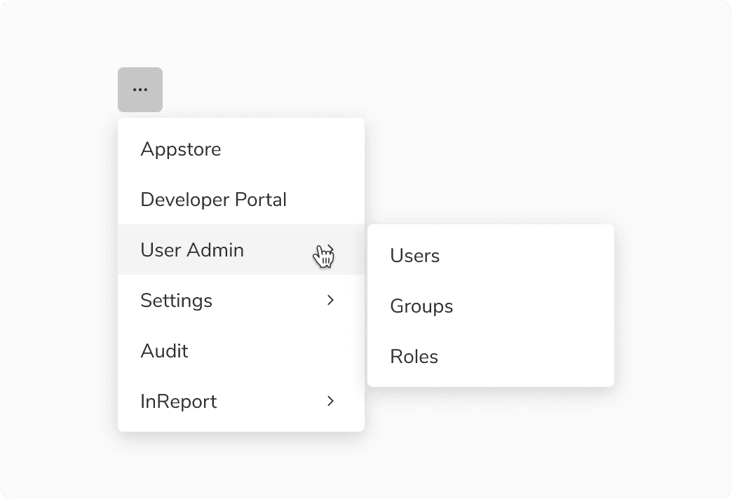
Nesting in menu
Nesting in menu is employed to establish a hierarchical structure and hide options, effectively conserving space and mitigating cognitive overload.
 Nesting in menu
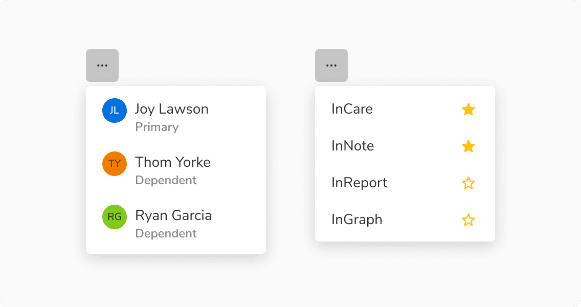
Custom options
Menu options can have custom content inside them.
 Custom options