
Switch
Switches are used to toggle between two states in a user interface - ON and OFF, hence resembling the real-life switches used to turn something ON or OFF.
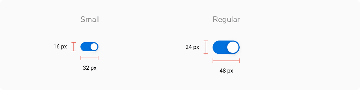
Sizes
Switch comes in 2 sizes based on height and width - small and regular.
Structure
| Property | Value(s) |
|---|---|
| Size |
|
| Size of knob |
|
| Padding (top, right, bottom, left) | 2 px, 2px, 2 px, 2 px |
Configurations
| Property | Value(s) | Default value |
|---|---|---|
| Size |
| Regular |
Usage
Switch size
The size of the switch depends on the other components appearing around it. If other components are regular in size, then the regular variant of switch should be used. The same goes for the tiny variant.
 Switch size
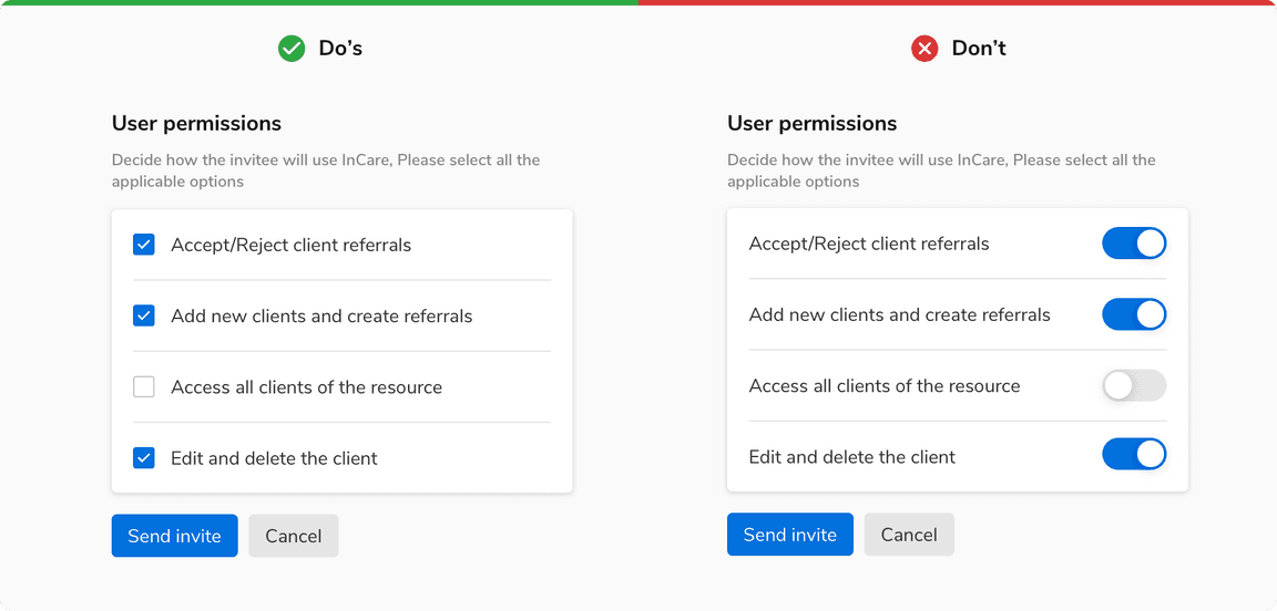
Switch vs Checkbox
- Tapping a switch is a two-step action: selection and execution.
- Whereas checkbox is just a selection of an option(s) and its execution requires another control, usually a button.
Instant response
The options that require an instant response are best selected using a switch.
 Instant response
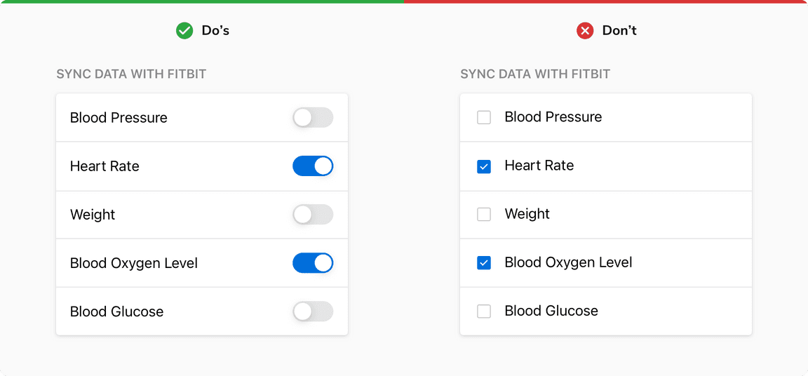
Multiple choices
Checkboxes are preferred over switches when multiple options are available and the user has to select one or more options from them. Clicking multiple switches one by one and waiting to see results after each click takes extra time.
 Multiple choices
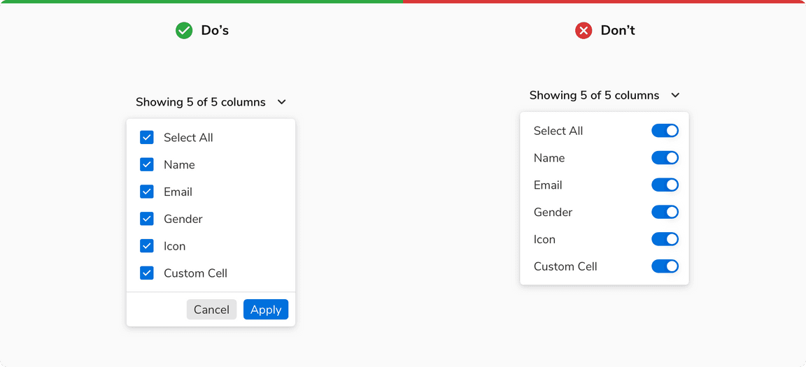
Confirmation
Checkboxes are preferred when an explicit action is required to confirm settings.
 Confirmation