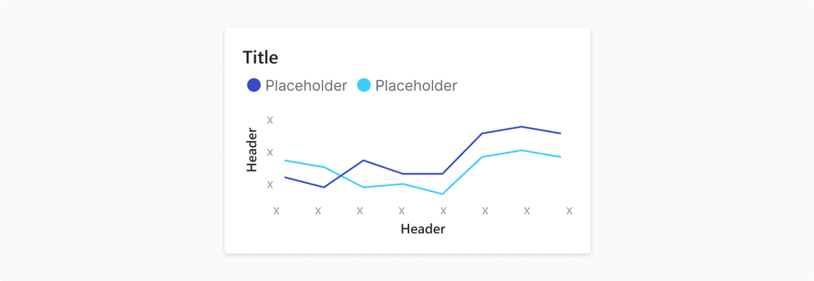
Line Charts
Displays information as a series of data points connected by straight line segments
A line chart is used to show information that changes over time. Line charts are created by plotting a series of several points and connecting them with a straight line.
Used For
- Show trends over time and compare several continous data sets
- Plot data at regular intervals connected by lines
- Track changes over short and long periods
Type
Line Chart
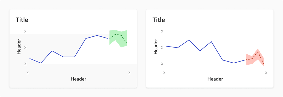
Line Chart With Forecast
It joins a line graph for observed past data, and a range area chart for future predictions.

Usage
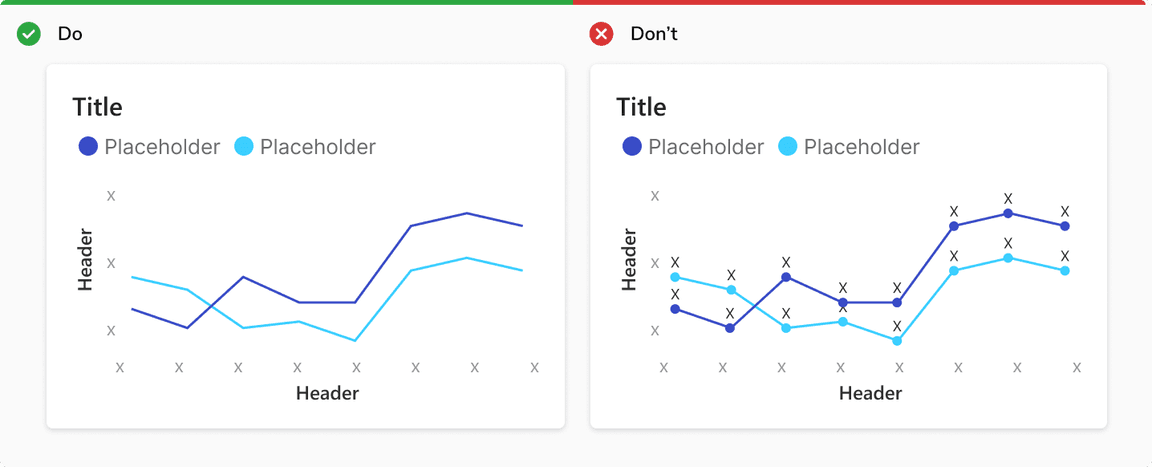
Avoid Individual Data Markers With Numbers
Showing individual data markers can reduce the readability of the chart.
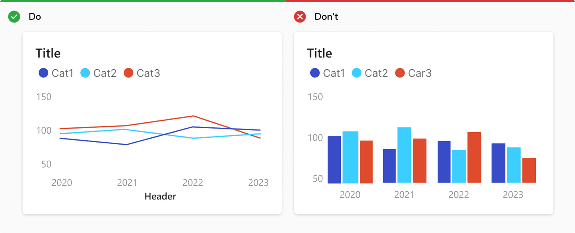
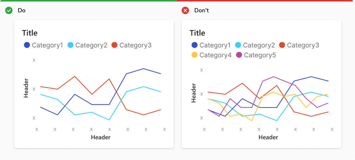
Use Maximum Three Categories
Plotting too many lines on the same chart gives a confusing picture and defeats the purpose.
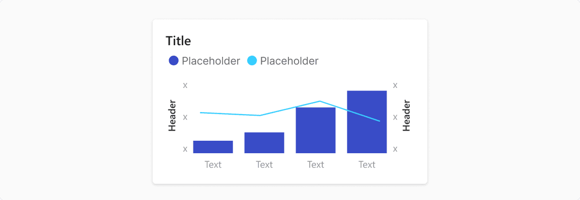
Using Secondary Y-Axis
Incase of secondary Y-axis, following guidelines should be followed:
- Secondary Y-axis should only be used if the type of values is different
- If the range of both the axes is close to each other, use proportional intervals
Note: Secondary Y-axis should be used sparsely as interpreting data to different axes might be confusing and difficult.
Showing Trend With Sentiment
The trend line can have sentiment colors to show positive and negative values.
Line Chart vs. Bar Chart
Line chart is preferred over bar chart to
- Compare changes over the same period of time for multiple categories
- Compare trend line for multiple categories