Layout
Instructions for using Innovaccer Design System layout. We use 8px as the base unit for our spacial system.
Spacing
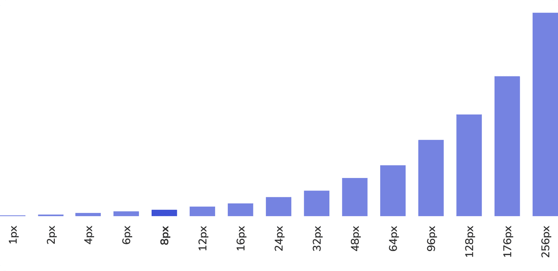
We use 8px as the base unit for our spacial system. The spacing system has been roughly generated by multiplying eight with even numbers.

Grid
Using a baseline grid creates a consistent rhythm between the components and typography. We use a 12-columns grid.
Types
Regular Grid
| Property | Value |
|---|---|
| Left padding | 8px |
| Right padding | 8px |
| Gutter | 16px |

Grid With Margin
For the outermost grid, this component is used. This can also be nested subsequently if a 16px padding is required on both sides.
| Property | Value |
|---|---|
| Left padding | 8 + 8px |
| Right padding | 8 + 8px |
| Gutter | 16px |

Columns
The column includes the padding at the inside, 8 px each side. This way the gutter becomes 16px for adjacent columns.

Components
We use a 8px baseline grid. All UI components including paddings and margins are created in multiples of eight so that everything aligns to the pixel grid. When text is used within a UI element, set the line-height to be consistent with the baseline grid.

Typography
All typography aligns to a 4px baseline grid. This allows for readable line heights at all sizes.

Spacing Guidelines
2 px Token
Spacing between related elements.
e.g. Spacing between heading and subheading.
 Spacing between heading and subheading
4 px Token
Spacing between group of elements.
e.g. Spacing between badges, buttons.
 Spacing between buttons
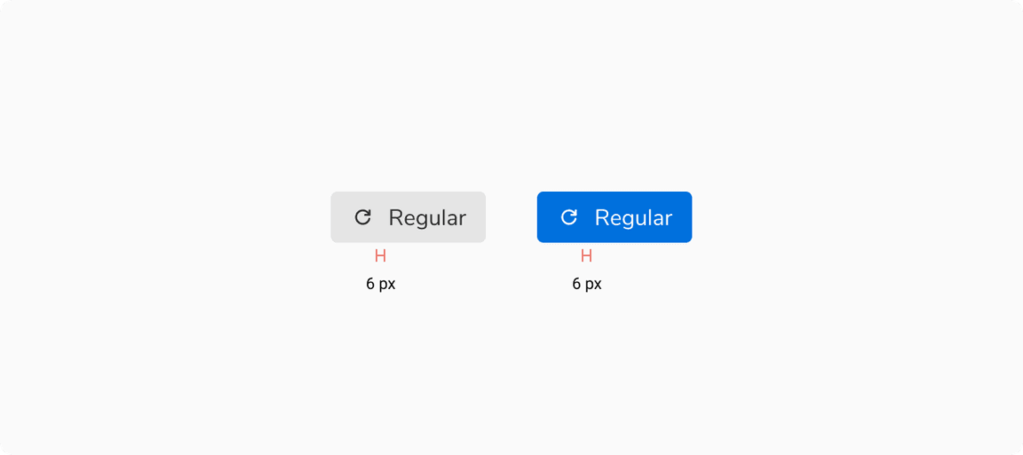
6 px Token
Spacing between multiple element in a component.
e.g. Button with icons on left or right.
 Spacing between buttons
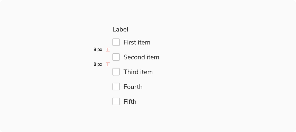
8 px Token
Spacing between group of elements.
e.g. Spacing within checkbox group, radio group.
 Spacing within checkbox group
12 px Token
Spacing within a section.
e.g. Spacing between sections within a modal, sections within a form.
 Spacing between sections within a modal
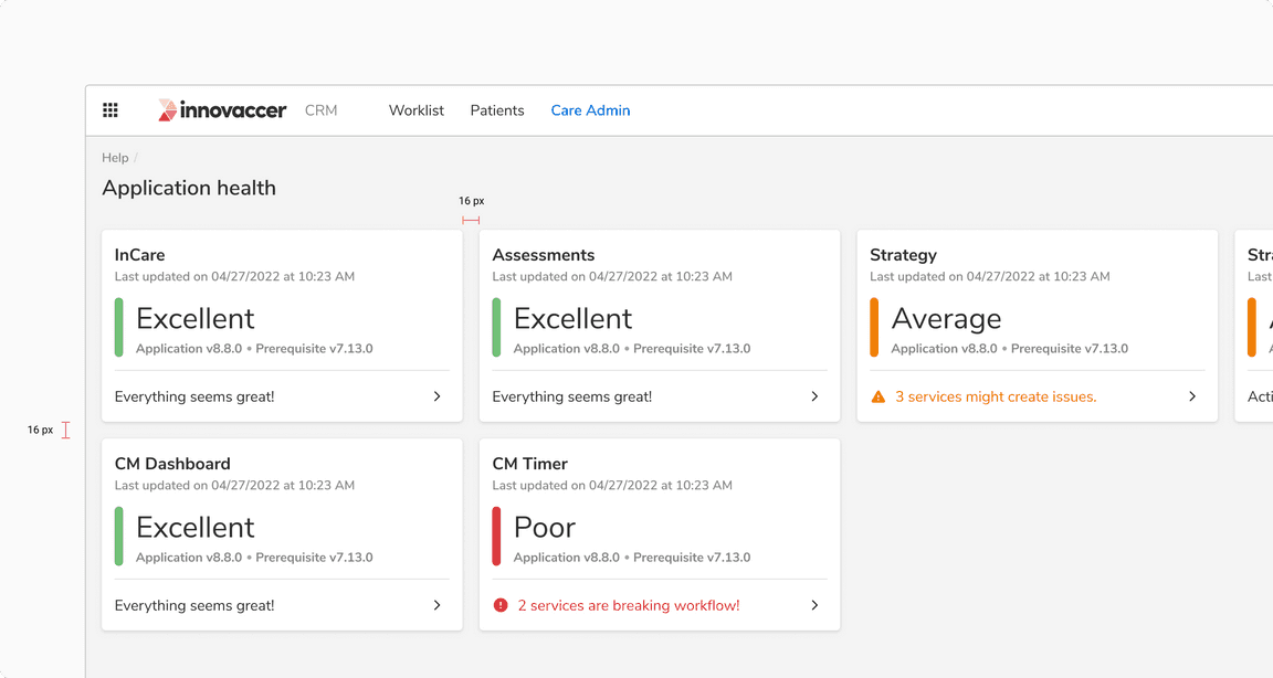
16 px Token
Spacing between different sections
e.g. Spacing between cards.
 Spacing between card
