
States
States are visual representations used to communicate the status of a component or interactive element.
Note: ‘Component’ used below implies ‘interactive component’.
Types of States
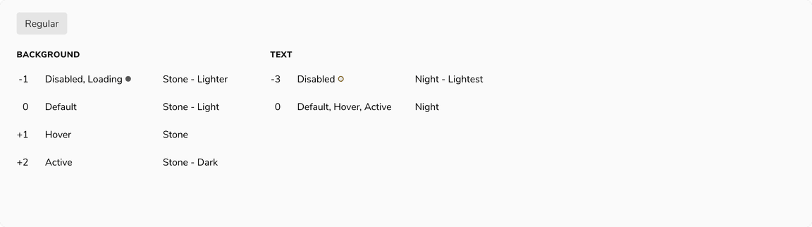
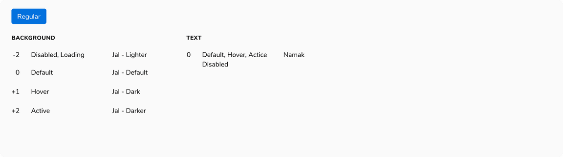
Default
A component is in default state when it is not interacted with.
State Logic
Consider it as 0 for reference point.
 Default state
Hover
A component transitions into hover state when the cursor is placed over it.
State Logic
+1 (slightly darker) for background color and content such as text (wherever applicable).
 Hover state
Active
A component transitions into active state when it is being pressed.
State Logic
+2 (moderately darker) for background color.
 Active state
Focus
A component transitions into focus state when it is highlighted by the user using a mouse, keyboard or voice input. This state indicates that the component is ready to interact with.
State Logic
Focus ring of 3px border, outside.
 Focus state
Disabled
A component transitions into disabled state when it cannot be interacted with.
State Logic
-2 (moderately lighter) for background.
 Disabled state
Loading
A component transitions into loading state if the action needs to be processed before proceeding.
State Logic
-2 (moderately lighter) for background and spinner in place of content.
 Loading state
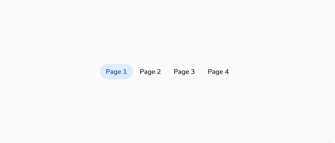
Selected
A component transitions into selected state when it is selected as an option out of many. The selected state should have medium emphasis so that it’s noticeable but not distracting.
State Logic
Jal/Lightest at 48% opacity for background color and Jal/Dark for text(wherever applicable)
 Selected state
Activated
A component transitions into activated state when a view associated with it is currently being viewed.
State Logic
Jal/Lightest for background color and Jal/Dark for text(wherever applicable)
 Activated state
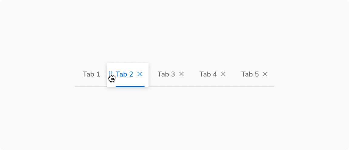
Dragged
A component transitions into dragged state when it is picked to move around.
 Dragged state
Examples
 Interactive states of Basic button
 Interactive states of Primary button
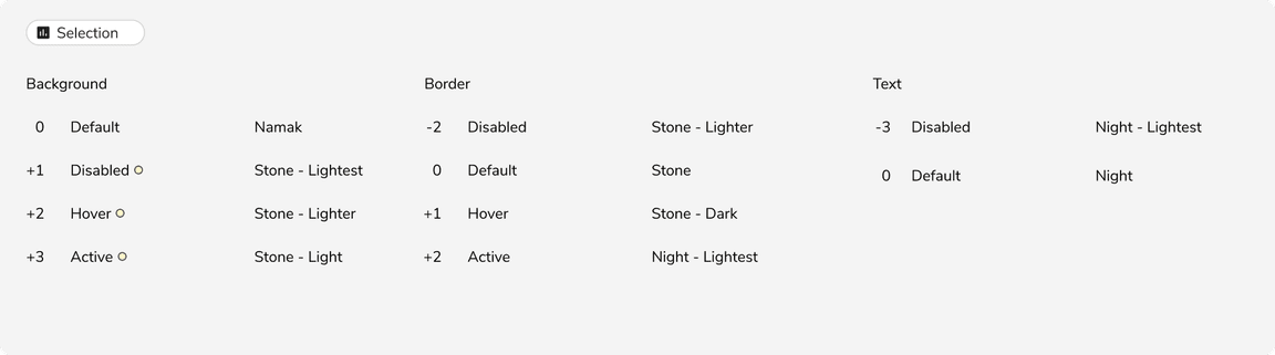 Interactive states of Selection chip in default state
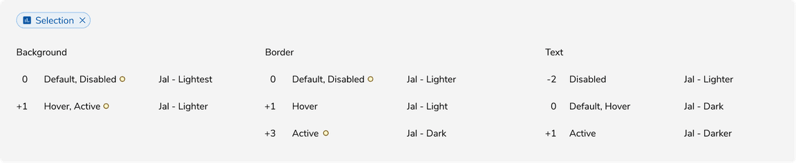 Interactive states of Selection chip in selected state