
AI Buttons
AI Buttons initiate actions powered by AI and have a distinct appearance to signal users that the action utilizes AI capabilities.
Types
AI Button
AI Button helps initiate actions powered by AI.
AI Icon Button
AI Icon Button can be used for AI actions when there is a space constraint and the meaning of the icon is universal. It features a sparkle icon that can be positioned on top right or bottom right of the icon button.
Variants
AI Button
AI button comes in 2 variants basis on their intent – default and with sparkle.
Default
This variant consists of just text which brings low emphasis on the action.
With Sparkle
This variant consists of an additional sparkle on the left for a touch of visual prominence bringing more attention on the action.
States
AI Button
AI button supports 5 states - default, hover, active, focus and disabled.
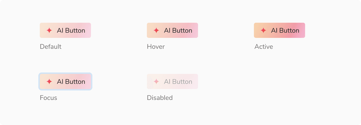 States - AI Button
AI Icon Button
Icon buttons supports 5 states - default, hover, active, focus and disabled.
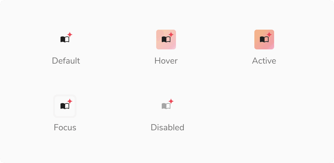 States - AI Icon Button
Structure
AI buttons (AI Button + AI Icon Button)
| Property | Value(s) |
|---|---|
| Height | 32px |
| Corner radius | 4 px |
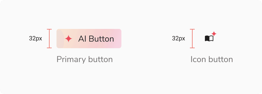 Structure - AI buttons
Configurations
AI Button
| Property | Value(s) | Default value |
|---|---|---|
| Variants |
| Default |
AI Icon Button
| Property | Value(s) | Default value |
|---|---|---|
| Large Icon |
| False |
| Sparkle position |
| Bottom |
Usage
Position of Magic Sparkle Icon in an Icon Button
The magic sparkle icon can be either positioned at top-right or bottom-right in the icon button. The sparkles are position to align with the edges of icon container.
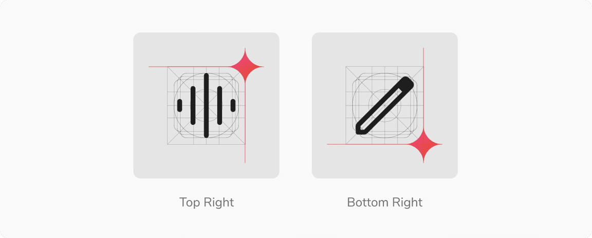 Position of magic sparkle icon in an icon button