
Popover
Popover is used to display floating content in relation to a trigger, usually a button or link.
Usage
Code
Interactions
Appearance
Light
Dark
Structure
| Property | Value(s) |
|---|---|
| Corner radius | 4 px |
| Shadow | 30 |
Configurations
| Property | Value(s) | Default value |
|---|---|---|
| Position |
| Bottom |
| Appearance |
| Light |
Usage
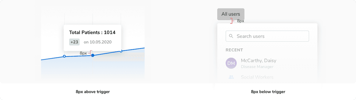
Positioning of Popover
Popovers appear either 8px above or 8px below their trigger.
The preferred and default side is the bottom. Popovers use smart positioning if there is not enough space in the designated direction.
 Positioning of popover
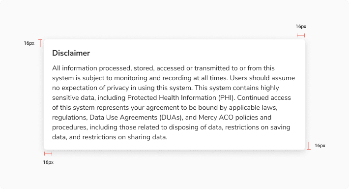
Padding Inside Popover
It is recommended to keep an overall padding of 16px inside the popover.
 Padding inside popover
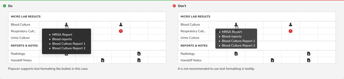
Popover as Tooltip
 Popover as tooltip
Popover as a Floating Component
 Popover as a floating component
Popover With Actions
Popover With Inputs
Popover as a Dropdown
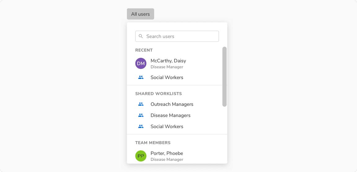 Popover as a dropdown
Popover as a Menu
 Popover as a menu
Popover vs Tooltip
Popover is an overlay container used to display links, interactive elements, avatars, text formatting (bullets etc), meta data in relation to a trigger whereas tooltip is used to display concise information.
 Popover vs Tooltip
Was this page helpful?