
Page Headers
Page headers act as the entry point for a page and house few key points for navigation.
Page headers act as the entry point for a page and house few key points for navigation. They help users know what the entire page is all about and what actions can be taken. They also help the users become aware of their current location with respect to the rest of the application using breadcrumbs.
Type
Page header comes in 2 types basis on what level of navigation they are being used -
Level 0
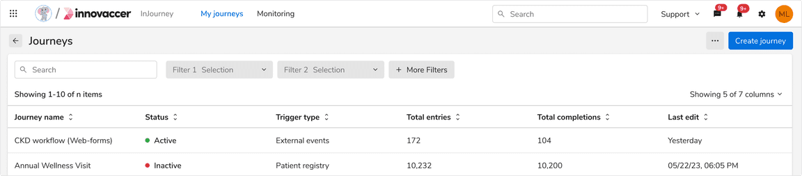
Level 0 page header is used at the topmost level in the hierarchy of pages where a resource table or a list generally exists. This table or list is usually a guiding path to go inside a particular page, navigating down the hierarchy.
Level 1
Level 1 header comes next in the navigation hierarchy. Users typically arrive here from a table or list present in Level 0. Hence, this header replaces the Level 0 header in the view.
This header stays the same in structure when a user navigates further down to subsequent levels i.e. Level 2, Level 3, and so on.
Level 1 With Back Button
The back button in header takes you to the previous page.
Level 1 With Breadcrumb
The breadcrumb in header helps you traverse across different levels of page hierarchy.
Variants
Page header comes in 3 variants - with navigation, with tabs and with steppers. Steppers are not required in Level 0 typically since the process of creating an entity lies in Level 1 and beyond.
With Navigation
Level 0, level 1 and level 1 and beyond page headers can accommodate horizontal navigation which allows users to navigate through the different sub-pages easily. Any variant of horizontal navigation (with icon & with count) can be used here.
Level 0
Level 1
Level 1 with back button
Level 1 with breadcrumb
With Tabs
Level 0, level 1 and level 1 and beyond page headers can accommodate tabs right beneath the page title to segregate the related content.
Level 0
Level 1
Level 1 with back button
Level 1 with breadcrumb
With Steppers
In order to show a multi-step process, page headers can accommodate steppers inside them.
When using steppers, the primary action is typically positioned within the body, while if there is any action that is for the whole process it will be accommodated in the page header itself.
Generally, steppers are not required at Level 0 since the process of creating an entity lies in Level 1 and beyond. But if needed, steppers can replace the center-aligned navigation tabs in headers in Level 0 as well.
Level 1
Level 1 with back button
Level 1 with breadcrumb
Configurations
| Property | Value(s) | Default value |
|---|---|---|
| Page title | <title> | - |
| Add-on (optional) |
| - |
| Divider (optional) | Horizontal divider | - |
| Back button | True, False | False |
Usage
Level 1 and Beyond
Page header can show multiple levels of hierarchy using different levels of breadcrumbs within the header in Level 1.
 A Level 1 page header with steppers
Header With Back Button
It is recommended to use a back button in the header for less than 3 levels to save space.
 Header with back button
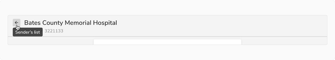
Tooltip on Back Button
Back button displays the title of the previous page in a tooltip on hover.
 Tooltip on back button
Dividers
Divider in a page header is optional to use.
However, it is recommended to not use a divider if the content below is in a card like container stretching to the full width of the page header as it is already creating an optical division in this case.
 Full width card below page header. Divider should not be used in such cases
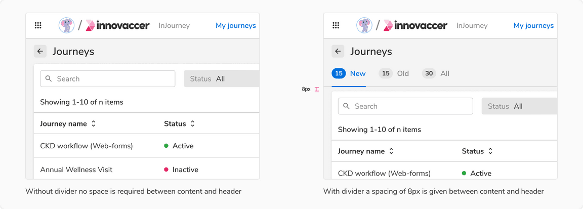
Spacing With and Without Divider
Spacing of 12px is given below header when a divider is present, otherwise no spacing required.
 Spacing with and without header
Responsiveness
By default, only the tabs appear beneath the page title. But if there is a width constraint, navigation can also be adjusted beneath the page title as well.
Note: Avoid using steppers when there is a width constraint as entity creation doesn’t usually take place in such conditions.
Recommended Navigation Items
It is recommended to use less than three navigation items when there are numerous actions on the right side of header.
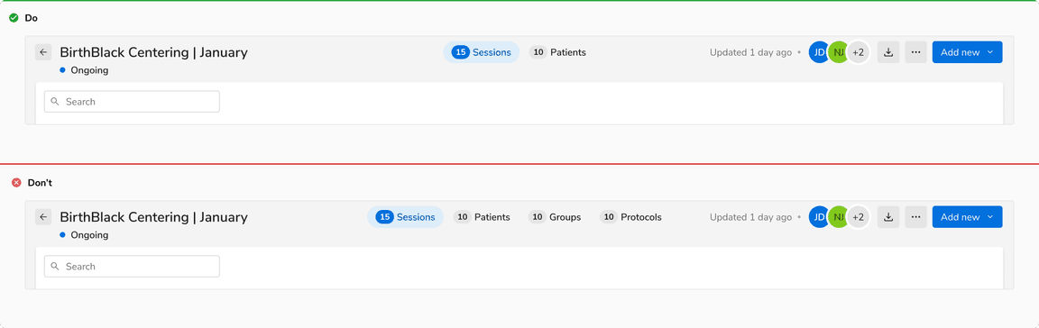 Recommended navigation items