
Sidesheet
Side sheets are used to present a great amount of information as a part of users' primary task while maintaining the context with the background content.
Side sheets are significantly larger than the Modals and hence they can accommodate complex informations and interactions. This way a side sheet works as a sub page in itself while maintaining the context.
Sizes
Basis on the sizes and the amount of content they can accommodate, side sheets are of 2 types -
Regular
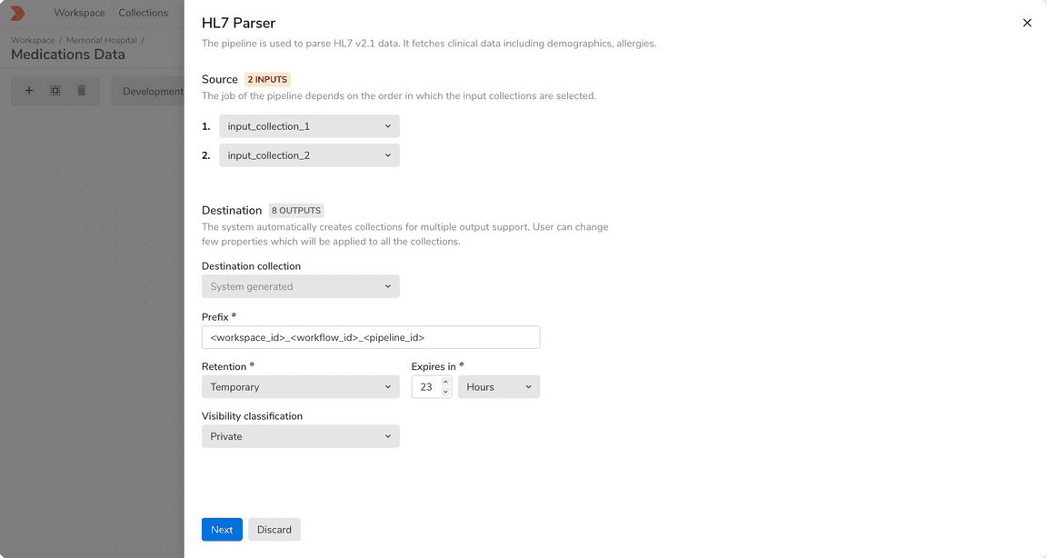
The default side sheet takes 6 columns in the grid and starts at just about halfway of the width of the screen.
Large
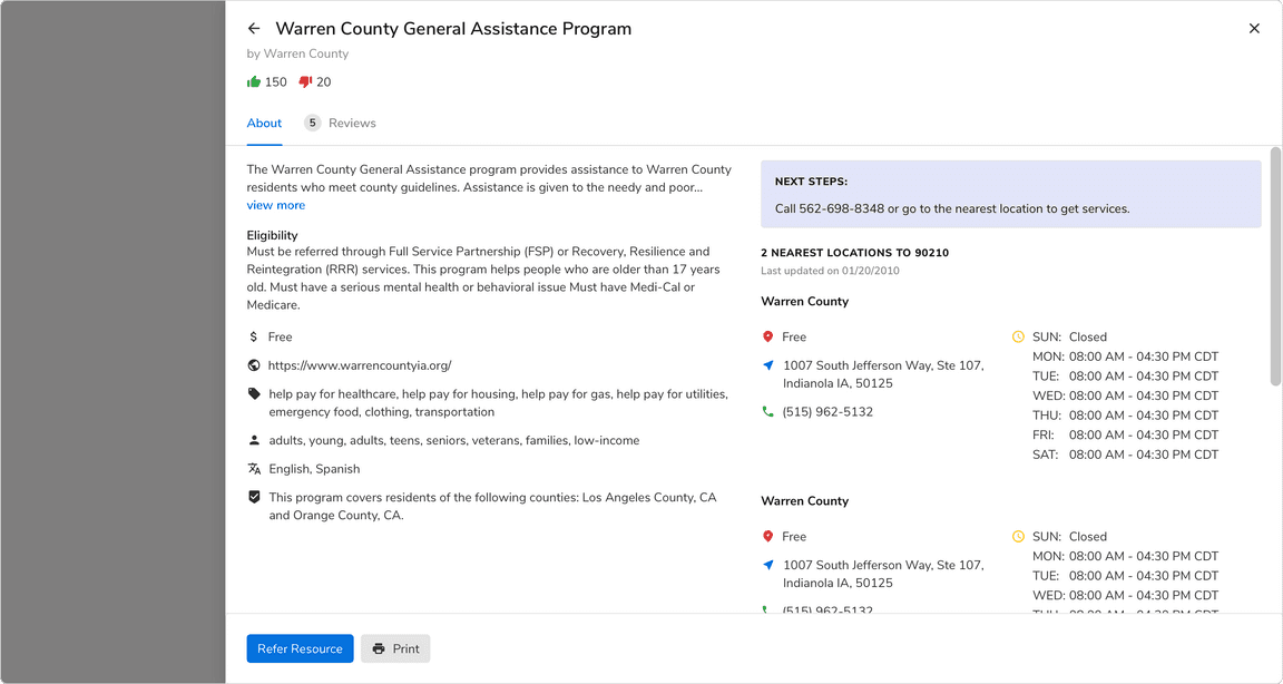
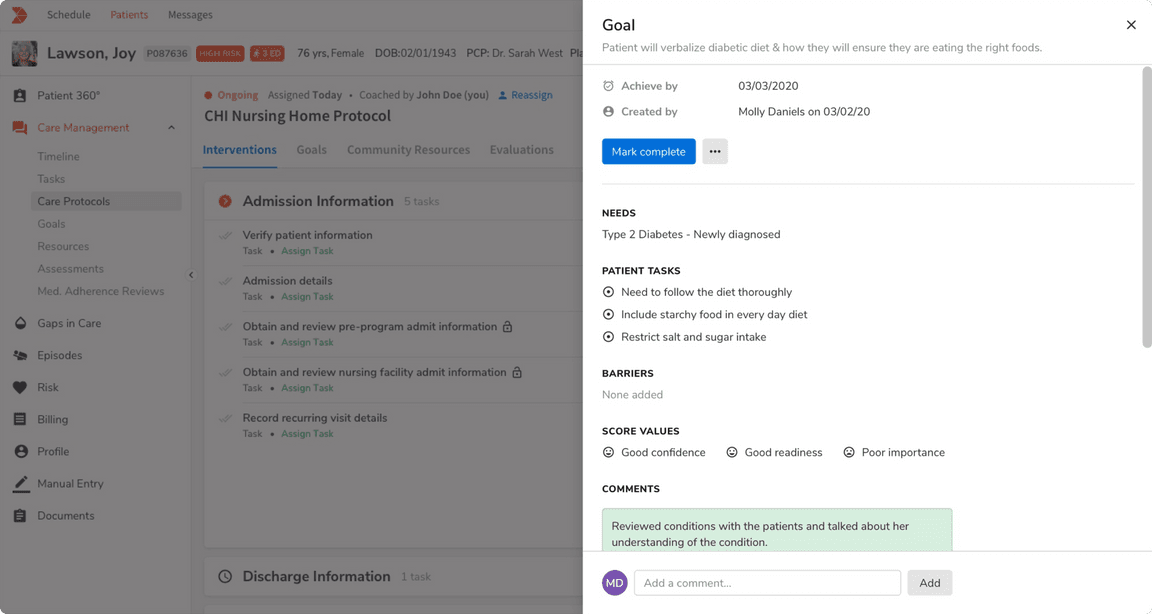
The large side sheet takes 10 columns in the grid and starts from left side of the screen.
Structure
| Property | Value(s) |
|---|---|
| Height | 100% |
Margin (top, right, bottom) | 0px, 0px, 0px |
| Corner radius | 0px |
| Background color | Namak |
| Shadow | Shadow 30 |
Configurations
| Property | Value(s) | Default value |
|---|---|---|
| Size |
| Regular |
Usage
Side Sheet vs Page
Default vs Large Side Sheet
The default side sheet covers most of the use cases but for the cases when the content is quite complex and needs a wider area, use the large variant.
 Default vs Large side sheet
Position of Action Buttons
The action buttons appear in the left side of the sheet and follows the reverse order as the modals to keep the position of primary action predictable. Also,
 Actions appear in the bottom
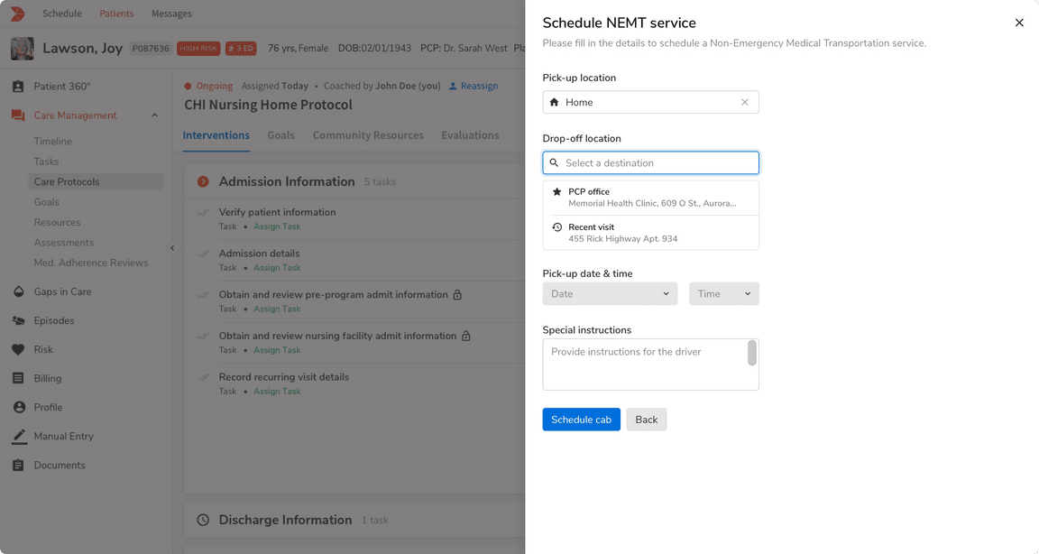 Actions appear just beneath the content
Dividers
Just like the modals, the dividers in the header and the footer should ONLY be shown when the content is scrollable.
 Dividers are hidden
 Dividers are visible
Closing the Side Sheet
Clicking outside the sheet should NOT cancel the current process and close it by default.
Multi Step Workflow
Unlike modals, side sheets can have multi steps workflow. Instead of showing multiple sheets, the entire workflow happens within the scope of a single side sheet. A user can navigate through the back stack using the Back button at the top left.