
Sliders
A slider lets user select a value (or range) from a given range of values.
Types
Based on usage, sliders are of two types -
Default Slider
The default slider can be used whenever selection of a single value is required out of a range.
Range Slider
Range slider is used if the user wants to select a range instead of a single value.
Variants
Based on selection, sliders have two variants -
Discrete Slider
In the case of discrete slier, while dragging slider knob will snap from one tick mark to the other. No values between two tick marks can be selected.
Free Slider
In the case of free slider, while dragging slider knob can move to each and every intermediate value possible. Values between tick marks can also be selected.
Structure

| Property | Value(s) |
|---|---|
| Size (knob) | 16x16 px |
Configurations
| Property | Value(s) | Default value |
|---|---|---|
| Label (optional) | <label> | - |
| Ticks | <ticks> | - |
| Numbers (optional) | <numbers> | - |
| Step size | <size> | 1 |
Usage
Pairing With Metric Inputs
Use slider with metric inputs for better accessibility in the case where choosing a specific value is important.
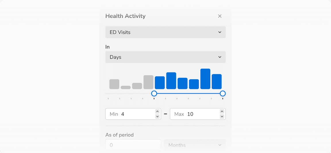 Slider paired with metric inputs