
Link
Links enable navigation within the product or to external destinations.
Links are used to navigate to a destination which can be on the same page or a different one. They should be used for navigation only not for actions.
Variants
Default
Default link button is blue in color. It is used when just enough attention of users is required.
 Default
With Icon
Link can have an optional icon on the left or right.
 With icon
Sizes
Link comes in 2 sizes - regular and small.
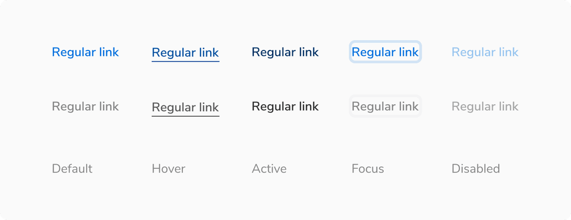
States
Link comes in 5 states - default, hover, active, focus and disabled.
Structure
A link consist of just a text. It does not contain any padding.

| Property | Value(s) |
|---|---|
| Height |
|
| Icon size |
|
Configurations
| Property | Value(s) | Default value |
|---|---|---|
| Size |
| Regular |
| Subtle |
| False |
| Icon (optional) | icon name | - |
| Icon alignment |
| Left |
Usage
Primary Link vs. Subtle Link
Primary Link
It is the default link component and comes in the primary color. It is used to draw attention and hence it is not recommended to have many links on a single page.
 Primary Link
Subtle Link
This is the subtle variant of link and hence uses a lighter color. It is primarily used in the breadcrumb component. Use it sparingly such as times when the default link can be too overwhelming to use (too much primary color on the screen).
 Subtle Link
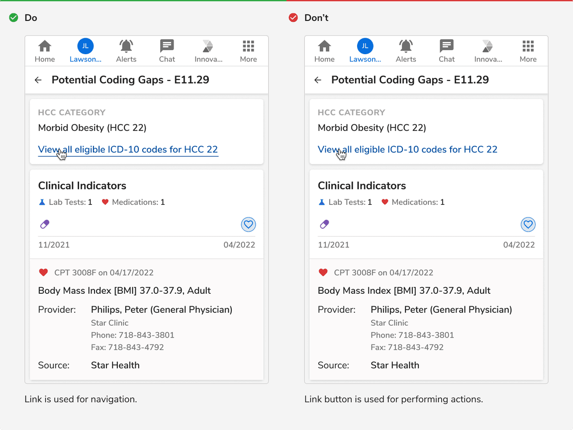
Link vs Link button
Link is used for navigation whereas link button is used for performing actions.
 Link vs Link button