
Date Pickers
Date picker is used for selecting or entering a date value.
Date picker lets users select or directly enter date values. It can either be a single date or a date range.
Types
Date picker comes in two types - one for selecting single date value called date picker and another for selecting a date range aptly called date range picker.
Date Picker
For selecting single date value.
 Date picker
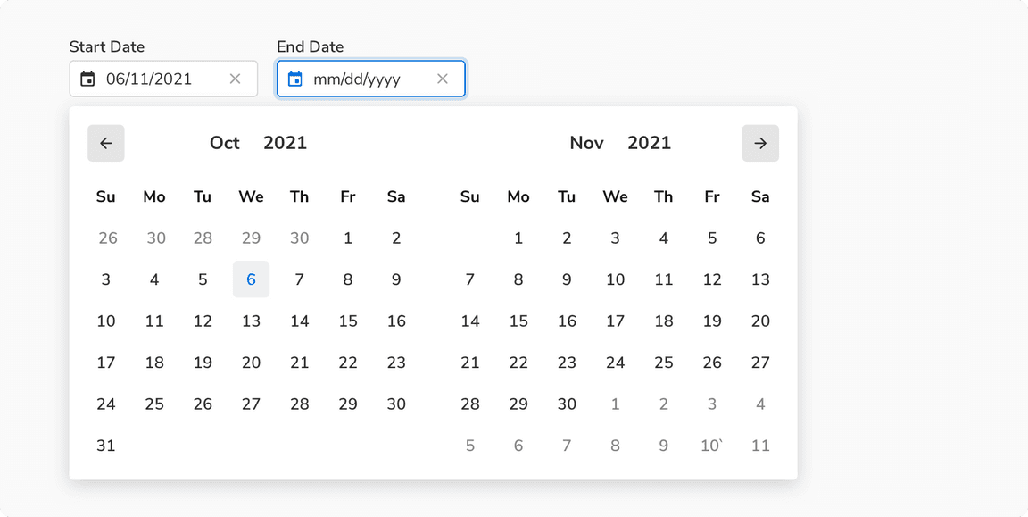
Date Range Picker
For selecting a date range.
 Date range picker
Structure
Date picker is built up using calendar and popover components. Unlike calendar, which can be displayed upfront, a trigger is always needed for the date picker such as inputs.
| Property | Value(s) |
|---|---|
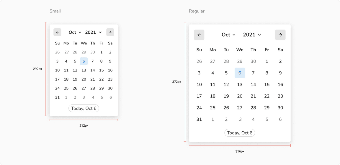
| Size |
|
Configurations
| Property | Value(s) | Default value |
|---|---|---|
| View |
| Month |
| Size |
| Regular |
Usage
Triggers
One obvious expectation from a date picker is the ability to input values using a keyboard e.g. when a user has to enter the date of birth. Getting the desired date is much quicker this way as users do not have to go through the calendar select the desired value. Therefore, use inputs to trigger the date picker.
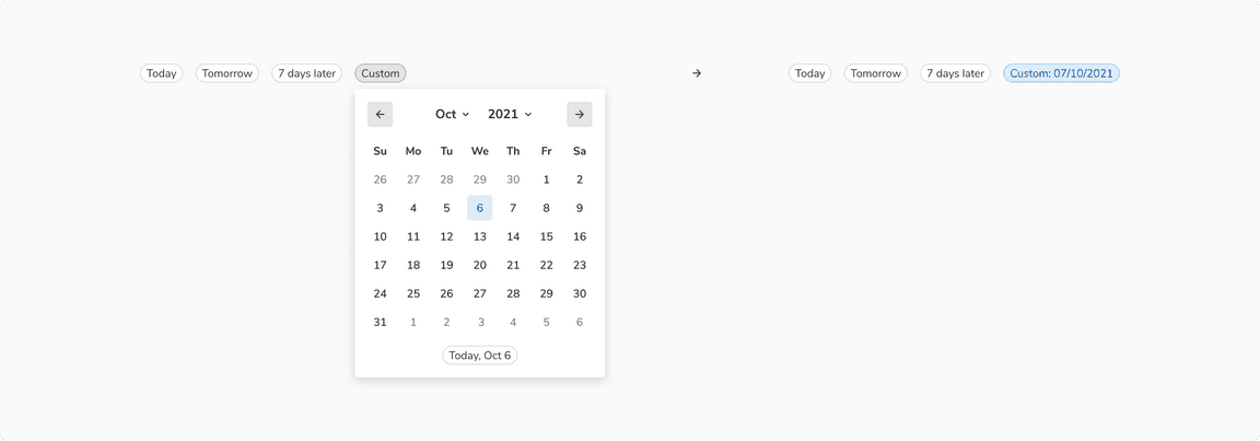
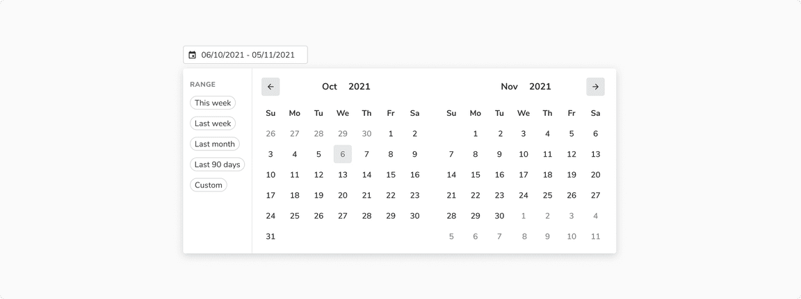
Using Preset Values
Use selection chips to give quick selection of preset date/date-range values.
 Using preset values
If there is a space crunch, you can have these preset values in the popover itself. But this defeats the purpose of quick selection since the users will have to open the popover to access them. Hence, make sure to use this only when there is no option left.
 Preset values inside popover
Using Single Input for a Date Range
If there is a space crunch, you can have a single input for entering/selecting a date range.
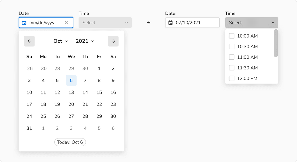
Using Date and Time Picker Together
As soon as a date or date range is selected, time picker dropdown should be triggered so that users can select the time without any additional click.
 Date and time picker together
Selecting Day of the Week or Time of Day
Use selection chips for selecting day of the week or time of day.
 Selection chips to select day of the week or time of day
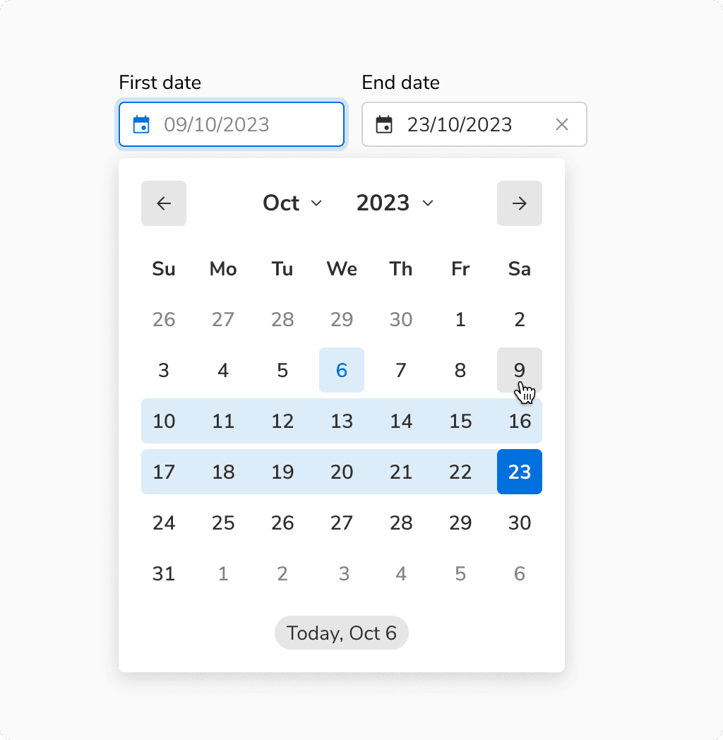
Reverse Selection in Date Range Picker
Users are allowed to choose the end date first and subsequently select the first date.
 Reverse selection in date range picker
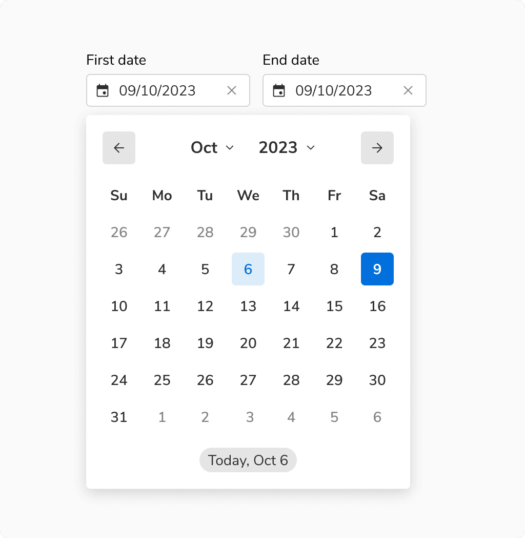
Selecting the Same Date Twice
Users are allowed to select the same date twice making the first and last date the same.
 Selecting the same date twice
Updating a Selected Date Range
In case of any update to the selected range, the selection will reset with the newly selected date becoming the new first date.