
Listbox
Related content grouped together and arranged vertically or horizontally.
A listbox consists of related content grouped together and arranged vertically or horizontally. Listbox present the content (text, supporting visuals, etc) in a consistent layout to make them easily scannable.
Types
Listbox come in 3 types: option list, description list and resource list
Option List
A list of options where an option is an entity that a user can select/pick.
 An option list
Description List
A list of items containing simple information which is meant for consumption only. It can occasionally contain minor actions such as copy, edit, remove, etc.
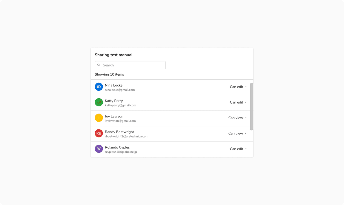 A description list
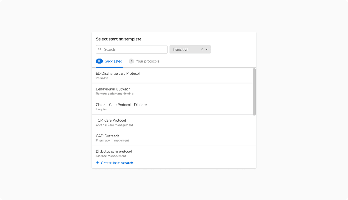
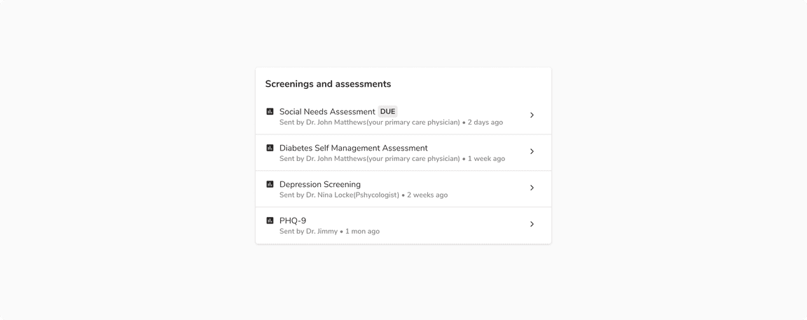
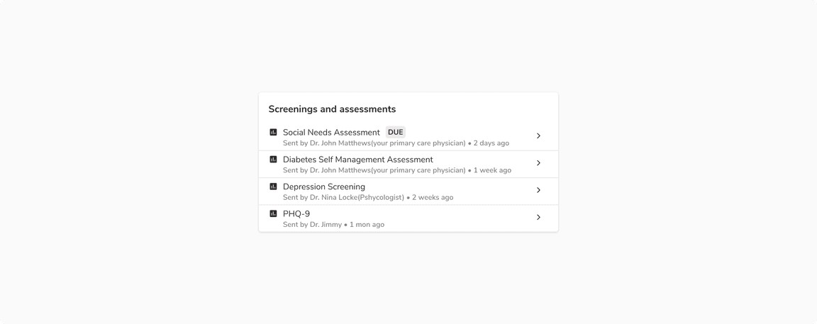
Resource List
A list of resources where a resource is an object in itself and has a detailed view linked to it.
 A resource list
Sizes
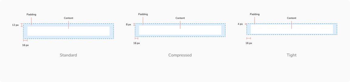
Listbox comes in 3 sizes: standard, tight and compressed. The width varies based on the content and layout.
| Type | Vertical padding | Horizontal padding |
|---|---|---|
| Standard | 12px | 16px |
| Compressed | 8px | 16px |
| Tight | 4px | 16px |
Standard
 Standard size - vertical padding - 12 px
Compressed
 Compressed size - vertical padding - 8 px
Tight
This size is typically suited for information-dense lists.
 Tight size - vertical padding - 4 px
States
Note: Since description list item is not interactive, it does not have any state.
Option List
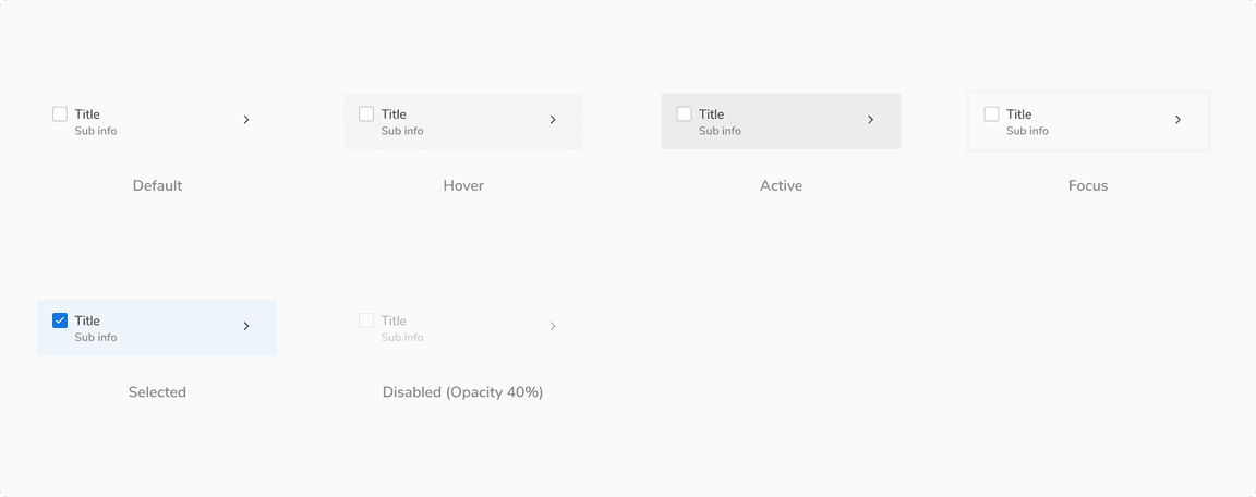 States of option list items
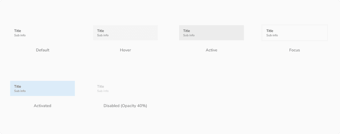
Description List
 States of description list items
Resource List
 States of resource list items
Structure
 Structure of list items
| Property | Value(s) |
|---|---|
| Horizontal padding | 16 px |
| Vertical padding |
|
| Shadow of picked item (while reordering) | Shadow 30 |
| Background | Nil |
Configurations
| Property | Value(s) | Default value |
|---|---|---|
| Spacing between 2 items | <value> | 0 px |
Usage
Arrangement
Vertical
This is the most common arrangement as the list is easy to read when arranged vertically.
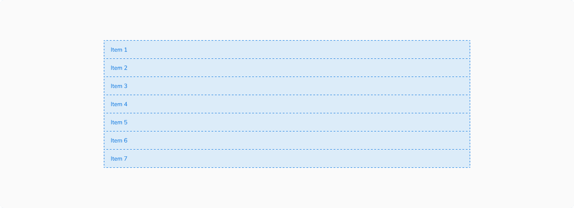 List items arranged vertically
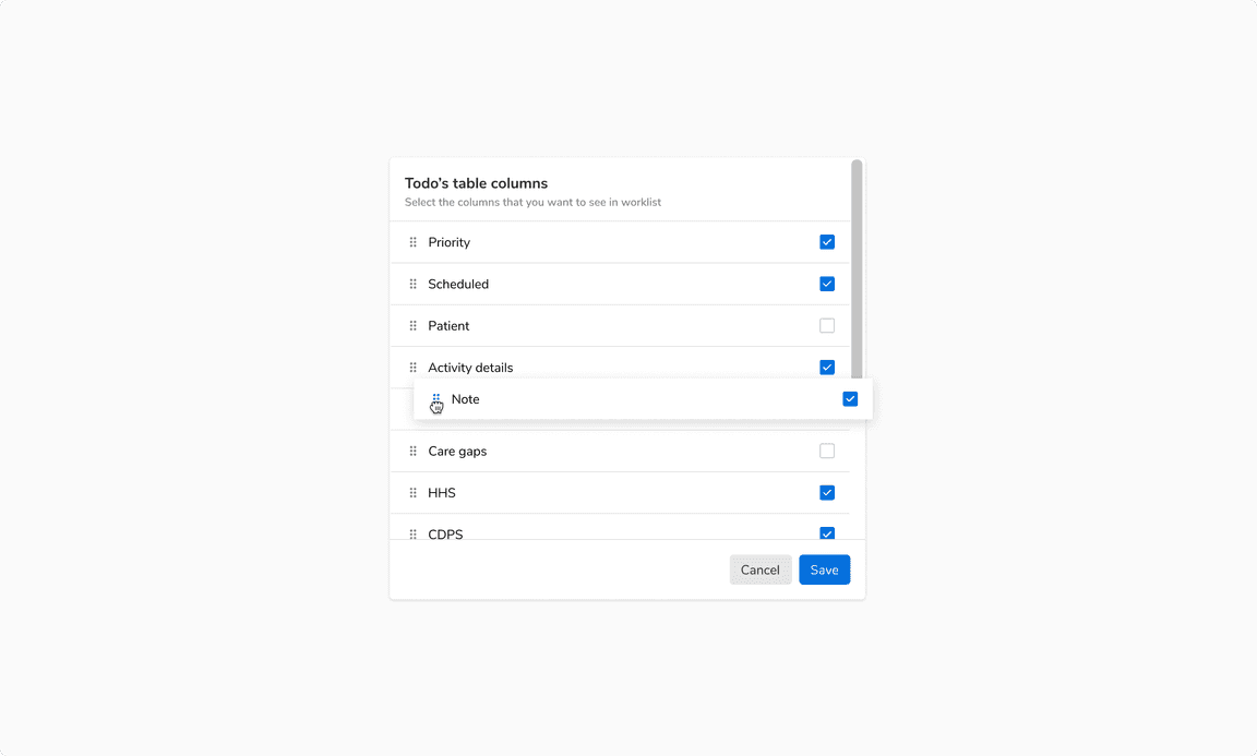
Nesting
List can be nested to show additional content. Any type of content such as a list, a card, etc can be nested inside a list items.
 A nested list
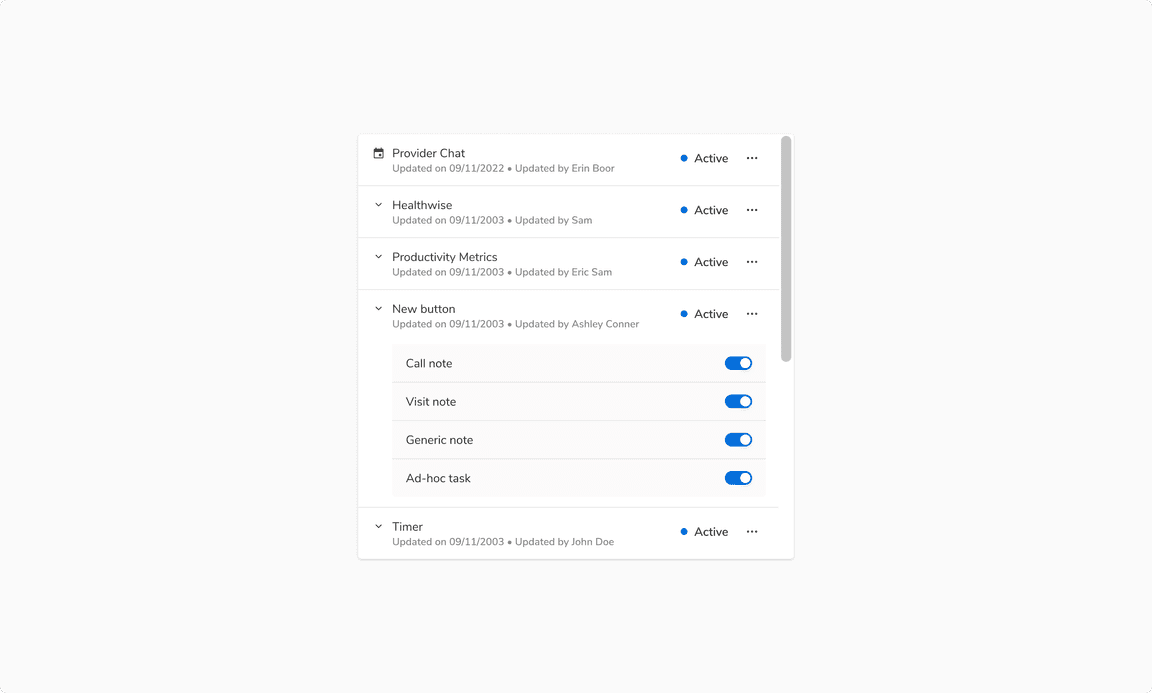
Reordering List Items
Reordering the list items should be hinted using a drag indicator placed at the beginning of the items. The list item can be picked and dragged using the drag indicator to reorder the list.
 Reordering the list items
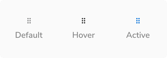 States of drag indicator icon