
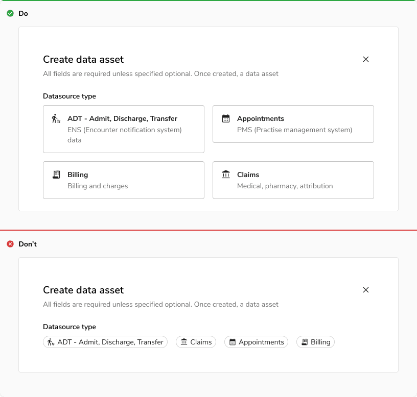
Interactive Cards
Interactive cards are used for actions like navigation and selection when options need to be descriptive, with a strong, captivating and balanced visual representation.
Interactive cards are flexible and make for an easily scannable way to present options.
Types
Action Cards
Action cards facilitate navigation by offering clear descriptions and a design that is both engaging and balanced.
 Action cards
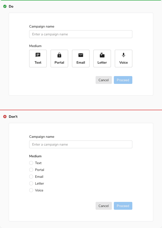
Selection Cards
Selection cards are used for selection. They can be single-select or multi-select.
 Selection cards
States
Interactive cards come in 5 states: default, hover, focus, disabled, and active.
Action Cards
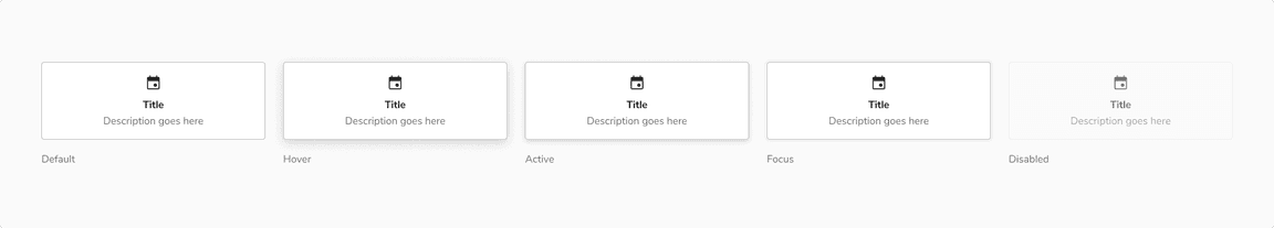 Various states of action card
Selection Cards
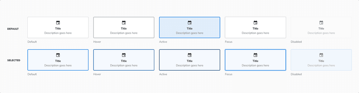 Various states of selection card
Structure
Content Alignment
Left
 Left aligned content
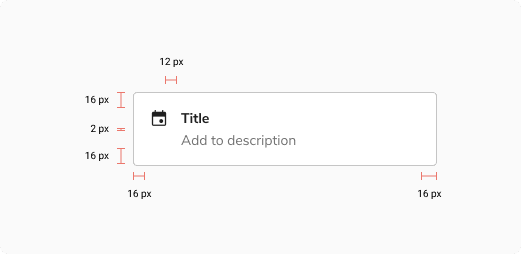
| Property | Value(s) |
|---|---|
| Corner radius | 4 px |
| Padding (top, right, bottom, left) | 16 px, 16 px, 16 px, 16 px |
| Spacing between content and icon | 12 px |
| Spacing between title and description | 2 px |
Center
 Center aligned content
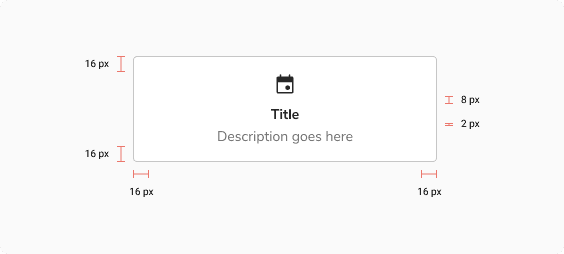
| Property | Value(s) |
|---|---|
| Corner radius | 4 px |
| Padding (top, right, bottom, left) | 16 px, 16 px, 16 px, 16 px |
| Spacing between content and icon | 8 px |
Usage
Content Alignment
Left
It is recommended to align content of interactive cards to the left when a long description is used, to give more visual room to read each line.
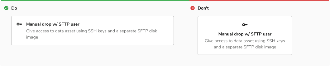 Left content alignment
Center
It is recommended to align the content of interactive cards to the center when the icon is sufficient to convey info or the description is short.
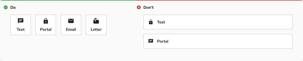 Center content alignment
Interactive Cards vs Chips
Interactive cards are used for descriptive and well organized options, while chips are a space efficient way to display simpler options.
 Interactive cards vs Chips
Interactive Cards vs Radio/checkbox
Interactive cards are used when you need to categorize your options using strong visual representation without making it overwhelming, while radio/checkbox is used for straightforward, simpler layouts.
 Interactive cards vs Radio/checkbox
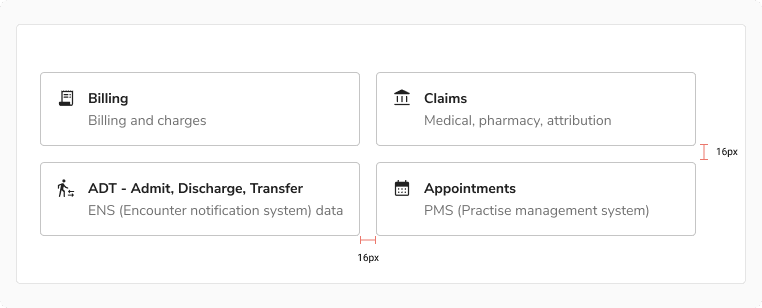
Recommended Spacing Between Cards
It is recommended to give a spacing of 16px between cards when stacking them horizontally or vertically.
 Recommended spacing between cards
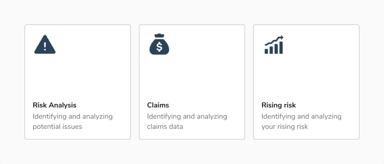
Custom Interactive Cards
Interactive cards can have custom content inside it, but the states of the card with custom content must remain coherent with the default interactive cards.
 Custom interactive cards