
Icon
Icon convey meaning to actions and other interface elements.
Icon is used to add additional visual cues on a page, hence helping to communicate a clearer meaning.
Appearances
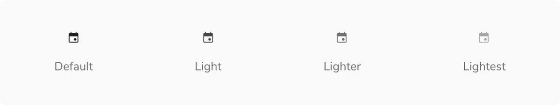
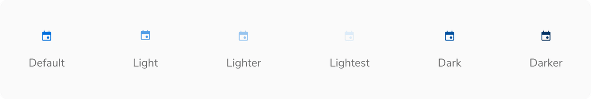
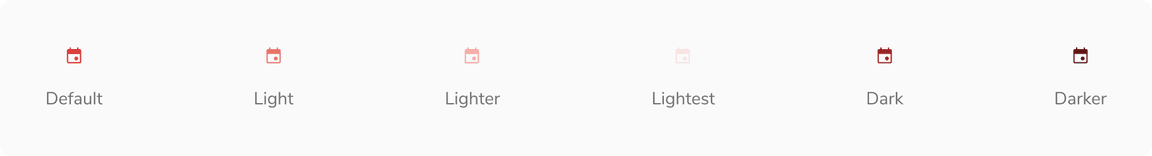
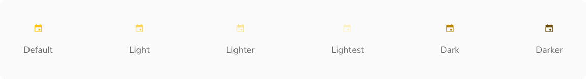
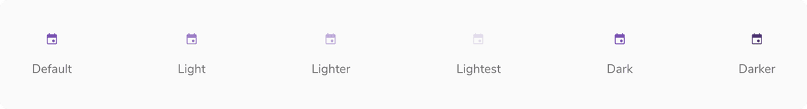
Based on the color palette that we follow, icons are offered in the following appearances. Barring the night and light variants, each appearance has 6 shades - Default, Light, Lighter, Lightest, Dark and Darker.
Night
Light
Note: Added a dark background here just to show the color of the icon.
Jal
Mirch
Haldi
Neem
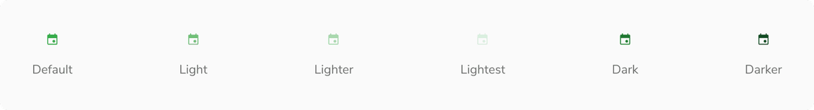
Nimbu
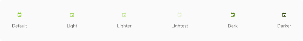
Tawak
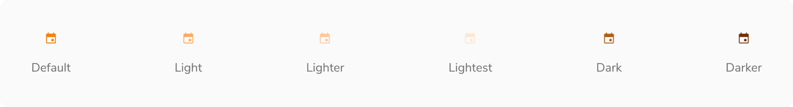
Neel
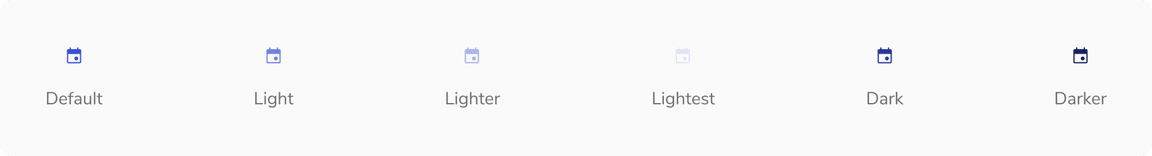
Jamun
Structure
Icons are based on Google’s Material Design and rendered using icon fonts. It supports rounded and outlined type. An icon component in the UI follows a simple structure.
| Property | Value(s) |
|---|---|
| Weight | 300 |
| Fill |
|
| Optical size | 24 |
| Grad | 0 |
Configurations
| Property | Value(s) | Default value |
|---|---|---|
| Size | <size> | 16 px |
| Appearance |
| Night |
| Shade |
| Default |
Usage
Different Sizes
Icons can also be resized to account for various use cases.
Large
Typically > 48px
Small
Smaller than 16px
With Label
Icons can come really handy when showing key-value pairs.
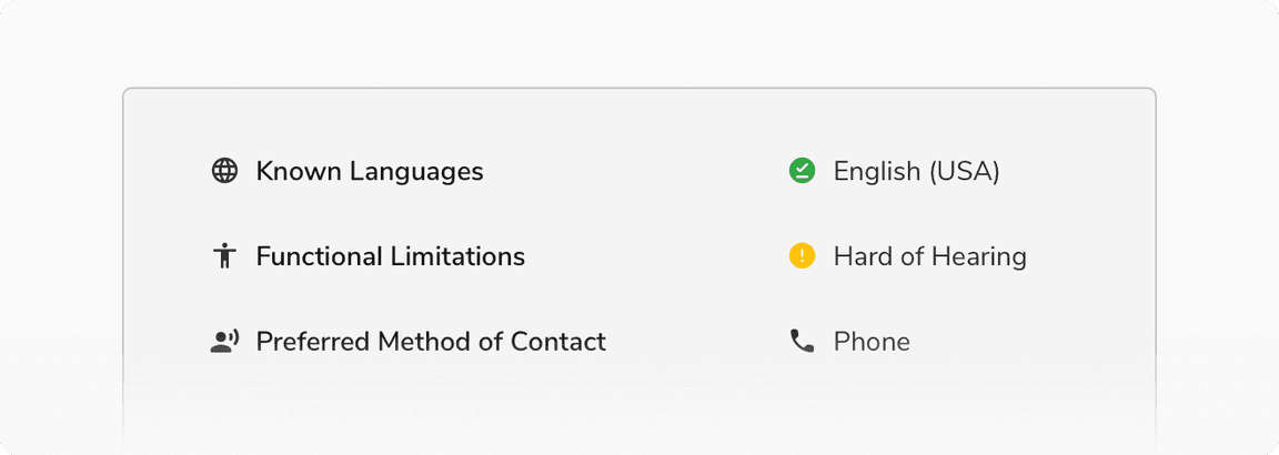 Icons appearing with label
With Background
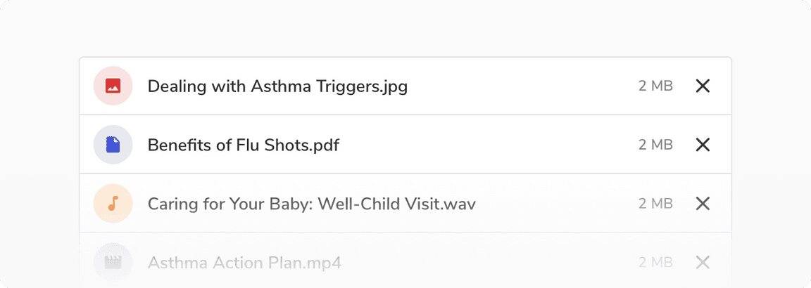 Icons with background containers
Hover
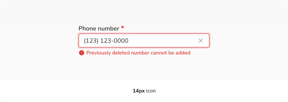
Icons, though being non-interactive, can also have tooltips/popovers to provide additional information on hover.
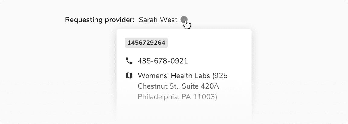 Hover on an icon