
Inline Editable Fields
Inline editable fields help users to directly jump from read mode to edit mode.
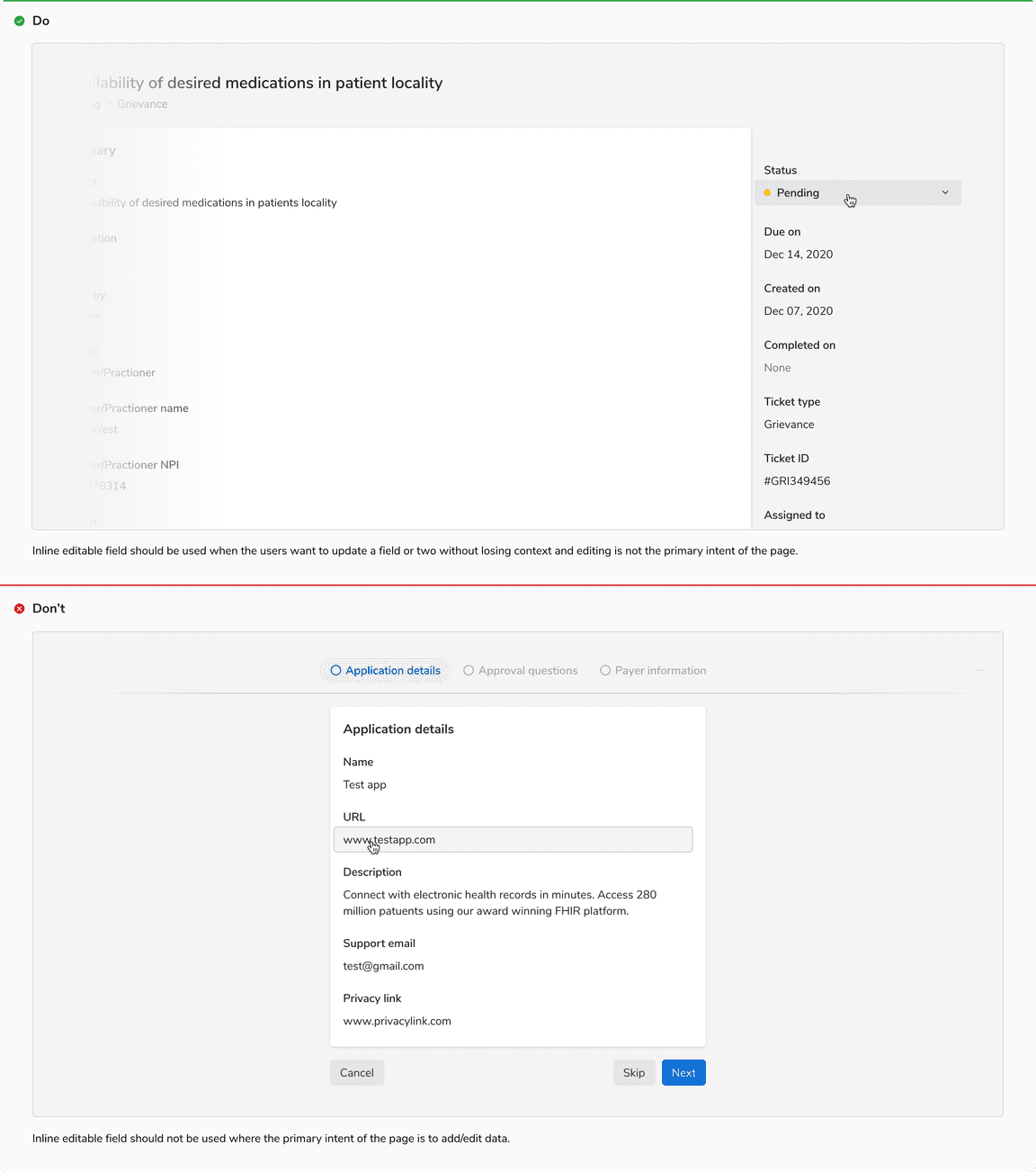
Inline editable fields enable users to edit the data right where they see it. They come handy when the users want to update a field or two without losing context and editing is not the primary intent of the page.
Types
Basic Input
Inline editable input comes with two small action buttons to confirm or discard the changes.
Input With Chips
Chips can be used as tags in inputs. Enter/return key is used to input the tags.
Select
Select type does not require explicit save/discard actions, as the result is saved immediately.
Sizes
Inline editable field comes in 2 sizes - regular and small.
States
Basic Input
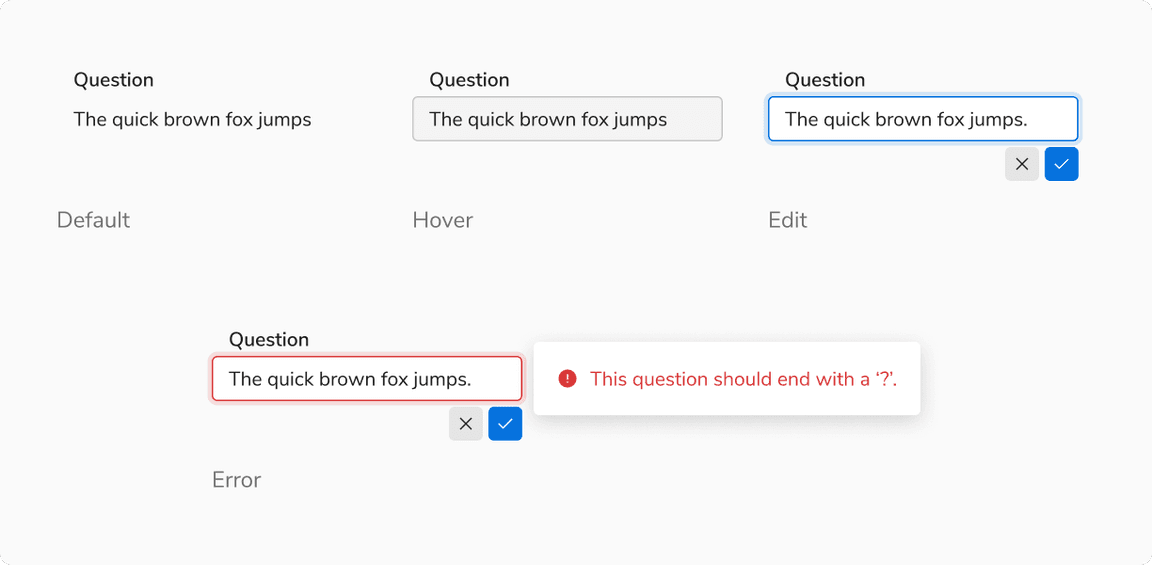 States of inline editable input
Input With Chips
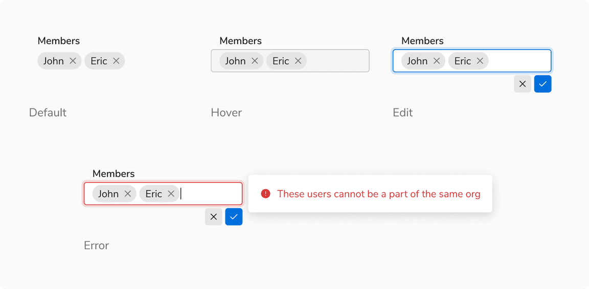 States of inline editable input with chips
Select
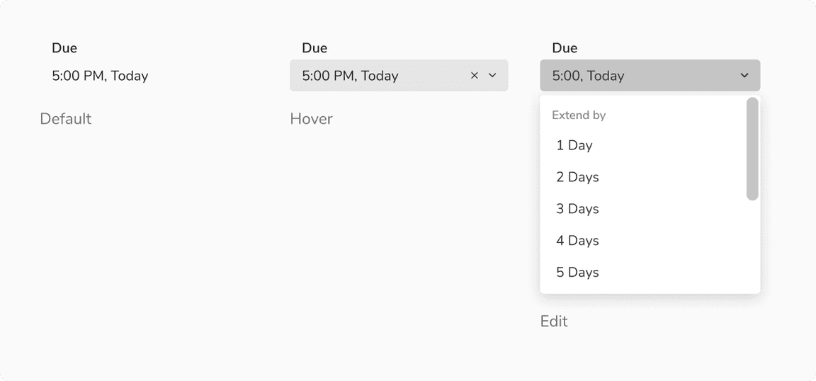 States of inline editable select
Structure
Basic Input and Select
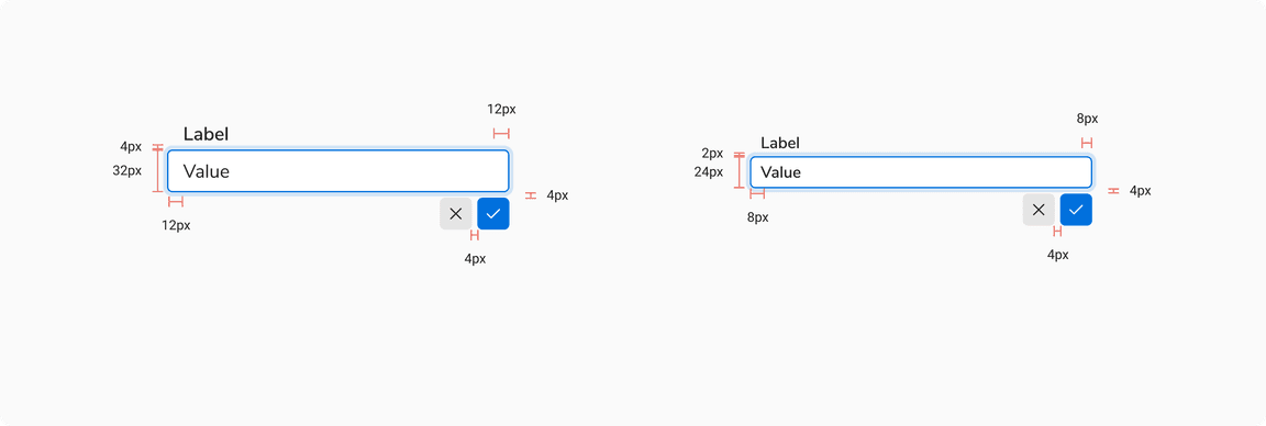
| Property | Value(s) |
|---|---|
| Height |
|
| Padding (right, left) |
|
| Spacing between input and actions | 4 px |
| Spacing between actions | 4 px |
Input With Chips
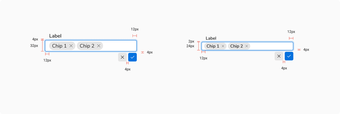
| Property | Value(s) |
|---|---|
| Height |
|
| Padding (right, left) |
|
| Spacing between input and actions | 4 px |
| Spacing between actions | 4 px |
Configurations
Inline Editable Field
| Property | Value(s) | Default value |
|---|---|---|
| Size |
| Regular |
| Width | <width> | 256 px |
Label
| Property | Value(s) | Default value |
|---|---|---|
| Size |
| Regular |
| Required |
| False |
| Optional |
| False |
| Info |
| False |
Usage
Intent
Inline editable fields are used when the users want to update a field or two without losing context and editing is not the primary intent of the page.
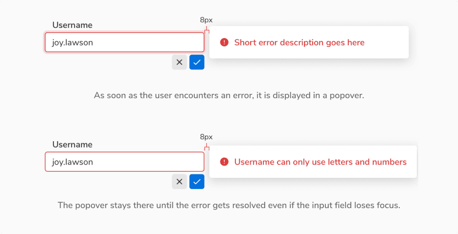
Showing Error
Errors are shown using popovers alongside the inline editable field.
 Showing error in inline editable fields
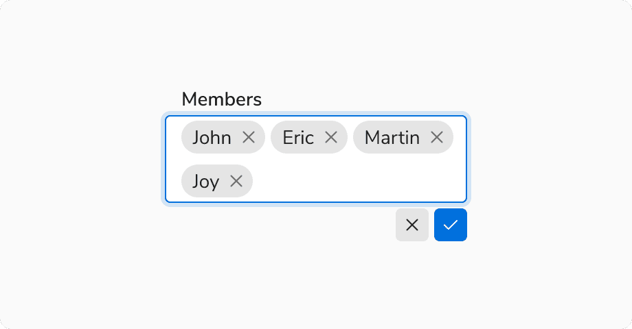
Overflow Behavior in Inline Editable Chip Input
In case of overflow the chip gets wrapped into the next line.
 Overflow behavior in inline editable chip input
Horizontal Spacing Between Label and Field
It is recommended to have a minimum spacing of 4px between the label and the inline editable field when placed horizontally.
This spacing is recommended so that the focus ring doesn’t overlap with the label.
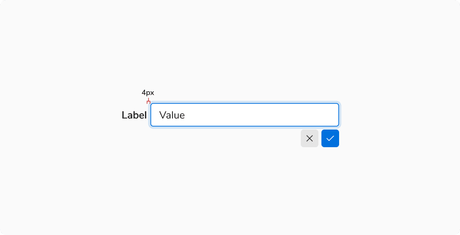 Recommended minimum spacing between the label and field