
Breadcrumb
Breadcrumbs indicate the path of a record and help the users to navigate back to the parent record.
Breadcrumbs help users become aware of their current location with respect to the rest of the product/application. Breadcrumbs show the hierarchical progress from the highest entity level to the lowest.
As helpful as they are, breadcrumbs should never replace the main navigation on a page.
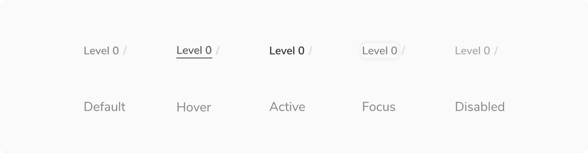
States
Since the breadcrumb component is made up of the subtle link, you can change its state as per the requirement. Available states are - Default, Hover, Active, Focused, Disabled.
Structure

| Property | Value(s) |
|---|---|
Padding (top, bottom) | 4 px, 4 px |
| Max width | 160 px |
Configurations
| Property | Value(s) | Default value |
|---|---|---|
Label | <label> | - |
Link | <link> | - |
Usage
Showing More Than 4 Levels
By default, breadcrumbs can show upto 4 levels of hierarchy. For cases where there are more than 4 levels, only first and last breadcrumb is shown. The rest levels can be seen on clicking the menu button present in the middle.
Seeing the Entire Label
The max-width of the label is 160px, beyond that the text will truncate with ’…‘. The users can see the entire label on hover inside a tooltip.
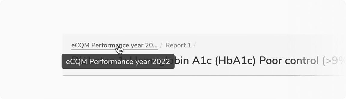 Entire label visible on hover inside a tooltip