
Link Button
Link button is used to initiate standalone actions in cases where using a button impacts spacing, alignment, or overall aesthetics.
Link button is an action button with no padding which makes it easier to fit within the spacing and alignment constraints of modern web applications. It has the same interaction states and semantics of a button.
Variants
Default
Default link button is blue in color. It is used when just enough attention of users is required.
 Default link button
Subtle
Subtle link button is gray in color. It is used where drawing users’ attention is not necessary.
 Subtle link button
With Icon
Link button can have an optional icon on the left or right.
 With icon
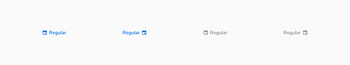
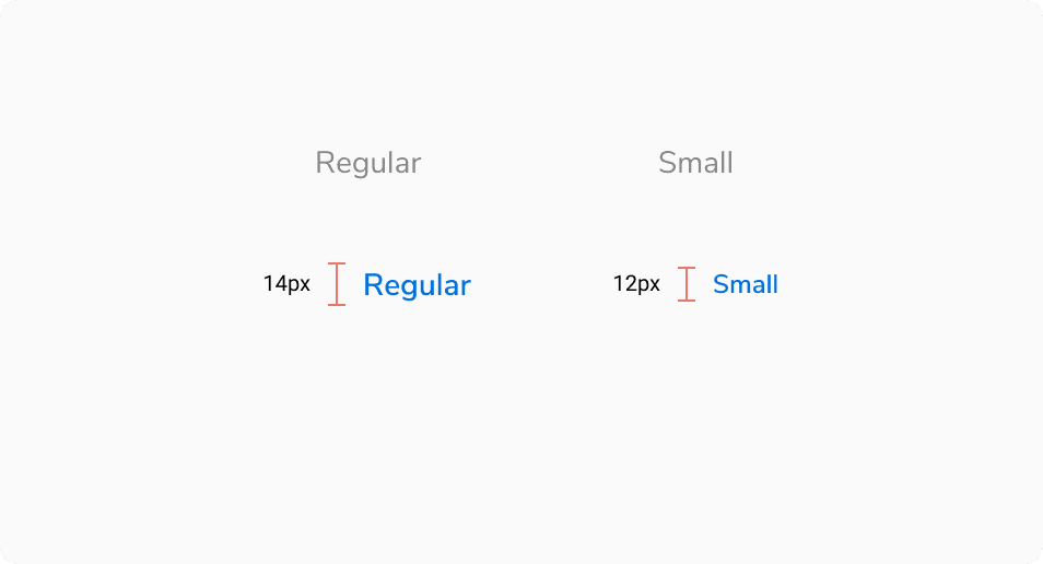
Sizes
Link button comes in 2 sizes - regular and small.
 Different sizes of link button
States
Link button comes in 5 states - default, hover, active, focus and disabled.
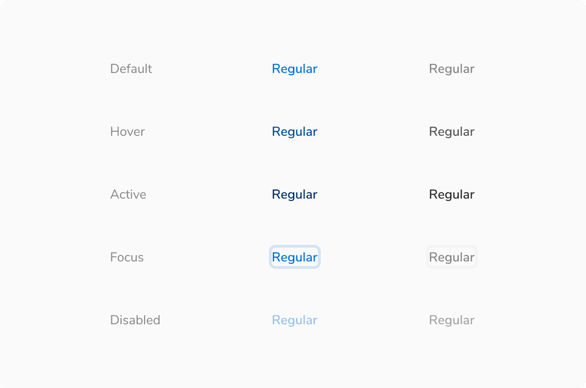 Various states of link button
Structure
 Structure of link button
| Property | Value(s) |
|---|---|
| Height |
|
| Icon size |
|
Configurations
| Property | Value(s) | Default value |
|---|---|---|
| Size |
| Regular |
| Subtle |
| False |
| Icon (optional) | <icon name> | |
| Icon alignment |
| Left |
Usage
Subtle Link Button vs Transparent Button
Subtle link button is used when there is a space constraint whereas transparent button is used when there is sufficient space and the clickable area needs to be larger.
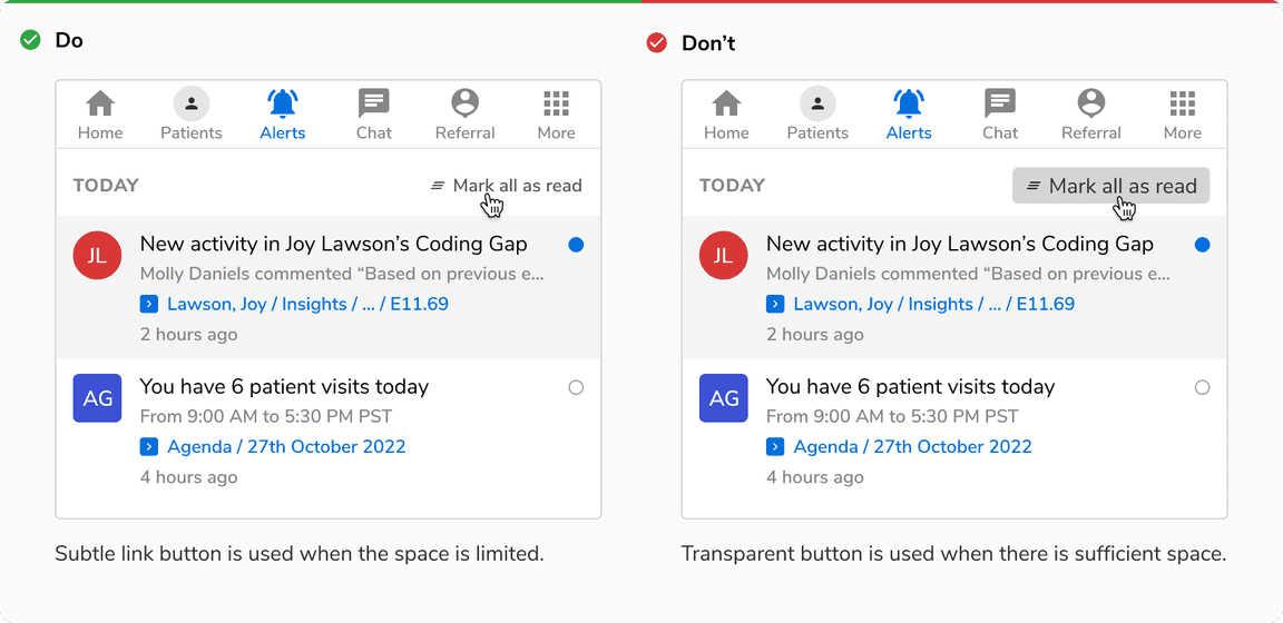 Subtle link button vs Transparent button
Link Button vs Link
Link button is used for performing actions whereas link is used for navigation.
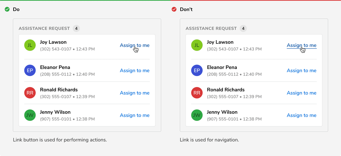 Link button vs Link