
Help Text
Help text provides a brief description accompanying a component.
Help text is used to provide additional information accompanying a component such as checkbox, dropdown, input, etc.
Structure

| Property | Value(s) |
|---|---|
| Width | Spans the width of the related component |
| Spacing between help text and the component | 4 px |
Usage
When to Use Help Text
Help text should only be used to provide a brief description related to the component. It should not be used for headings, main content, or long paragraphs.
 When to use help text
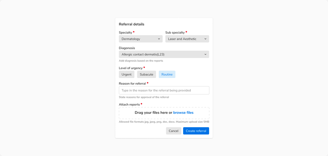
 Using help text with different components
Help Text vs Inline Message
Inline message is used to provide inline feedback regarding a state or action and hence it is reactive (only appears after something has happened, to provide feedback). Whereas help text is used to provide additional information typically appearing just below a component e.g. inputs, dropdowns, etc.
 Help text vs Inline message
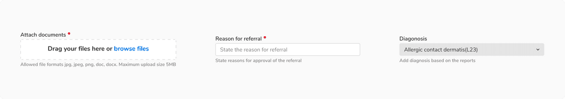
Position and Width of the Help Text Component
Help text always appears just below the accompanying component and spans across its width.
 Position and width of the help text component