
Modals
Modals are used to present information, critical alerts, and confirmations requiring user input or interaction.
Modals are used to present information, critical alerts, and confirmations to the users. Occasionally they can contain short forms to input data from users. They are presented on top of a translucent overlay to maintain context with the background content and hence preventing users from interacting with the background.
If the information or interactions are more complex, consider using a side sheet.
Types
Standard Modal
Standard modals appear in the center of the screen along with an overlay which prevents users from interacting with the background.
Full Screen Modal
Full screen modals cover the entire screen. They are used when you want the complete undivided attention of users. The prime use case is when the users create a new entity because in such cases the context with the content behind the modal is typically not required.
They should not be used for confirmations, critical alerts or to present information.
Variants
Standard Modal
Dialogs
Dialogs are used to convey information to users where interaction with that information is not required.
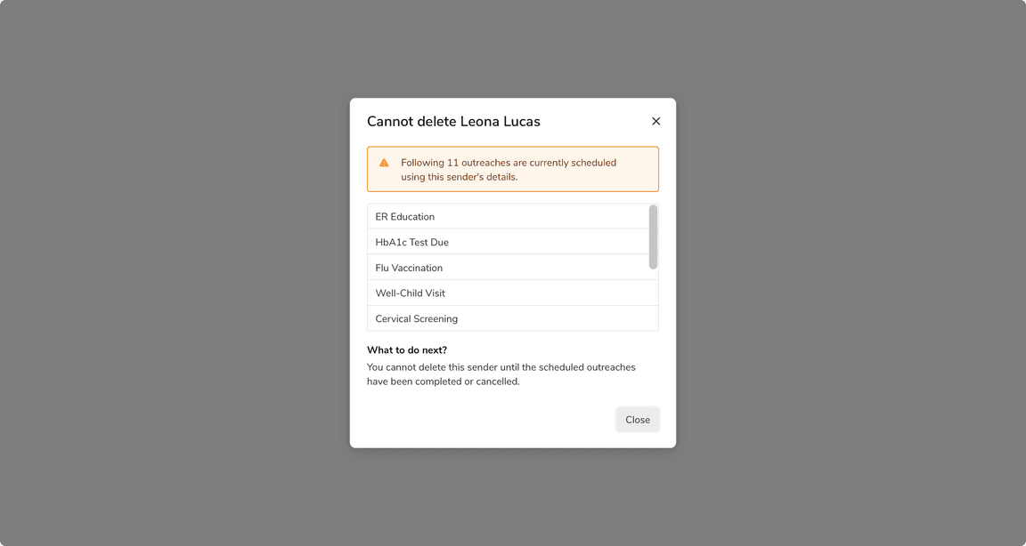
Alerts
Alerts are used to convey critical information before taking a destructive action such as delete, discard, deactivate, etc.
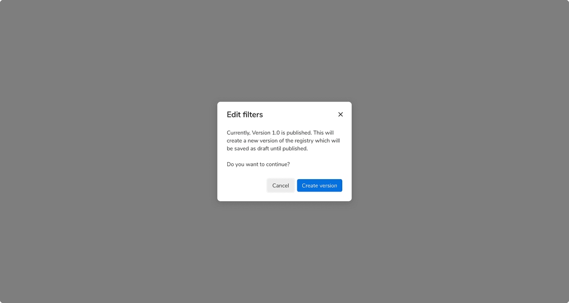
Confirmations
Confirmation dialogs are used to take confirmation from users before taking any important action.
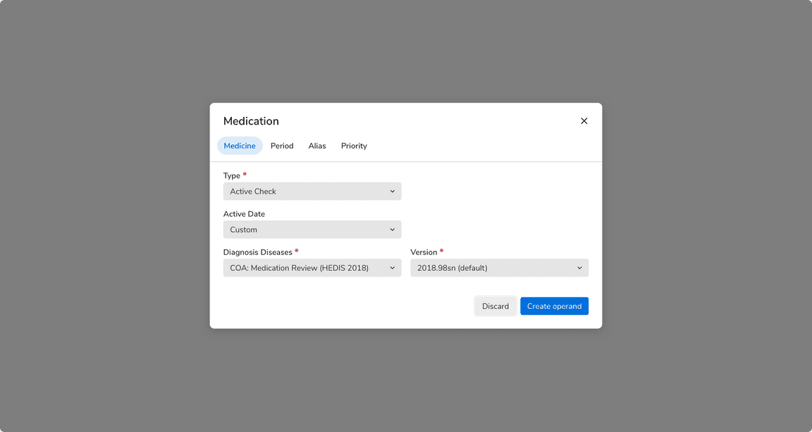
Input Modals
Input modals are used to present forms to users such as input fields, dropdowns, etc.
Sizes
Standard Modal
Standard modal comes in 3 sizes basis on the breakpoints -
| Size | Breakpoint < = small | Breakpoint = medium | Breakpoint = > large |
|---|---|---|---|
| Small | 10 columns | 4 columns | 3 columns |
| Medium | 10 columns | 6 columns | 4 columns |
| Large | 10 columns | 8 columns | 6 columns |
Note: While designing, only design as per the large breakpoint case (width >= 992 pixels).
Small
Medium
Large
Full Screen Modal
The content of a full screen modal comes in 2 sizes basis on the breakpoints -
| Size | Breakpoint < = small | Breakpoint = medium | Breakpoint = > large |
|---|---|---|---|
| Default | 12 columns | 6 columns | 4 columns |
| Large | 12 columns | 8 columns | 6 columns |
Note: Content here refers to the section appearing in the center of the full screen modal.
Default

Large
Structure
Standard Modal
| Property | Value(s) |
|---|---|
| Minimum height | 200px |
Minimum margin (top,bottom) | 64px, 64px |
| Corner radius | 8px |
Padding (top,right,bottom,left) | 16px, 24px, 24px, 24px |
| Background color | Namak |
| Shadow | Shadow 30 |
Full-Screen Modal
| Property | Value(s) |
|---|---|
| Padding-top | 64px |
| Background color | Namak |
Configurations
Standard Modal
| Property | Value(s) | Default value |
|---|---|---|
| Size |
| Regular |
Full-Screen Modal
| Property | Value(s) | Default value |
|---|---|---|
| Size |
| Regular |
Usage
Positioning and Scaling of Modals
Modals are vertically center-aligned. They scale vertically in case the content is long enough, until reaching 64px from the screen’s top and bottom edge. In those cases, a scroll is introduced as well.
A top and bottom margin of 64px allows to best utilize the space on the viewport and maximize the content area of the modal.
 Positioning and scaling of modals
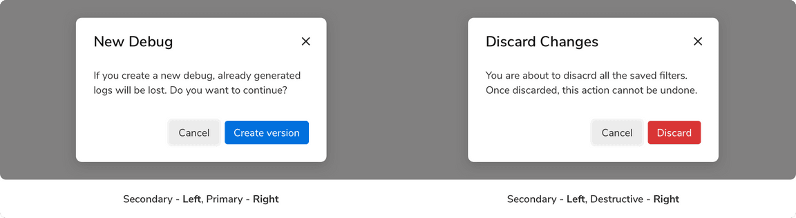
Default Focus on Secondary Action
By default, the secondary action should be in its focused state when the modal appears. This helps to avoid the trigger of primary action (especially the delete action) by accidental pressing of Enter key.
 Default focus on secondary action
The Order of the Action Buttons
The primary and secondary actions appear at the bottom right in a modal. However, the order in which they appear has to be the same regardless of the nature of the primary action (create, delete, etc.). Listing primary actions last improves the flow, because the modal then “ends” with its conclusion. Also, keeping the order the same makes the position of actions predictable.
Using in Conjunction With the Message Component
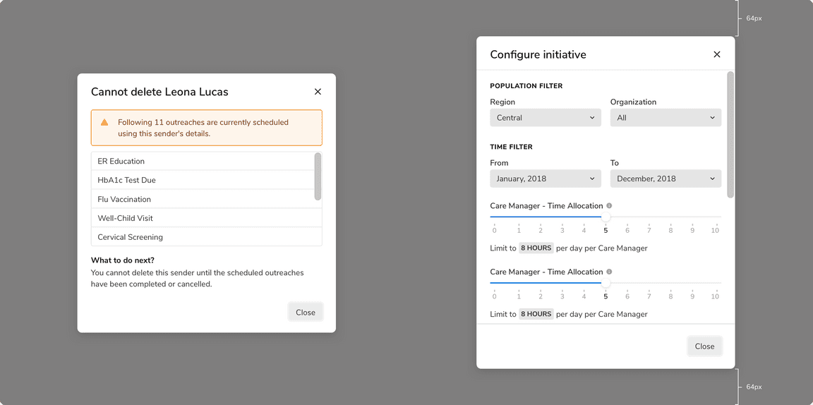
Message component can be used in the body of the modal in case the need arises. It should always appear at the top in the body section.
For example, this can be helpful when you want -
- The users to be aware of the consequences their actions can have
- To show a critical error, etc.
Message component in modals
Dividers
The dividers in the header and the footer should only be shown when the content is scrollable.

 With dividers
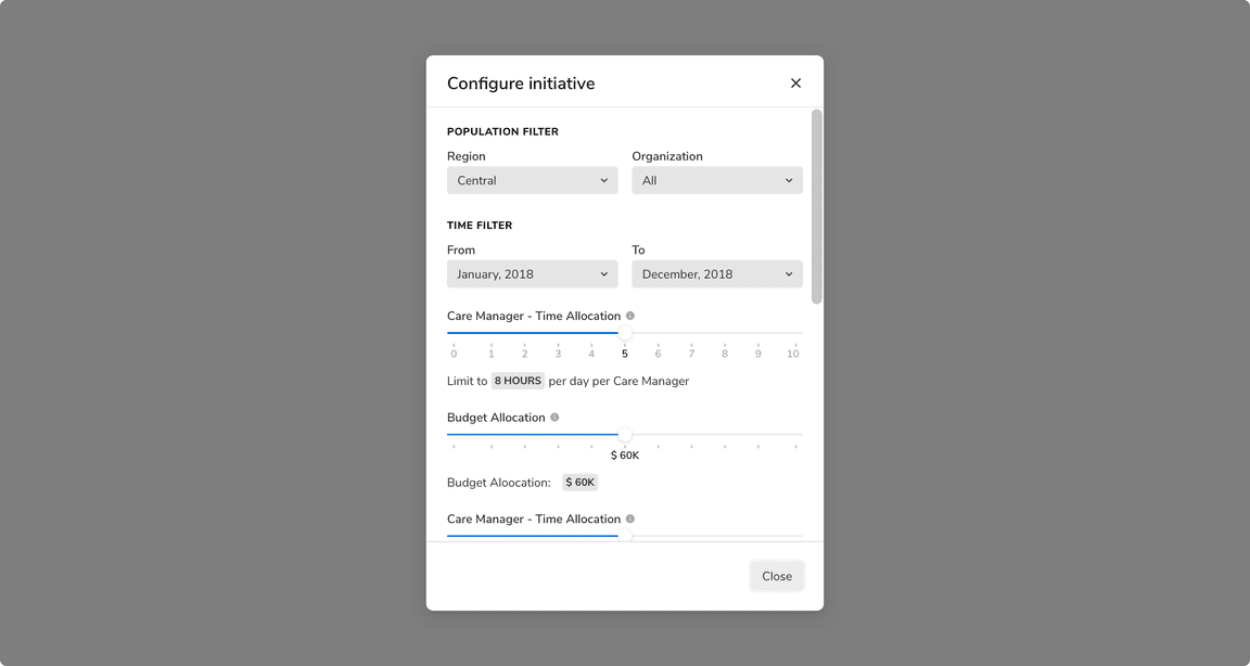
Scrollable Content
You should avoid adding scrollable content in a modal as they are meant to be used to convey concise information, alerts, and confirmations. But there can be cases when scrolling is unavoidable.
Few points to keep in mind then -
Closing the Modal
Clicking outside the modal should not cancel the current process and close the modal by default. However, this behavior is configurable and can be turned on for dialogs only since they just present information and any sort of user interaction is not required there. Pressing ESC key on the keyboard does the same.
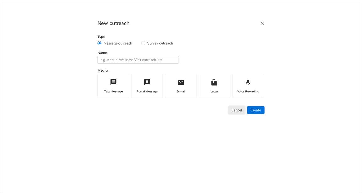
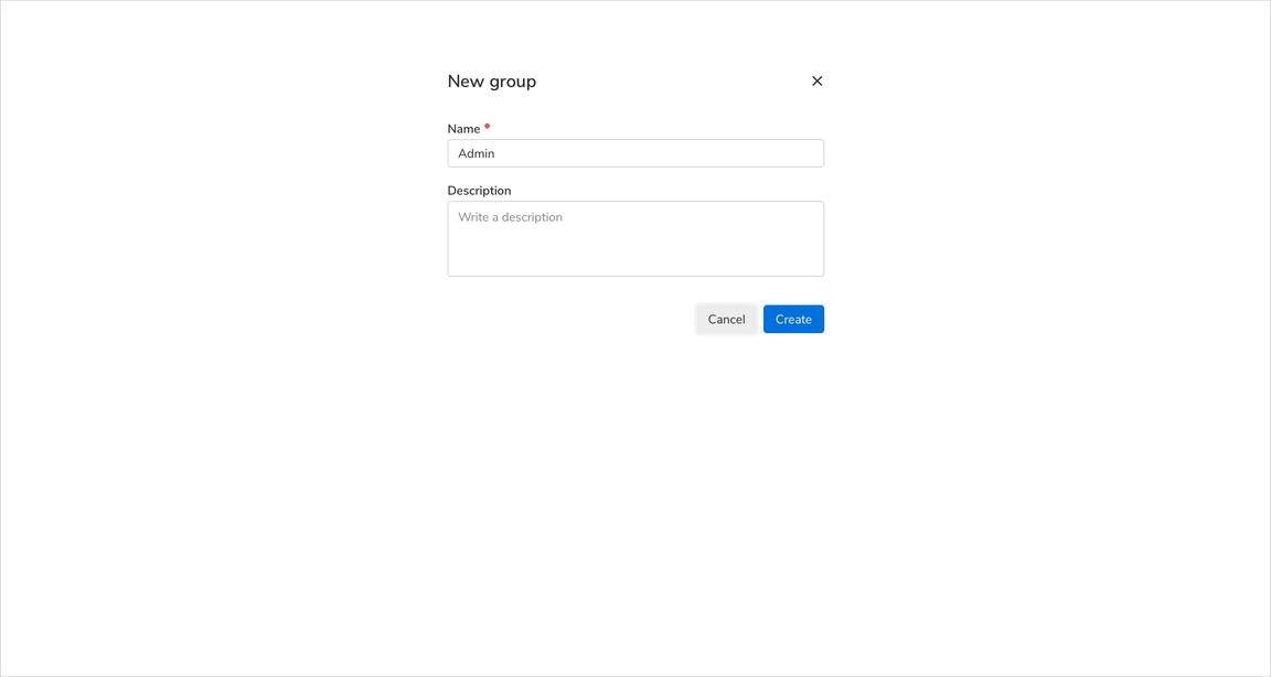
Using Forms
Forms with simple inputs can be used inside a modal. For more complex forms and interactions, side sheets should be considered.
Steppers
Steppers can also be used in a modal as long as the content is concise and short. The rule of thumb is to use side sheets when the content is large and complex.
 Steppers in a modal
Full Screen Modals
Lifetime of a Full Screen Modal
Full screen modal is initialized and displayed when a user clicks on a “Create …” entity button. It is de-initialized and closed as soon as that entity is created. DO NOT use full screen modals for workflows involving multiple steps.
Two Steps Workflow - Back Button
To maintain simplicity, full screen modals are only supposed to have 1 step. But even then, there can be cases when a two steps workflow is required in order to create an entity. In that case, the header of the full screen modal can be updated to include a back button.
Action Buttons
Just like the default modals, the action buttons appear at the bottom right and follows the same order rules.
 Action buttons in a full screen modal
Scrolling Behavior
Unlike default modals, the header and footer are not fixed in the full screen modals. So the content goes beneath the fold like this -
Modal vs Message vs Toast
| Factors | Toast | Message | Modal |
|---|---|---|---|
| Severity | LOW | MEDIUM | CRITICAL |
| Feedback | Feedback or update after an action has taken place | Information or feedback that aids users in completing their action or flow | Critical information that requires user input or interaction |
| When to use | After an action has taken place | Before or after an action has taken place | Before an action has taken place |
| Information detail | Concise | Concise | In-depth |
| Intrusiveness | Unobtrusive | Attention demanding | Disruptive |
| Duration | Persists for 5 seconds (Default), can be customized in case of a critical notification | Persists but can be removed from the view upon resolution of the error. | Persists until user interaction or input is received. |