
Avatar Group
Displays multiple avatars together
Types
Avatar Group
An avatar group displays a group of avatars stacked together to represent entities.
Selection Avatar Group
Selection avatar displays a group of avatars that can be interacted with. It is mainly used for filtering of data.
States
Avatar Group
Avatar group comes in 3 states for upfront avatars i.e default, focus and disabled. It has 2 states for numeric avatars i.e default and focus.
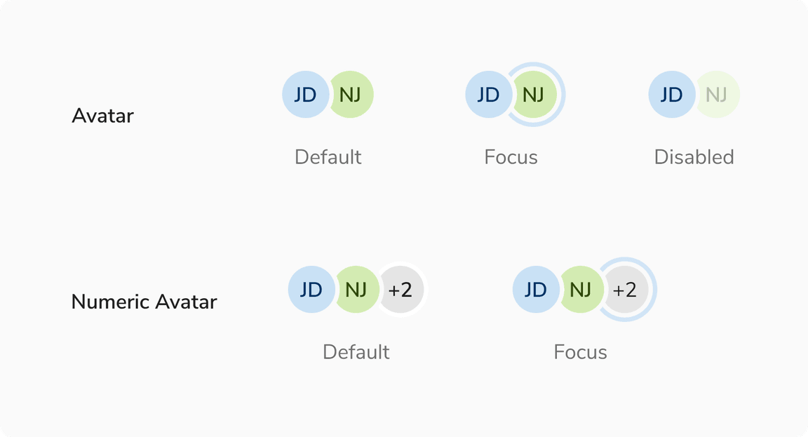 States of Avatars in Avatar Group
Selection Avatar Group
Selection avatar group comes in 5 states - default, hover, active, focus and disabled.
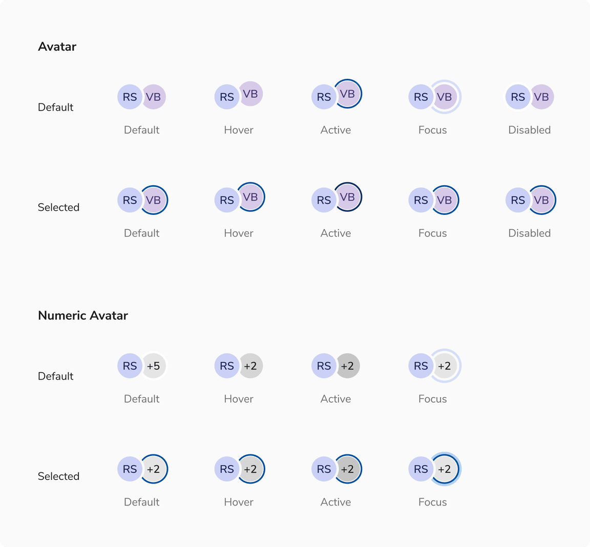 States of Avatars in Selection Avatar Group
Sizes
Both avatar group and selection avatar group come in 2 sizes - small and regular.
![[Left] Regular size vs [Right] Small size of avatars](/static/8494854435f687521fbeddf28ac5f832/3cbba/sizes.png) [Left] Regular size vs [Right] Small size of avatars
[Left] Regular size vs [Right] Small size of avatars
Variants
Both avatar group and selection avatar group share the same variants.
With Initials
![[Left] Avatar group vs [Right] Selection avatar group with initials](/static/2d99766c7dce6ab3224cd29ff04a6265/3cbba/with-initials.png) [Left] Avatar group vs [Right] Selection avatar group with initials
[Left] Avatar group vs [Right] Selection avatar group with initials
With Icon
![[Left] Avatar group vs [Right] Selection avatar group with icon](/static/bfff342af39365fa9926f2c2f1f4fce0/3cbba/with-icon.png) [Left] Avatar group vs [Right] Selection avatar group with icon
[Left] Avatar group vs [Right] Selection avatar group with icon
With Image
![[Left] Avatar group vs [Right] Selection avatar group with image](/static/50e939f88ccc045ad15ab2e6e4516678/3cbba/with-image.png) [Left] Avatar group vs [Right] Selection avatar group with image
[Left] Avatar group vs [Right] Selection avatar group with image
Structure
Option Item (Avatar Group)
| Property | Value(s) |
|---|---|
| List type | Description List |
Option Item (Selection Avatar Group)
| Property | Value(s) |
|---|---|
| List type | Option List |
Configurations
Avatar Group
| Property | Value(s) | Default value |
|---|---|---|
| Size |
| Regular |
| Border color | <color> | Namak |
| Additional users | <count> | - |
Option Item (Avatar Group)
| Property | Value(s) | Default value |
|---|---|---|
| Label | <label> | - |
| Size |
| Compressed |
Selection Avatar Group
| Property | Value(s) | Default value |
|---|---|---|
| Size |
| Regular |
| Border color | <color> | Namak |
| Additional users | <count> | - |
Option Item (Selection Avatar Group)
| Property | Value(s) | Default value |
|---|---|---|
| Label | <label> | - |
| Size |
| Compressed |
Popover (Avatar Group)
| Property | Value(s) | Default value |
|---|---|---|
| Width | <width> | 176px (Customizable) |
| Max height | <max_height> | 256px (Customizable) |
| Min height | <min_height> | - |
Popover (Selection Avatar Group)
| Property | Value(s) | Default value |
|---|---|---|
| Width | <width> | 256px (Customizable) |
| Max height | <max_height> | 256px (Customizable) |
| Min height | <min_height> | - |
Usage
Max Count
Here are the guidelines for the maximum number of avatars permitted to prevent excessive cognitive load.
Avatar Group
Avatar group is limited to three entities. For groups larger than three, only two avatars are displayed. The additional avatars are represented by a numeric avatar with the text +N (where N is the number of remaining avatars beyond two).
![[Left] Three avatars vs [Right] More than three avatars](/static/a9153464d4665ed0bb274ad2d17beb49/3cbba/max-count-3.png) [Left] Three avatars vs [Right] More than three avatars
[Left] Three avatars vs [Right] More than three avatars
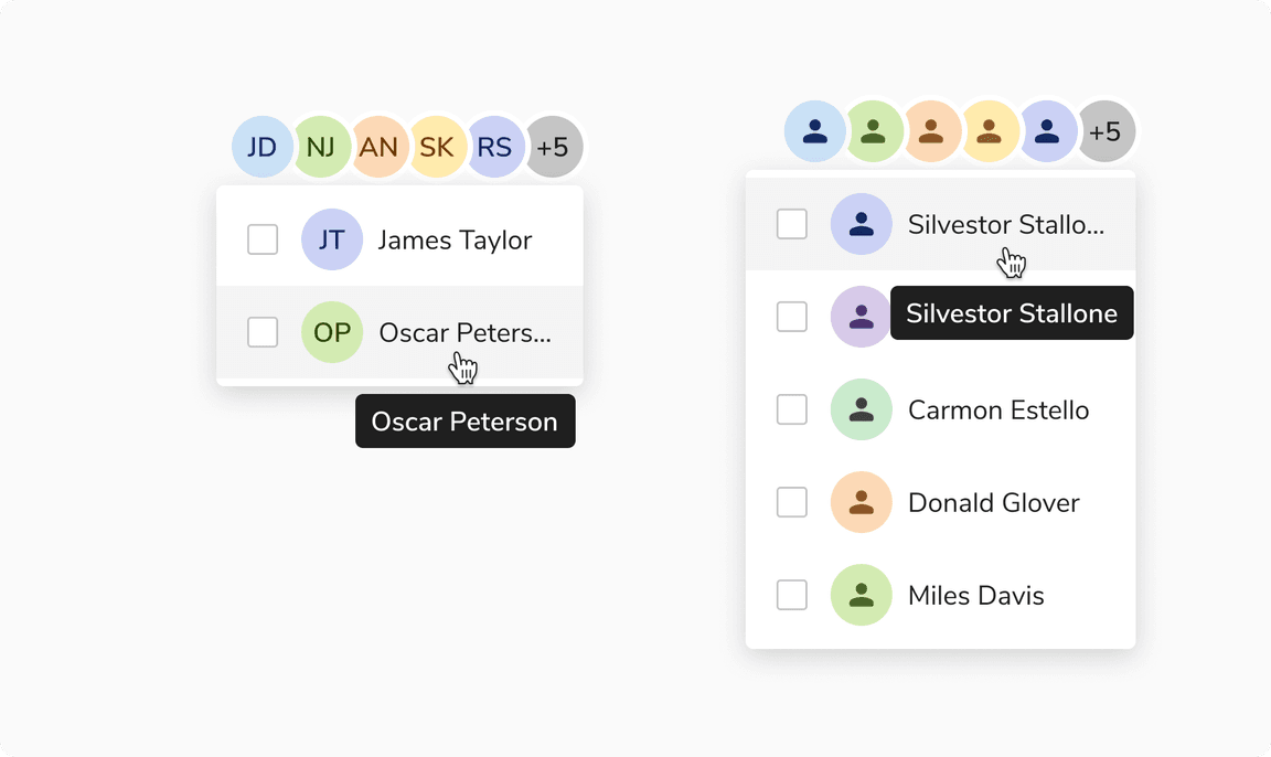
Note: To display the additional entities that are not visible upfront, a popover with the full names of those entities is shown when you hover over the numeric avatar.
 Popover displays hidden entities when hovering
Selection Avatar Group
Selection avatar group is limited to six entities to facilitate data filtering and alleviate cognitive overload. For groups larger than three, only two avatars are displayed. The additional avatars are represented by a numeric avatar with the text +N (where N is the number of remaining avatars beyond two).
![[Left] Six avatars vs [Right] More than six avatars](/static/f65a105658f8d224a6367c39f5e9656c/3cbba/max-count-6.png) [Left] Six avatars vs [Right] More than six avatars
[Left] Six avatars vs [Right] More than six avatars
Note: To view additional entities not visible upfront, click the numeric avatar to display a popover with a checklist of their full names.
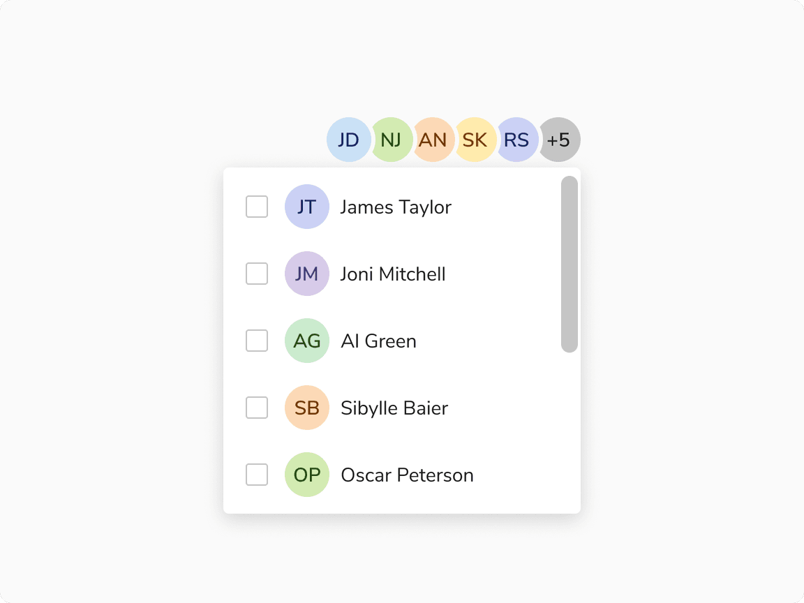 Popover displays hidden entities upon clicking
Square Avatar vs Avatar Group
Square Avatar is useful to represent the group as a single unit. Also works well when space is limited.
Avatar Group is better when individual group members need to be visible upfront.
Selection Avatar Group vs Select
It is recommended to use selection avatar group for fewer entities, and select for a larger number of options.
Width of Popover
While the popover’s width is flexible and can vary, it is advisable to maintain a size that is equal to or larger than the avatar group.
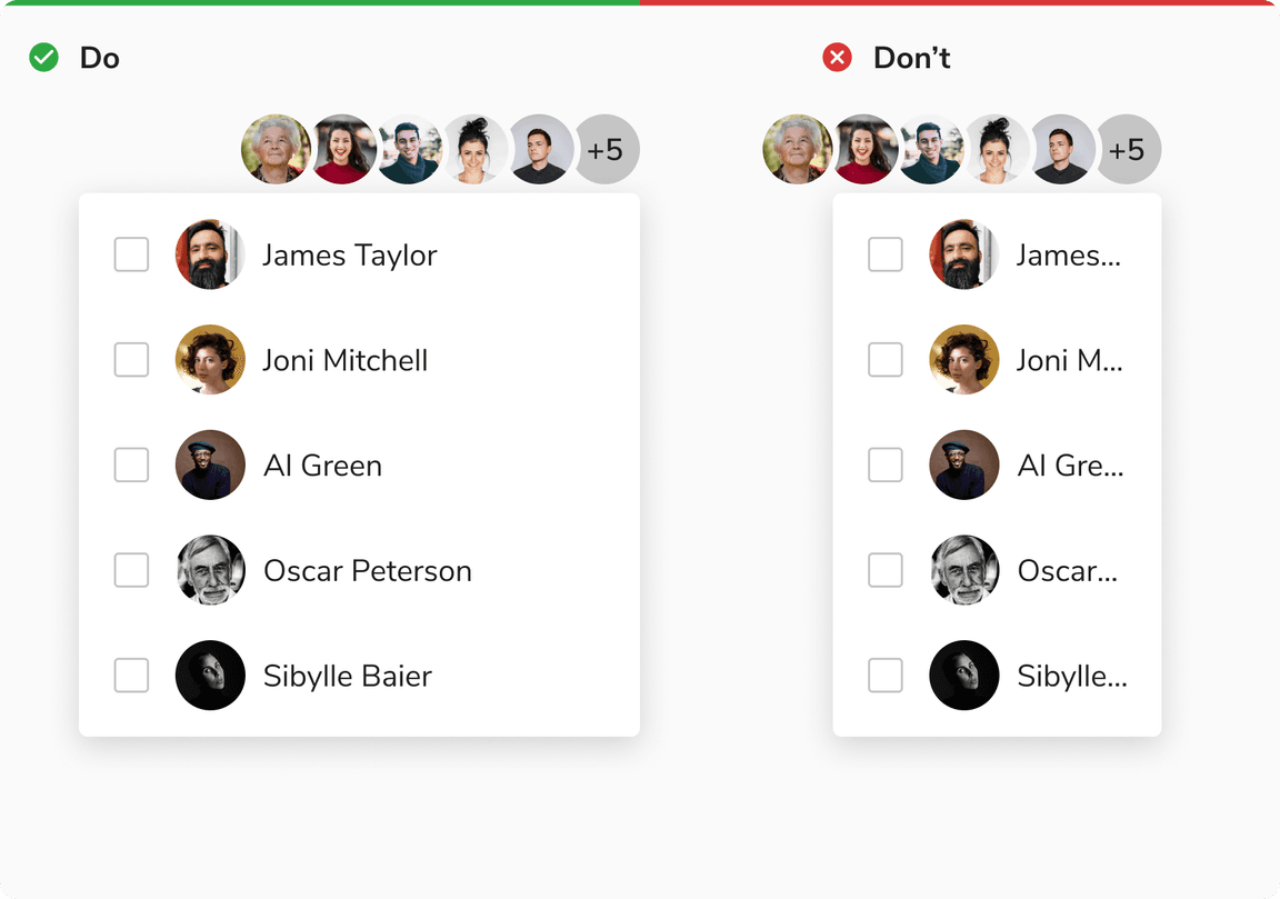 Width of popover
Overflow Behavior of Items
In case of overflow, the items will get truncated and can be viewed inside a tooltip on hover.
 Overflow behavior of items inside popover