
Calendar
Calendar lets users select a date.
Calendar lets users select a date. The dates are arranged in a grid visually for familiarity and easy scanning. A calendar is always visible upfront on screen when used i.e. a date can be selected directly unlike a date picker where a date can be selected only after interacting with a trigger.
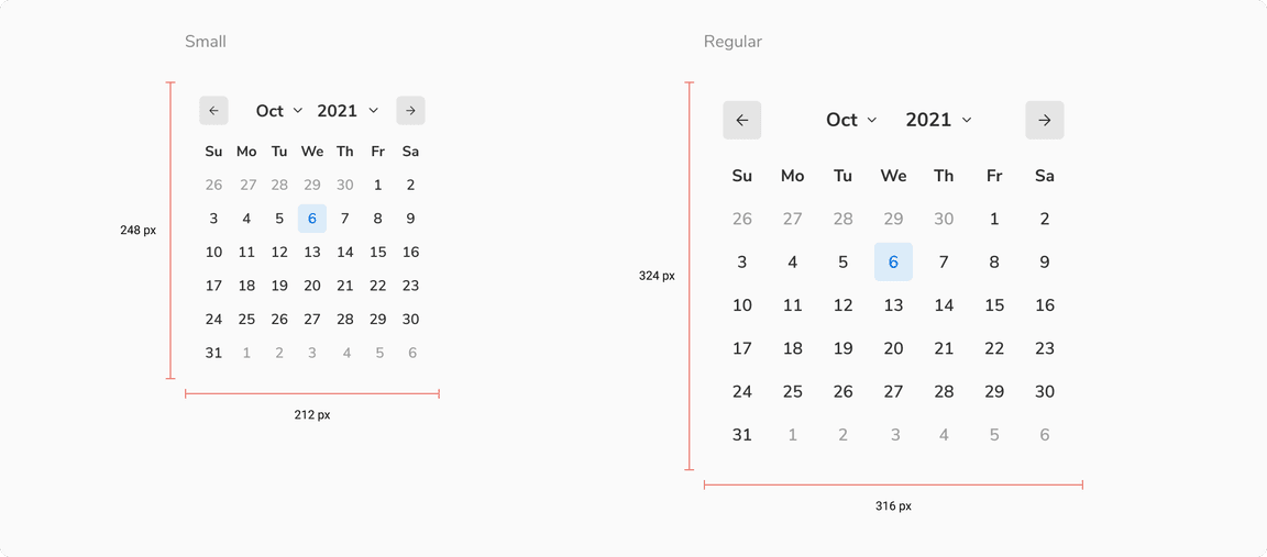
Sizes
Calendar comes in 2 sizes - small and regular.
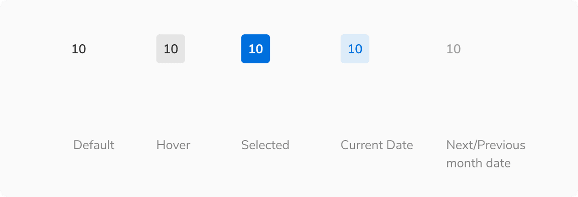
States
A time entity in calendar (date, month, year) can come in different states -
Structure
| Property | Value(s) |
|---|---|
| Size |
|
Configurations
| Property | Value(s) | Default value |
|---|---|---|
| View |
| Month |
| Size |
| Regular |
Usage
Calendar vs. Date Picker
Date picker is nothing but a calendar inside a popover and hence a trigger is always required to open it e.g. an input box. On the other hand, calendar is used as an inline component to show a view without additional triggers.
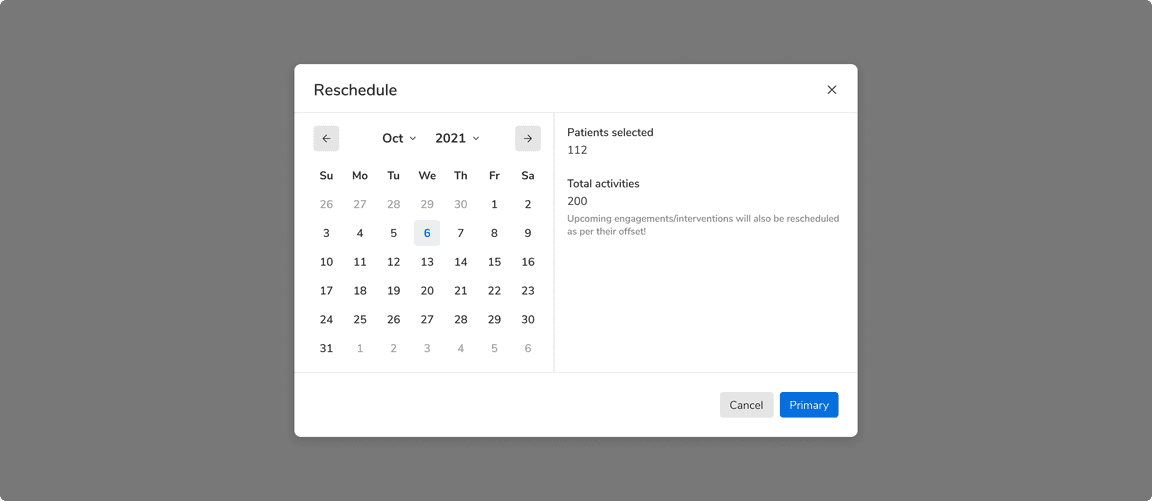 Calendar is used inline
Date With an Event
Specific date can be highlighted to show that there is an event on that particular day.