
Combobox
A combobox displays an input box combined with the option list.
A combobox displays an input box combined with the option list enabling the users to select items from the list or type a new value of their choice.
The users can navigate through the options using the arrow keys and then press ‘Enter/Return’ to select the value.
Note: By default the combobox shows an option list as the input is in focus and filters out the options as the user starts typing.
Sizes
Just like the inputs, combobox also comes in 3 sizes - small, regular and large.
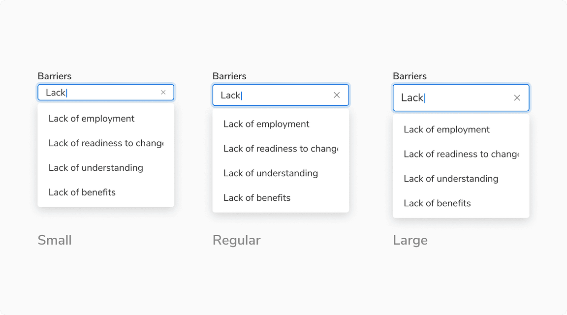 Different sizes of combobox
States
Single and Multiple Input States
The input has following states - default, hover, focus, typing, error and disabled.
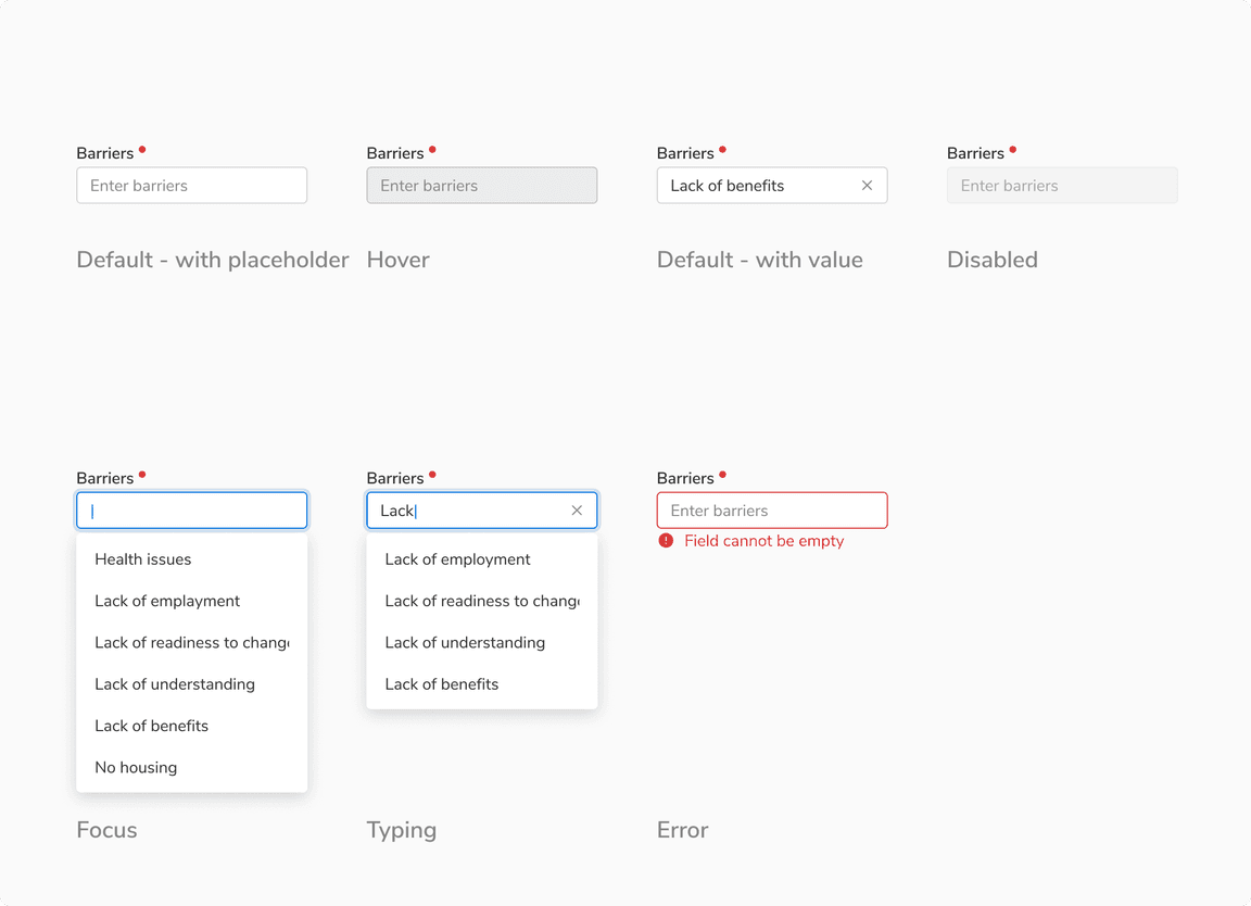 States of input box
Option States
The items in the option list come in following states - default, hover, active and selected. Users can also use the up/down arrow key on their keyboard to traverse the options.
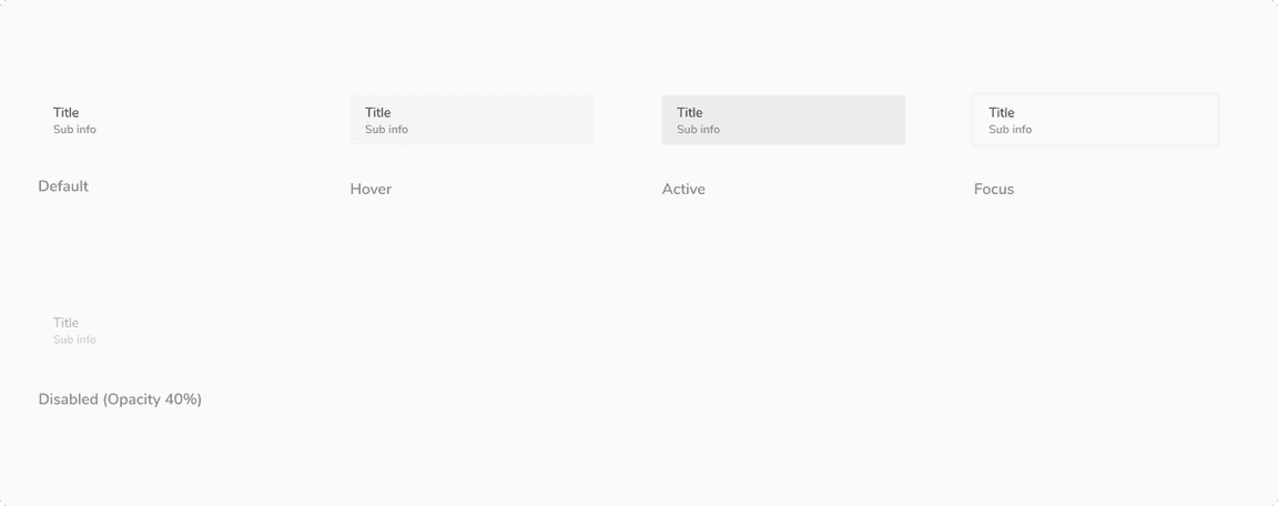 States of option items
Structure
Single Input Trigger
| Property | Value(s) |
|---|---|
| Height |
|
Popover
| Property | Value(s) | Default value |
|---|---|---|
| Appearance |
| Light |
Configurations
Input Trigger
| Property | Value(s) | Default value |
|---|---|---|
| Size |
| Regular |
| Left icon (optional) | <icon name> | - |
| Action icon (optional) | <icon name> | - |
| Help text (optional) | <help text> | - |
Option Items
| Property | Value(s) | Default value |
|---|---|---|
| Icon (optional) | <icon name> | - |
| Sub Info (optional) | <sub info> | - |
Popover
| Property | Value(s) | Default value |
|---|---|---|
| Width | <width> | Width of Input |
| Max Height | <max height> | 256px |
Note: It is recommended to align the width of the popover with the width of the trigger input to maintain a visually pleasing appearance.
Usage
Triggers for Opening the Popover
The popover is by default collapsed when the combobox is in its default state.
The popover can be opened when:
The user clicks on the input.
The user starts typing in the input.
The input is in focus and the user hits down arrow key.
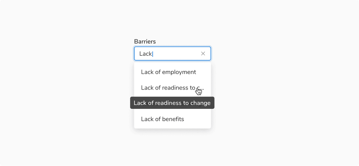
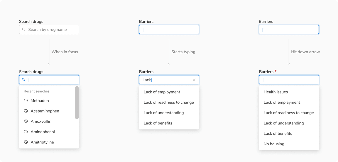 Examples with different triggers
Single Input
Single input combobox allows users to input or select only one value.
Multiple Input
Multiple input combobox allows users to input or select multiple values as chips.
The users can hit ‘Enter/Return’ to add the input value or the focused item as an input chip.
Note: The selected option gets removed form the options list.
Overflow Behavior of Option Item
If the text exceeds the available space, it will be truncated and can be seen in a tooltip upon hovering.
 Overflowed Option Item
Recent/Top Searches
The combobox can be used for cases where there is a need to display either the top or the recent searches.
Note: In such instances, the Combobox may also include an optional section heading to convey the intent or purpose of the presented options.
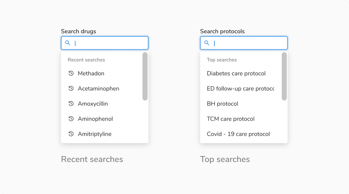 Example for Top and recent searches with an optional section heading
Custom Options
An option in a combobox can be any combination of text, checkbox, icon, badge, etc. Such type of options are referred as custom options.
Note: A combobox can also have options that follow different option templates e.g. few options can just be text while the others can be a combination of text and badge.
 Examples with custom options in combobox
Combobox vs Select
In combobox, apart from the options, users can freely input their values without any obstruction, but with select they are encouraged to exercise caution and be mindful when adding options.
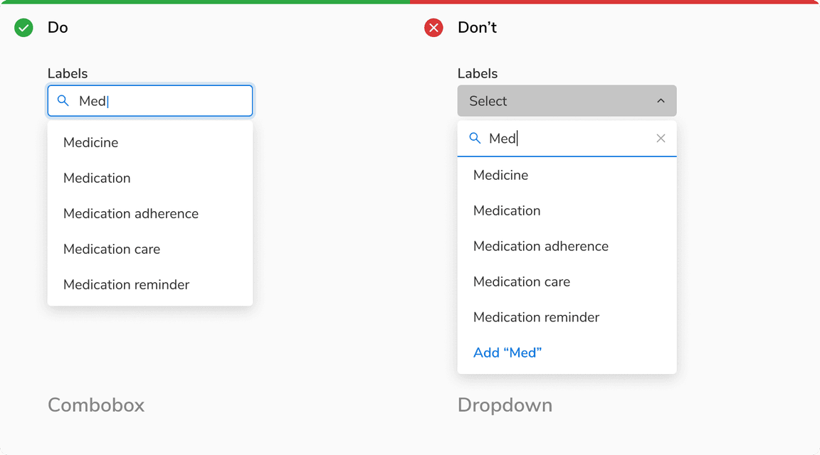 Combobox vs Select