
Dropdowns
Dropdowns offer multiple choices in a compact way.
Dropdowns display a list of options for users to choose from. They provide the option to let users select a single option or multiple.
Types
Dropdowns can be categorized into 2 types basis on their uses -
Standard
This is the typical custom button + popover combination of dropdowns.
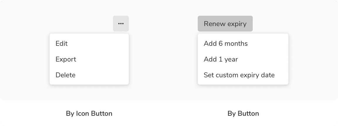
Menu
This is the icon button + popover combination of dropdowns which is used only for menu commands e.g. edit, export, delete, etc. This is not used for selecting options. The menu can open in either direction i.e towards left or towards the right.
Variants
Button Variants
The custom button for dropdowns comes with a few variants -
Standard
The standard variant consists of just text which changes its state when one or more options are selected.
With Icon
This variant comes with an icon in the left preceding the text to provide additional cues regarding the type of the options.
Inline Label
This variant comes with a label preceding the text and can be used at places where there is a space crunch.
Options Variants
The options in a dropdown can be single select or multi-select. They come with a few variants -
Standard
This variant comes with just text.
With Icon
This variant comes with an icon preceding the text.
With Sub Info
This variant comes with sub-info beneath the text.
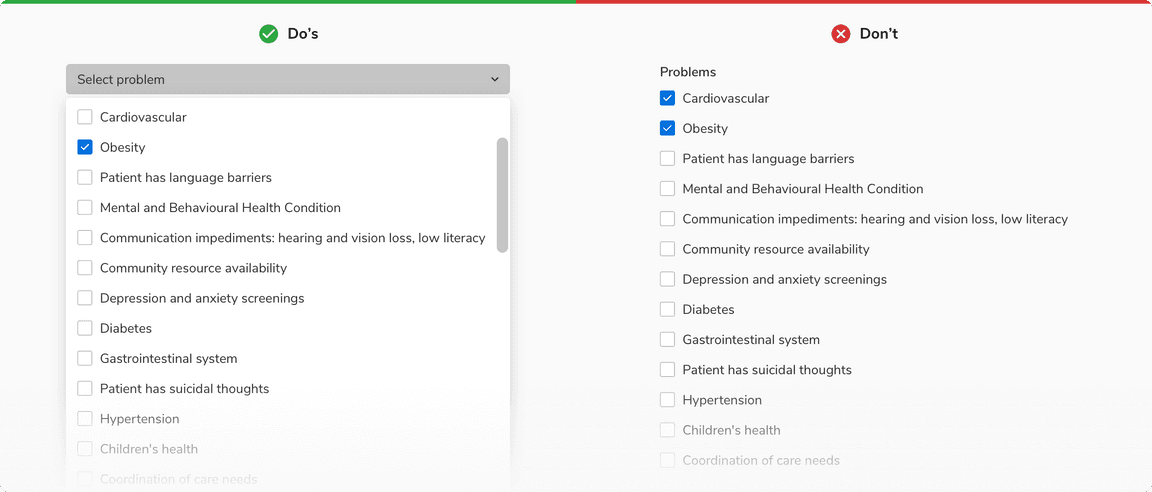
With Checkbox
This variant comes with the support of checkboxes to select single or multiple options. The options here can also have sub info just like the previous variant.
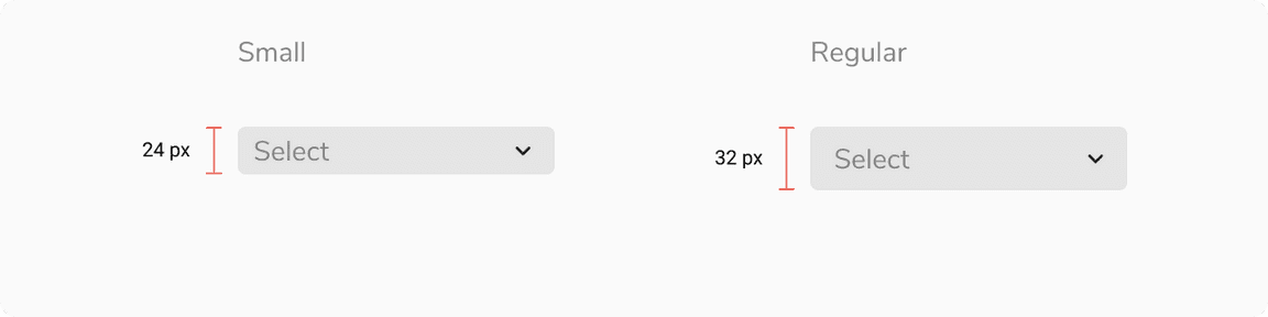
Sizes
Dropdowns come in 2 sizes - small and regular.
States
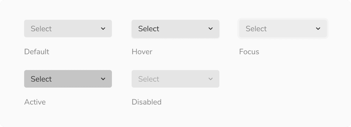
Button States
The custom button comes in 5 states - default, hover, focus, active and disabled.
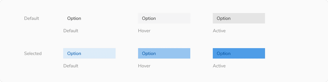
Options States
The options come in 3 states - default, hover and selected. Users can also use the up/down arrow key to traverse the options. In that case, the highlighted option has the same state as hover.
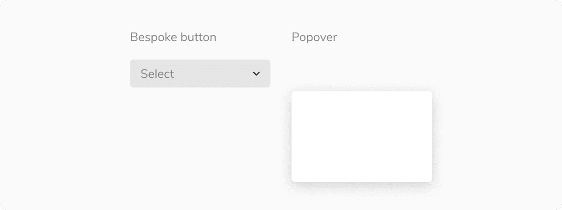
Structure
Dropdown is made up of 2 key components - a custom button which acts as a trigger and a popover which acts as a container for the options.
Trigger (Dropdown Button)
| Property | Value(s) |
|---|---|
| Height |
|
| Corner radius | 4 px |
Options

| Property | Value(s) |
|---|---|
Padding (top, right, bottom, left) | 6 px, 8 px, 6 px, 12 px |
Configurations
Trigger (Dropdown Button)
| Property | Value(s) | Default value |
|---|---|---|
| Size |
| Regular |
Placeholder | <placeholder> | Select |
Icon (optional) | <icon name> | - |
Inline label (optional) | <label> | - |
Options
| Property | Value(s) | Default value |
|---|---|---|
Label | <label> | - |
Icon (optional) | <icon name> | - |
Sub info (optional) | <sub info> | - |
Checkbox (optional) | Checkbox | - |
Usage
Search
Dropdown can be offered with a search functionality. In that case, the search input appears at the top.
Multi Select
The multi-select behavior in a dropdown is divided into 2 categories as following.
For Options Less Than or Equal to a Threshold
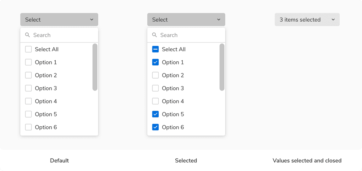 Multi-select behavior of dropdown for options less than or equal to a threshold
For Options More Than the Threshold
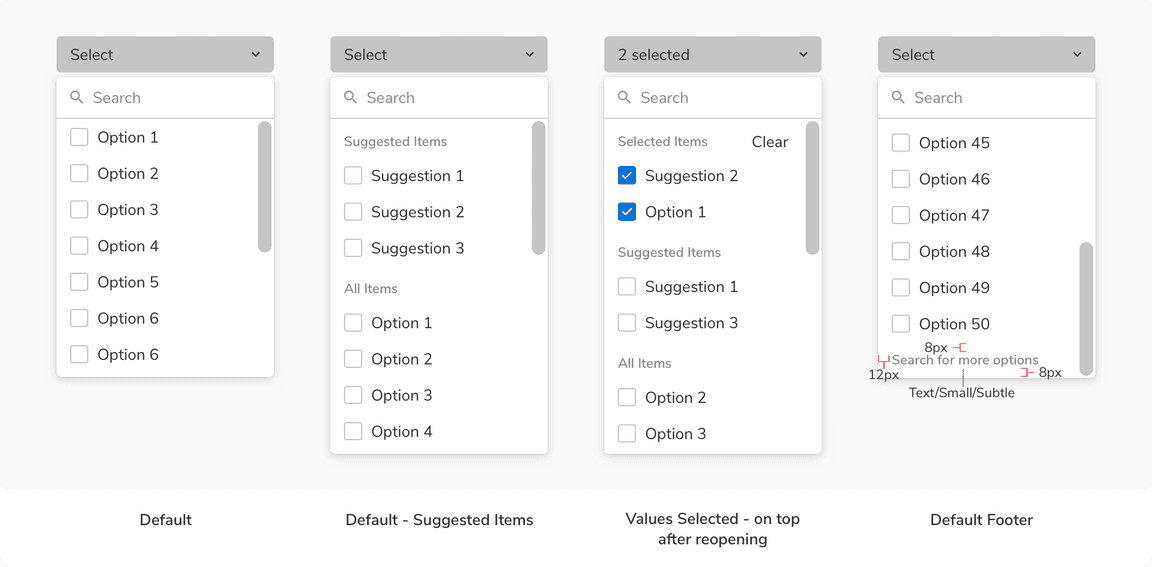 Multi-select behavior of dropdown for options more than the threshold
Note: 50 is the default threshold and it can be changed to any number between 50 to 100.
Grouping Options
Dropdown options can be grouped under a section using a sub header, if needed.
 Grouping options under a sub heading
Label Position
The label provides a better understanding of what kind of selection is expected. Labels can be placed either on the top of the dropdown or can be placed inline with the value or placeholder of the dropdown.
Help Text
Help text can be provided beneath a dropdown to add context regarding the type of input required just like the input fields.
Actions in Footer
Using network resources on each checkbox selection in a dropdown can be quite expensive. To avoid sending api calls at every selection, the dropdown with multi-select comes with an option of having actions in the footer. This helps in sending the api call just once i.e. on click of Add/Apply button.
Custom Trigger
Dropdowns can also be triggered by other components, primarily by buttons and icon buttons. The basic behavior of the dropdown remains the same.
 Custom triggers to open a dropdown
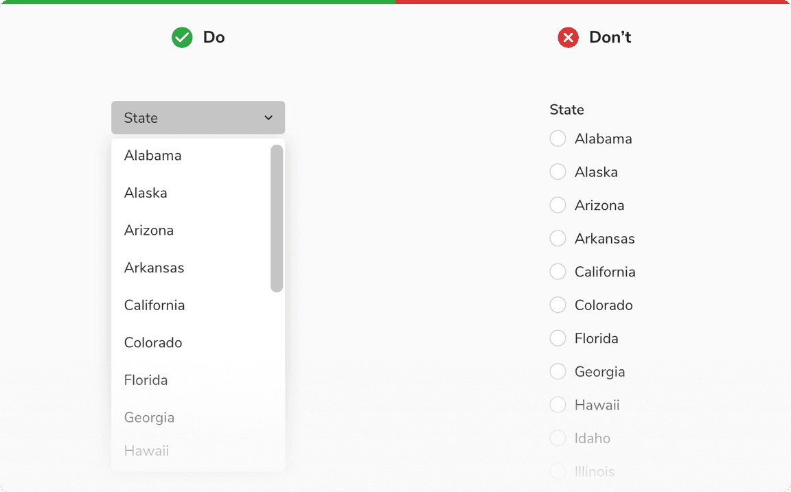
Dropdown vs. Radio
It is recommended to use dropdowns if the number of single-select options exceeds 5 or if the space is limited, to better utilize the space. Radios should be used if the options are fewer than 5 and there are no space restrictions.
Dropdown vs. Checkbox
It is recommended to use dropdowns if the number of multi-select options exceeds 5 or if the space is limited, to better utilize the space. Checkboxes should be used if the options are fewer than 5 and there are no space restrictions.
Error & Empty States
These states are used to inform users about the status of the data that is being loaded in the dropdown. Note: It is recommended to avoid using an image or illustration in these states due to the limited real estate available within the dropdown.
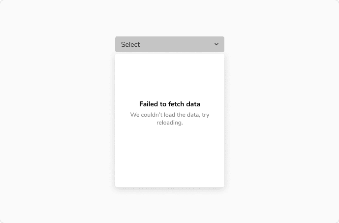 Dropdown having error in loading the options
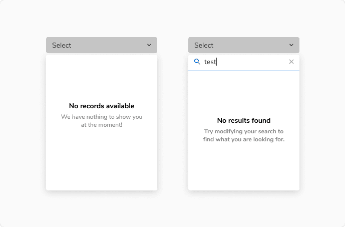 No options vs No results found after search