
Empty state
The empty state indicates the absence of data and helps guide users on expected content and next steps.
Empty state shows that there is no data to display on the page/section. Such states can be utilized to educate users about the kind of content they can expect and the next steps that they can take.
Sizes
Empty states come in 3 different sizes ie. standard, compressed and tight.
Standard
This is the largest size of empty states, making them ideal for use at the page level or within large cards. The illustrations used, can be resized according to the height available.
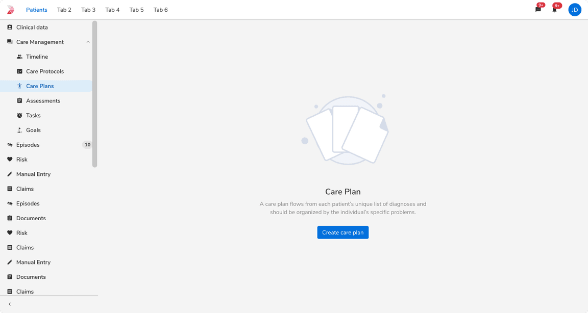 Standard size of empty state
Compressed
This size is suitable for use within medium-sized cards.
 Compressed size of empty state
Tight
This size is best suited for use within compact cards or smaller components such as selects, etc.
Note: If space is constrained, use icons instead of illustrations, or omit illustrations altogether.
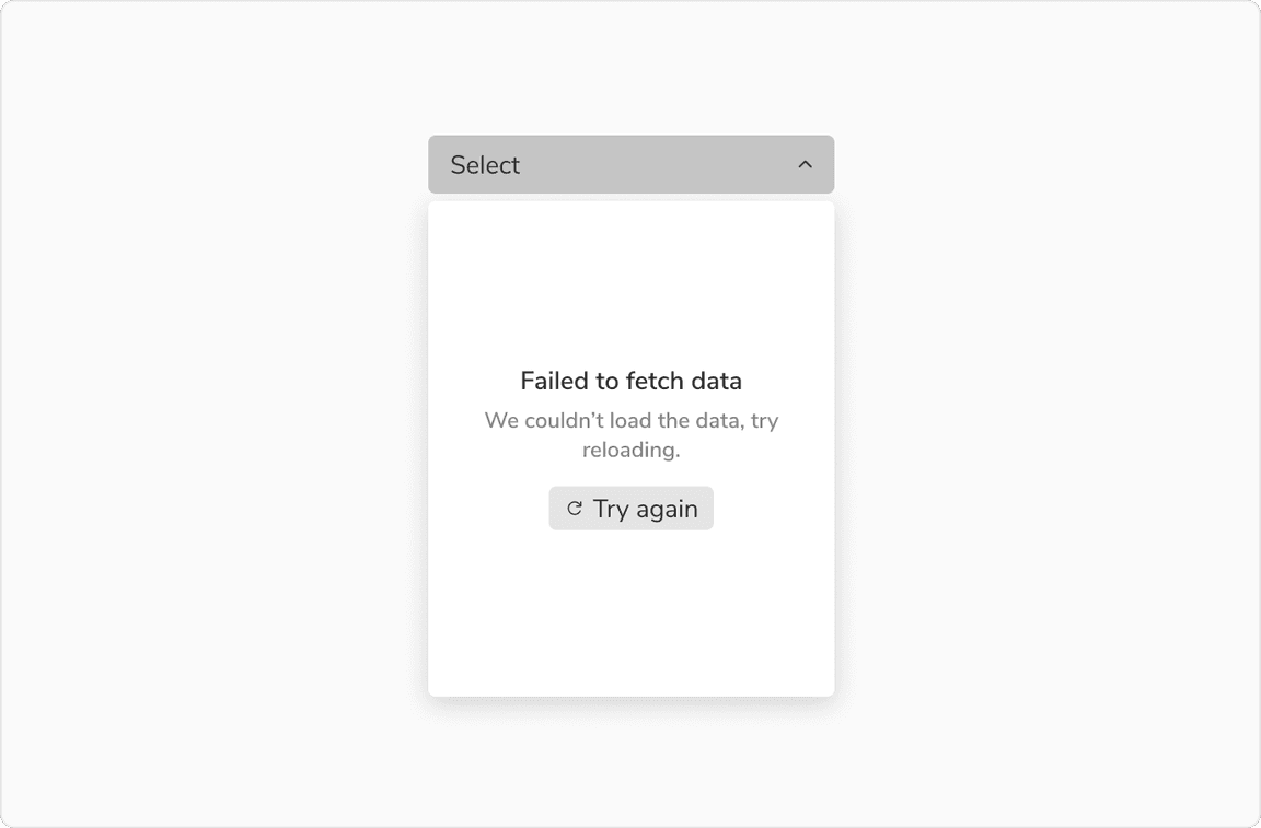 Tight size of empty state
Configurations
| Property | Value(s) | Default value |
|---|---|---|
Illustration (optional) | <illustration> | - |
Title | <title> | - |
Description (optional) | <description> | - |
Actions (optional) |
| Secondary button |
Size |
| Standard |
| Max width of component | <max_width> |
|
| Max height of component | <max_height> |
|
| Maximum no. of actions | 2 | - |
Usage
Illustrations
Illustrations provide valuable visual context for users. Therefore, always ensure that the illustration used is relevant to the context. In limited space, opt for icons or omit illustrations entirely.
Note: Illustrations have a maximum height limit, and they will be resized based on the available space within the container, up to the defined maximum height.
Title and Description
The title should succinctly describe the page’s current state, followed by a description elaborating on the empty state and available user actions.
Note: A title is necessary, regardless of space constraints.
Actions
Ensure that action buttons clearly indicate the available next steps for users, limiting them to two actions at most to prevent confusion.
Guidelines to use each action type:
Note: Be cautious about the number of primary actions displayed on a single page.
Where to Use
Empty states can arise due to various factors, each requiring distinct approaches. These include:
1. No Data State: Occurs, for instance, during first-time use.
2. User Action Based State: Such as when there are no filter or search results.
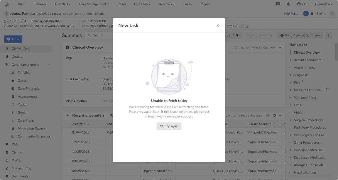
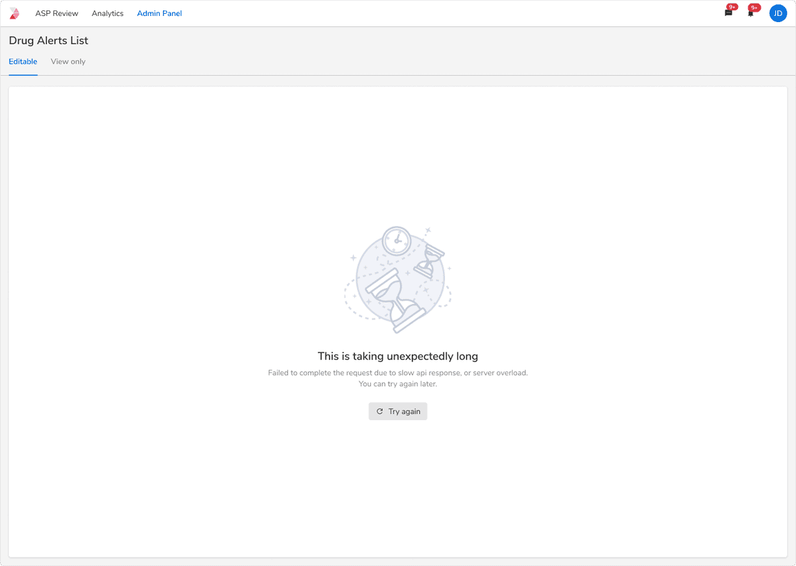
3. Error States: Arising from system issues, permission issues, server maintenance, etc.
Note: Please refer these comprehensive guidelines for addressing different empty states.
Using Empty States in Larger Spaces
For page-wide spaces or large containers, it’s best to utilize large-sized empty states. Ensure that the contents of the empty state are center-aligned, and let the space size determine the image size as well.
 Empty state usage in large cards
Using Empty States in Smaller Spaces
In spaces smaller than others, opting for a standard-sized empty state might clutter the UI unnecessarily. Instead, consider using a compressed or tight-sized empty state. Let the space size dictate the illustration size, and if space is limited, opt for text only.
 Empty state usage in small cards
Multiple Smaller Spaces
In situations such as dashboards with multiple smaller cards, employing repetitive illustrations may clutter the UI. Thus, it’s more suitable to use an empty state with only text and an action. In these instances, consider using a secondary button rather than the primary call-to-action button.