Key Value Pair
Key value pairs consist of properties (keys) each paired with their respective values.
Key-value pairs help present a pair of data in a structured way. They are useful for displaying data in an organized manner, making it easier to understand and process information on the screen.
Key
A key acts as an identifier of the value. It should be short and easy to understand.
Variants
Following can be the variants of key:
- Icon
- Text
- Icon and text
![[1] Textual Key, [2] Textual key with icon on left, [3] Textual key with icon on right, [4] Icon as key](/static/7178c15876c43d91919902072859bdf7/3cbba/1-Variants-Key.png) [1] Textual Key, [2] Textual key with icon on left, [3] Textual key with icon on right, [4] Icon as key
[1] Textual Key, [2] Textual key with icon on left, [3] Textual key with icon on right, [4] Icon as key
Value
A value represents the actual content corresponding to the key. Values can be more varied in type and length than keys.
Variants
Here are the common variants:
- Text
- Icon and text
- Avatar and text
- Status
- Link
- Array of items
- Custom
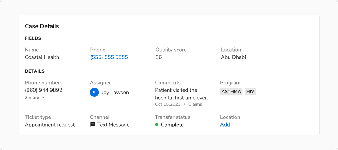 Various variants of value
Arrangement
Key-value pairs can be arranged in two ways: Top-Bottom and Left-Right.
Top-Bottom
In a Top-Bottom arrangement, the key is positioned above the value, creating a strong visual connection between the two. This layout is suitable for narrow containers or vertical layouts, providing ample space for both keys and values.
- Length of Key: If the keys are long, a top-bottom arrangement can accommodate longer keys in a single line without truncation.
- Length of Value: When values are lengthy or require more space, a vertical layout handles this well without disrupting the flow.
- Scannability: Users tend to scan content from top to bottom, especially in narrower containers. A top-bottom arrangement aligns with this natural scanning pattern, making it easier for users to quickly locate the information they need.
 Top bottom arrangement of key value pairs
Left-Right
In a Left-Right key-value pair arrangement, the key is positioned on the left, while the corresponding value is placed on the right. This layout is typically suitable for wider containers or horizontal layouts, maximizing the utilization of horizontal space and minimizing the need for vertical scrolling.
- Comparison of Similar Items: This arrangement facilitates quick scanning across rows, allowing for easy comparison of similar pieces of information.
- Variation in Values: It preserves visual hierarchy, especially when there is significant variation in the lengths of the values.
- Emphasis on Values: If the values hold more importance than the keys, a left-right arrangement can draw attention to the values by positioning them prominently on the right side of the keys.
- Compact Design: The layout conserves vertical space, making it suitable for interfaces where space is limited and extensive information needs to be displayed without excessive scrolling.
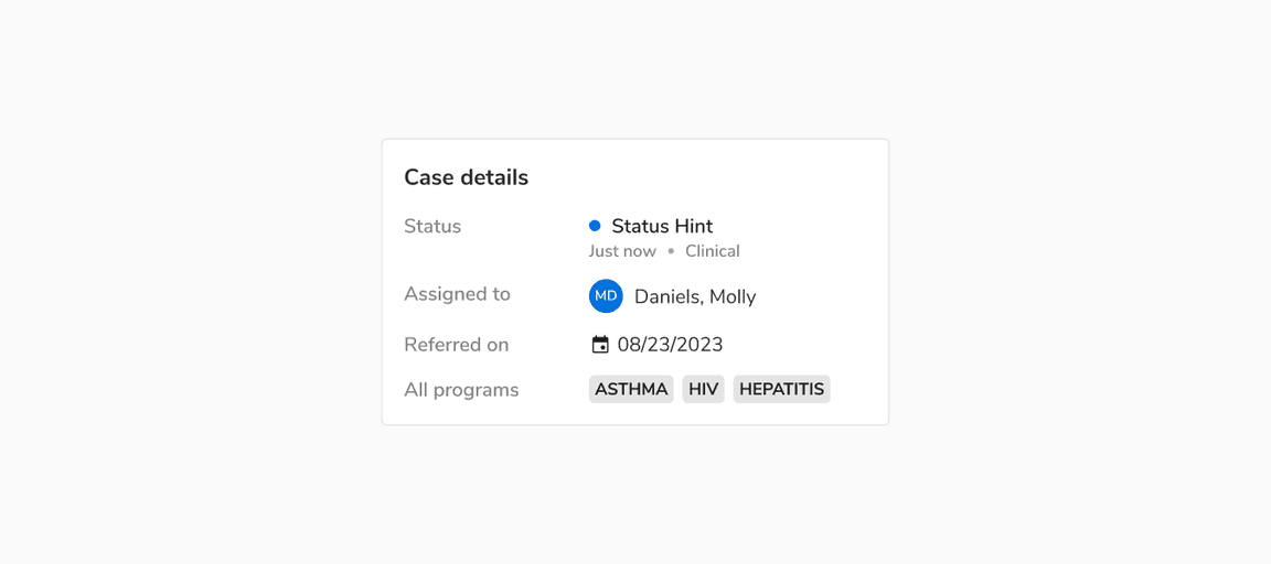 Left right arrangement of key value pairs
Structure
Key
| Property | Value(s) |
|---|---|
| Text | Night Lighter (#707070) |
| Icon | Night Lighter (#707070) |
Value
| Property | Value(s) |
|---|---|
| Text | Night (#1F1F1F) |
Usage
Top-Bottom vs Left-Right Arrangement
Choosing between a left-right and a top-bottom arrangement often depends on the context, user preferences, and the amount of information to be presented. Here are some points to consider while doing so:
| Top-Bottom | Left-Right |
|---|---|
| Suitable for narrow containers | Suitable for wider containers |
| Strong visual connection between key and value | Key and value may seem unrelated at times. |
| Easier to focus on individual pairs | Easier to compare multiple items |
| Best for longer keys and values | Best for shorter keys and values |
| Not suitable for multiple variation of values. | Best for multiple variation of values |
Width Guidelines and Overflow Behavior
Top-Bottom Arrangement
Both the key and the values can share the same width. Keep the key short to prevent it from spanning multiple lines and disrupting the layout. The value can wrap to the next line to ensure all information is visible.
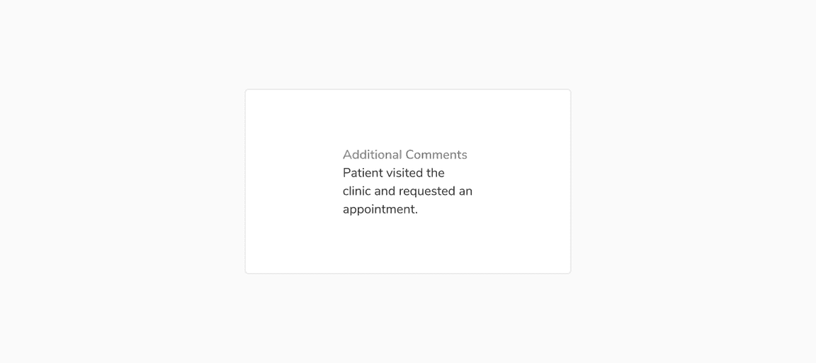 Key and value has same width
Left-Right Arrangement
The key should occupy about 40% of the available width, with the remaining 60% allocated to the value.
For wide containers, if 40% makes the keys too wide, adjust the width to suit the use case, and allocate the remaining width to the values.
If only one or two keys are too wide, adjust the width of the key column to suit the remaining keys and wrap the wider keys to the next line.
Note: Both the key and the values can span multiple lines if needed.
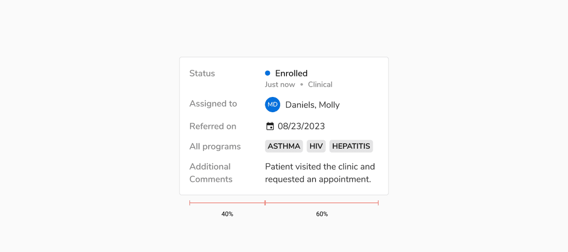 Key occupying 40% of the space, including padding, and value occupying 60%.
Arranging Key Value Pairs Based on Container Sizes
Below are guidelines for utilizing various key-value pair arrangements based on the available container size.
Note: These are our recommendations; feel free to adjust the layouts as needed.
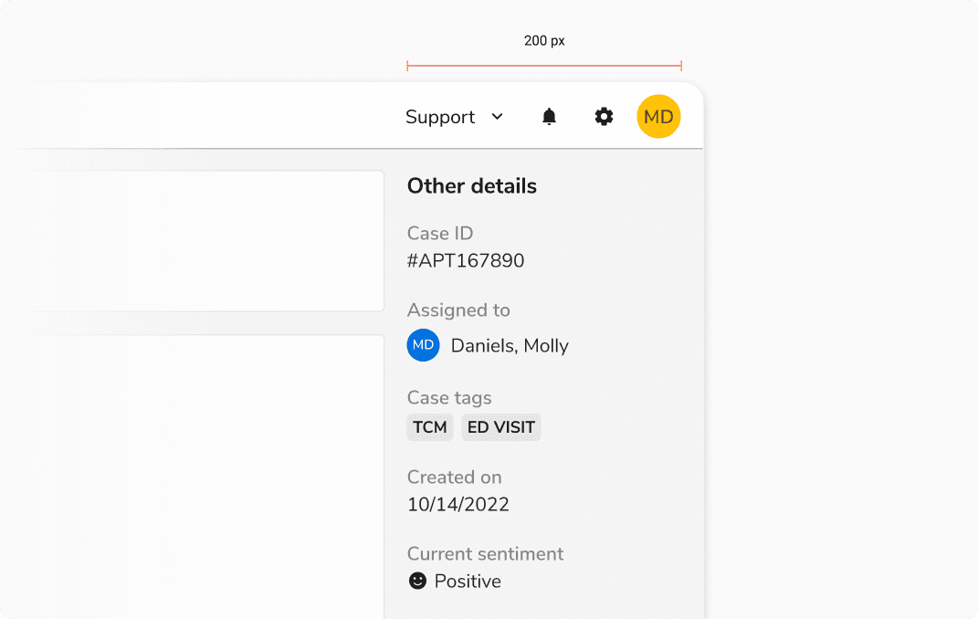
Small Containers
For containers around 200px, opt for Top-Bottom key-value pairs to maintain most content within a single line.
 Top bottom alignment in small containers
Medium Containers
For widths around 400px, Left-Right key-value pairs are advisable, as keys and values can now have ample space.
 Left right alignment in medium containers
Large Containers
Widths exceeding 400px allow for the utilization of single or multiple column layouts.
Single column layouts
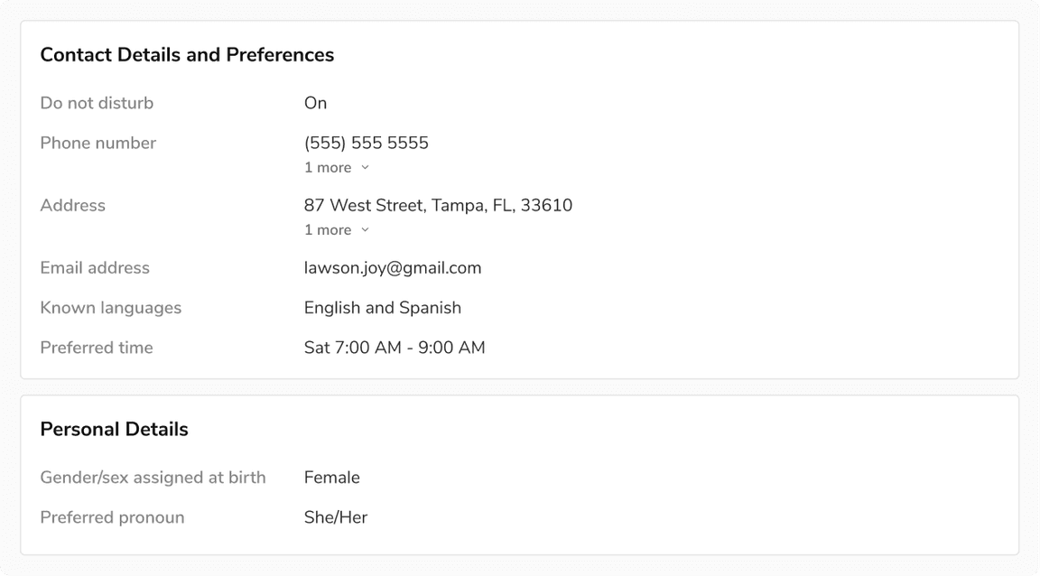
When dealing with complex values or array of multiple values where scanning is a priority, opt for Left-Right key-value pairs.
Note: Avoid the use of multiple columns for key-value pairs in this context.
 Left right alignment in a single column layout
Multiple column layouts
For simple and mostly similar values, the top-bottom arrangement is ideal as it occupies minimal space.
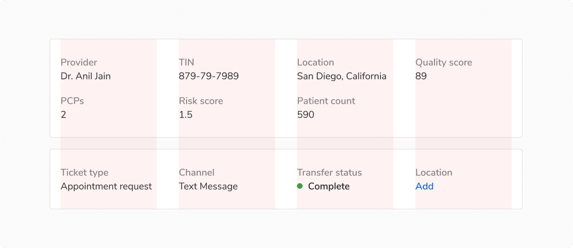
In such layouts, key-value pairs can align to either fixed or variable width columns.
Note: In a row, the keys should always be top aligned.
1. Column with fixed width
This approach is most effective when displaying multiple rows, either within the same container or across multiple vertically stacked containers.
 Key value pairs aligned to fixed width columns
2. Column with variable width
This approach is most efficient when you only need to display a single row, as it occupies the least horizontal space.
 Key value pairs aligned to variable width columns
Spacing Guidelines
Ensure adequate spacing between entities to maintain readability and avoid a cluttered UI.
Top-Bottom Arrangement
Minimum Padding
![Recommended minimum padding between key and [left] textual value vs [right] complex value](/static/93ae14f5370fbee76915099744ea05e4/3cbba/12-Minimum-padding-Top-Bottom.png) Recommended minimum padding between key and [left] textual value vs [right] complex value
Recommended minimum padding between key and [left] textual value vs [right] complex value
Minimum Margin
 Recommended minimum horizontal and vertical margin between two key-value pairs
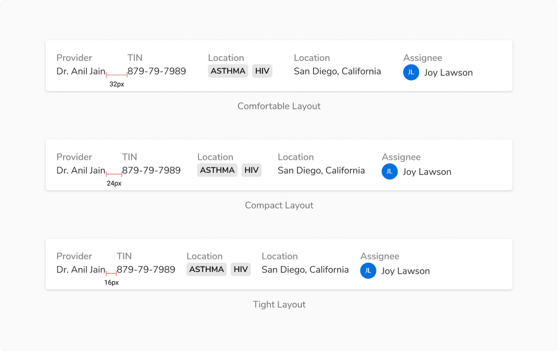
Other Layouts
Here are some recommended layouts to make sure users can scan the information easily. Feel free to go beyond these suggestions to best suit your use case.
 Other recommended layouts for top-bottom arrangement
Left-Right Arrangement
Minimum Padding
 Recommended minimum padding between key and value
Minimum Margin
 Recommended minimum vertical margin between two key-value pairs
