
Meter
A meter is a visual tool for quickly interpreting scores or quantities.
A meter is a visual tool for displaying scores or quantities, enabling quick and easy interpretation of data. It can also represent value ranges with associated semantic meaning.
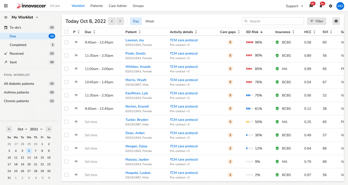 Table using meter component to show risk scores
Size
Meter Component
Meter component has three sizes: small, regular and large
 Meter representing neutral value
Small
The small size is ideal for situations with limited space or when the component appears frequently on the screen.
Regular
The regular size is versatile, it works well for a single component on the page or when the component is used repeatedly.
Large
The large size is perfect for making the element stand out compared to other elements on the page.
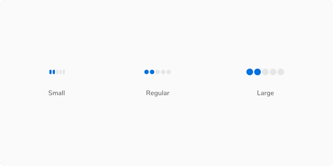
Value Label
The Value Label is available in three sizes: small, regular, and large.
Note: The Value Label can override the size of the meter component if needed. For instance, a small meter component can display a regular or large Value Label.
 Meter representing neutral value
Appearances
Meter can represent semantic values by changing appearances as the value changes, from positive to average, and then to negative.
Info (Default)
The default appearance of meter represents neutral and non-semantic values.
 Meter representing neutral value
Warning
This appearance of meter represents an average or medium value.
 Meter representing average value
Alert
This appearance of meter represents a negative semantic value.
 Meter representing negative value
Success
This appearance of meter represents a positive semantic value.
 Meter representing success value
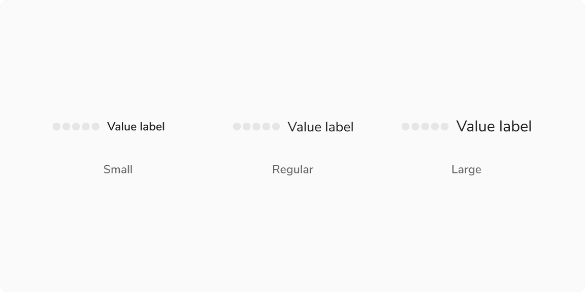
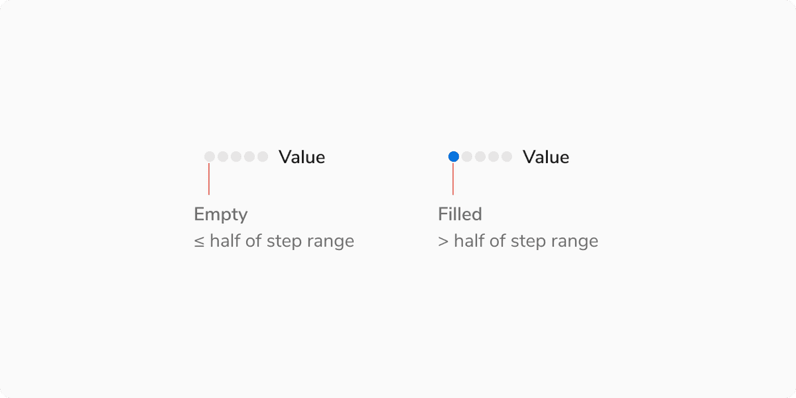
States
Each step in meter component have 2 steps: Empty and Filled
 Empty vs Filled Step
Structure
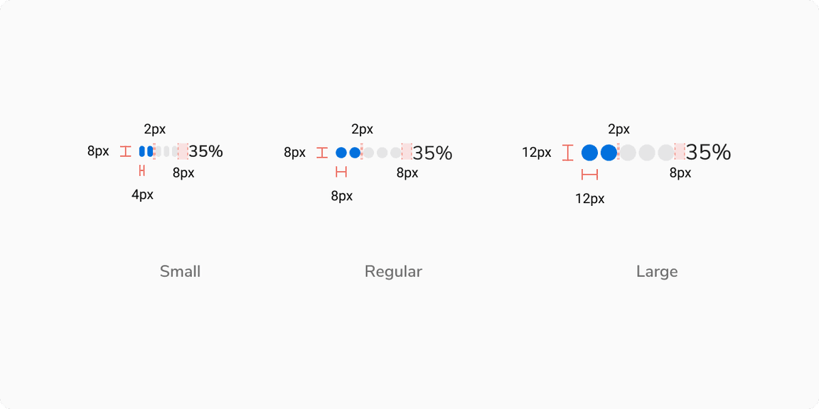 Structure of Meter Component
| Property | Value(s) |
|---|---|
| Size of steps |
|
| Padding between steps | 2px |
| Padding between last step and value label | 8px |
| Background color - Empty step | Stone Light |
Configurations
Steps
| Property | Value(s) | Default value |
|---|---|---|
| Number of steps | <Number of steps> | 5 |
| Minimum no. of steps | 3 | - |
| Background color - Filled step |
| Info |
Value Label (Optional)
| Property | Value(s) | Default value |
|---|---|---|
| Value Label | <value_label> | - |
| Size |
| Regular |
Usage
Logic for Filling a Step
Each step covers a specific range of values. If the value is less than or equal to the half of the range, the step remains empty; it fills once the value exceeds the range.
For example, in the case below, the score is out of 100 with 5 steps, each covering 20 points. If the score is 15, step 1 will be filled.
 Logic for filling a step
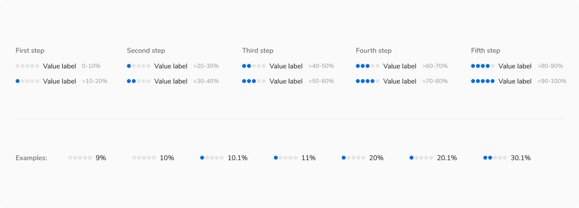 Logic for filling a step
Value Label
Meters can display a detailed value label on the right side, showing simple numerical data like “9” or “50%,” as well as ranges to help users interpret metrics such as “40 out of 100” or “30/100.”
Note: The Value Label by default shows the percentage value provided to the component and can be customized as needed.
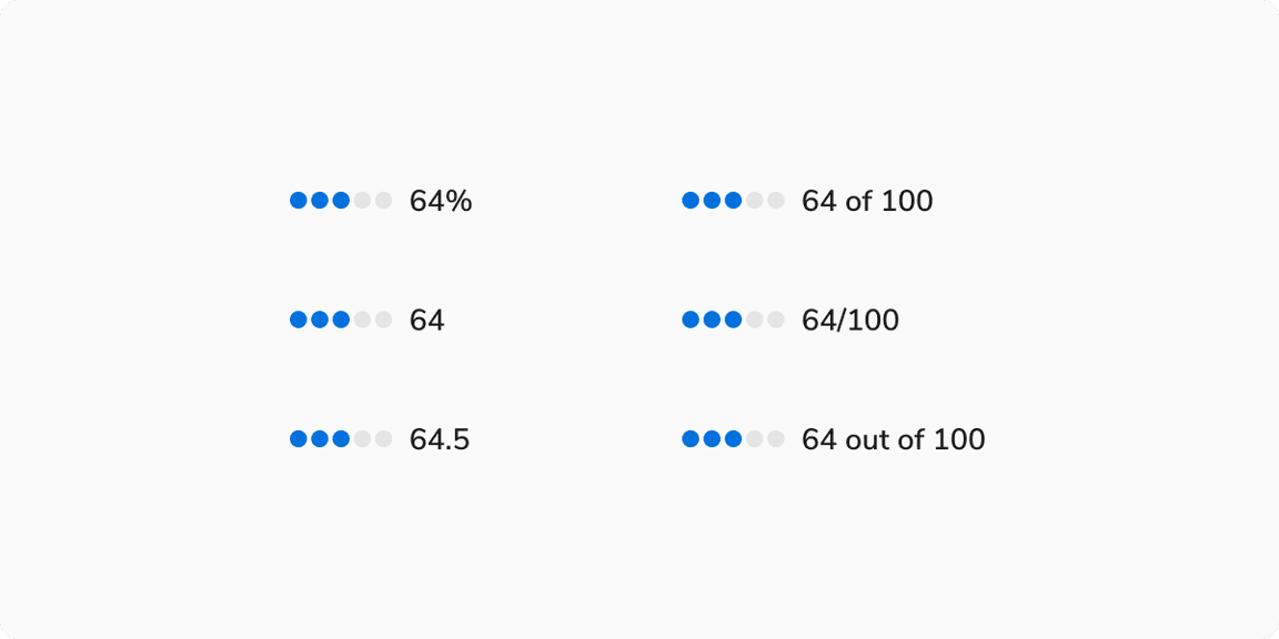 Various formats for displaying values on the right.
Number of Steps in Meter
The Meter component comes with 5 default steps, but the number of steps can be customized based on the use case.
Note: However, ensure the steps are not set to fewer than 3 to avoid any kind of confusion.
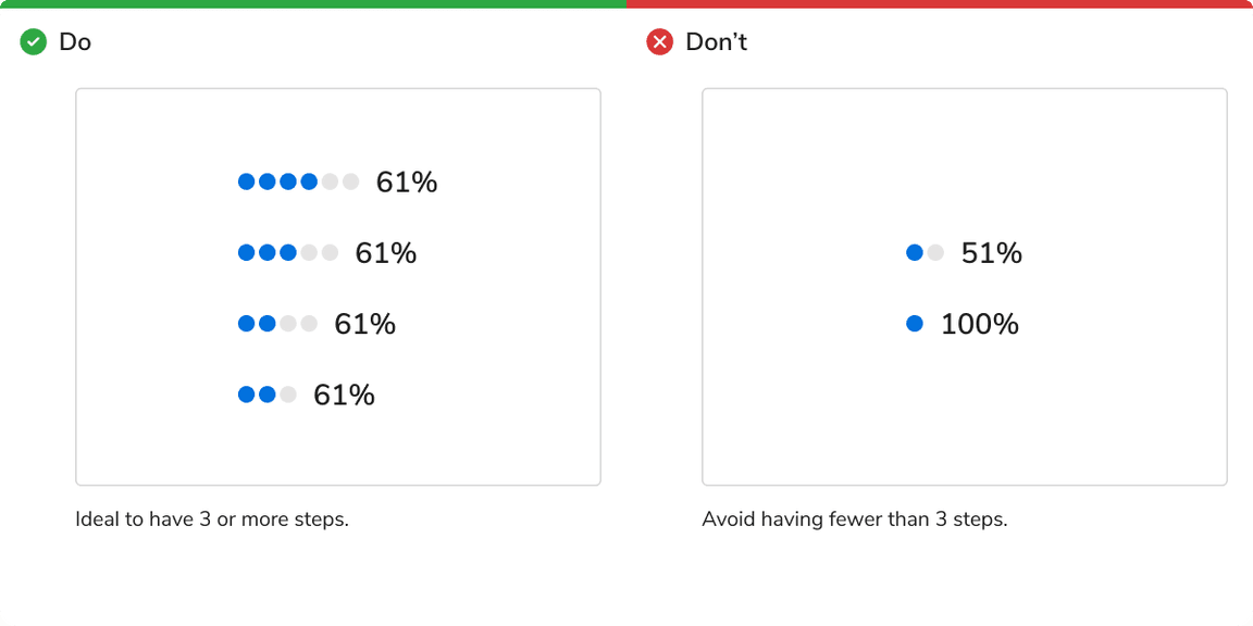 Number of steps should not be less than 3.
Multi-Sentiment Support
The Meter component supports multiple sentiments in a single instance using appearances.
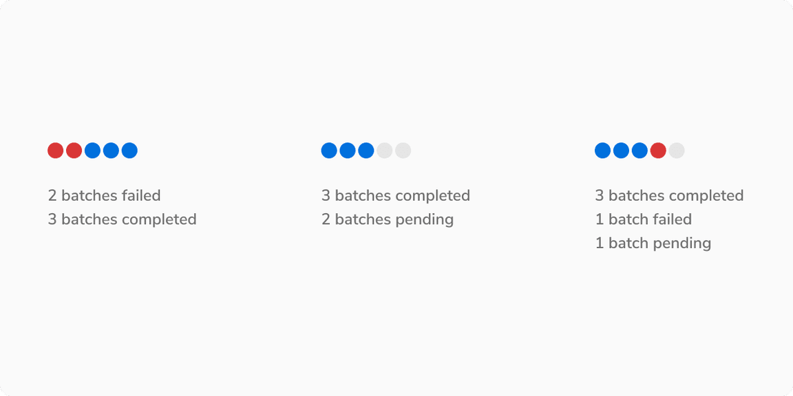 Multi-Sentiment Support