
Navigation - Vertical
Vertical navigation helps the users to quickly move among different pages in a module.
Vertical navigation helps the users to quickly move among different pages in a module just like the horizontal navigation. The key difference here is that the navigation items are laid out vertically and hence there is virtually no limit on the number of navigation items to be displayed.
Types
Flat
Rounded
Rounded variant comes handy when the navigation is not at the extreme left. Hence the left part of the selected navigation item is rounded and not flat.
Structure

| Property | Value(s) |
|---|---|
| Height | 36 px |
| Width | 256 px |
| Corner radius (Top right, bottom right) | 16 px |
| Spacing between nav items | 0px |
| Icon size | 16x16 px |
Configurations
| Property | Value(s) | Default value |
|---|---|---|
| Panel collapse/expand action icon | keyboard_arrow_left/ keyboard_arrow_right icon | - |
| Section (optional) | <section title> | - |
| Icon (optional) | <icon name> | - |
| Count (in parent)* (optional) | <count> | - |
| Count (in child) (optional) | <count> | - |
Note: Count in parent item is supported only when it does not have children.
Usage
Overflow Behavior
In case of overflow, the label of the nav items will get truncated and can be viewed inside a tooltip on hover.
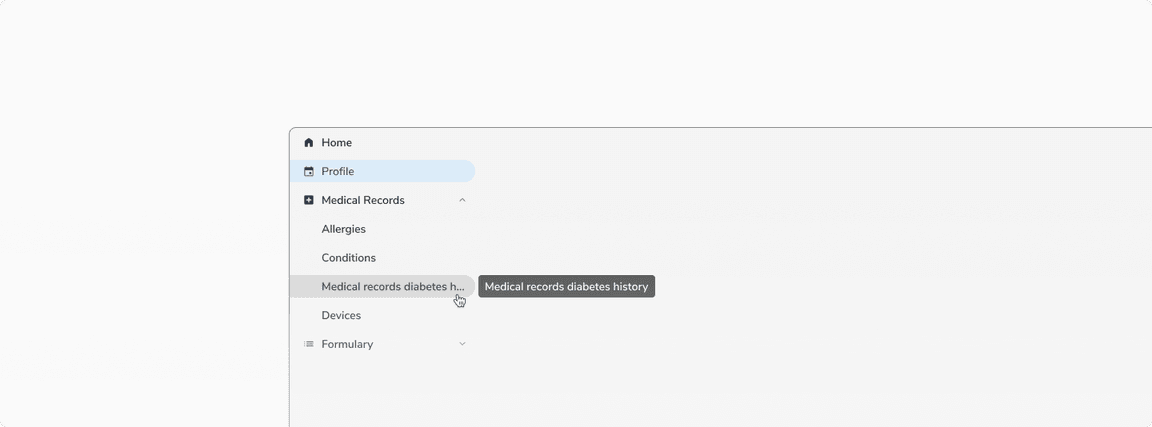 Overflow behavior of nav item label
Maximum Levels
To reduce the unnecessary visual clutter, a maximum of two levels are supported in the vertical navigation. If more than two levels are needed, one can use tabs, horizontal navigation, or secondary navigation inside the page.
Collapsing a Panel
Parent Item - Without Icons
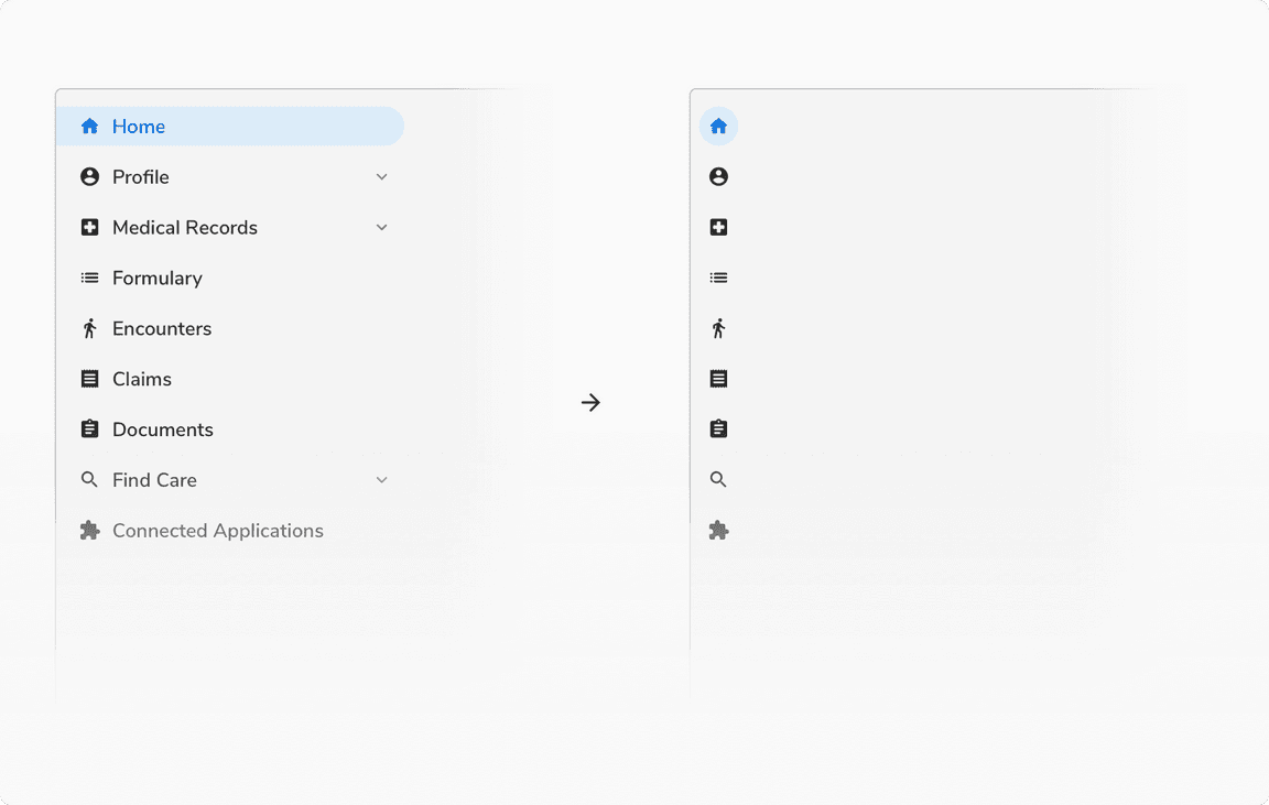
The panel cannot be collapsed when the parent items do not have icons.
 Parent Item - Without Icons
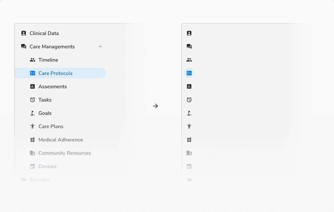
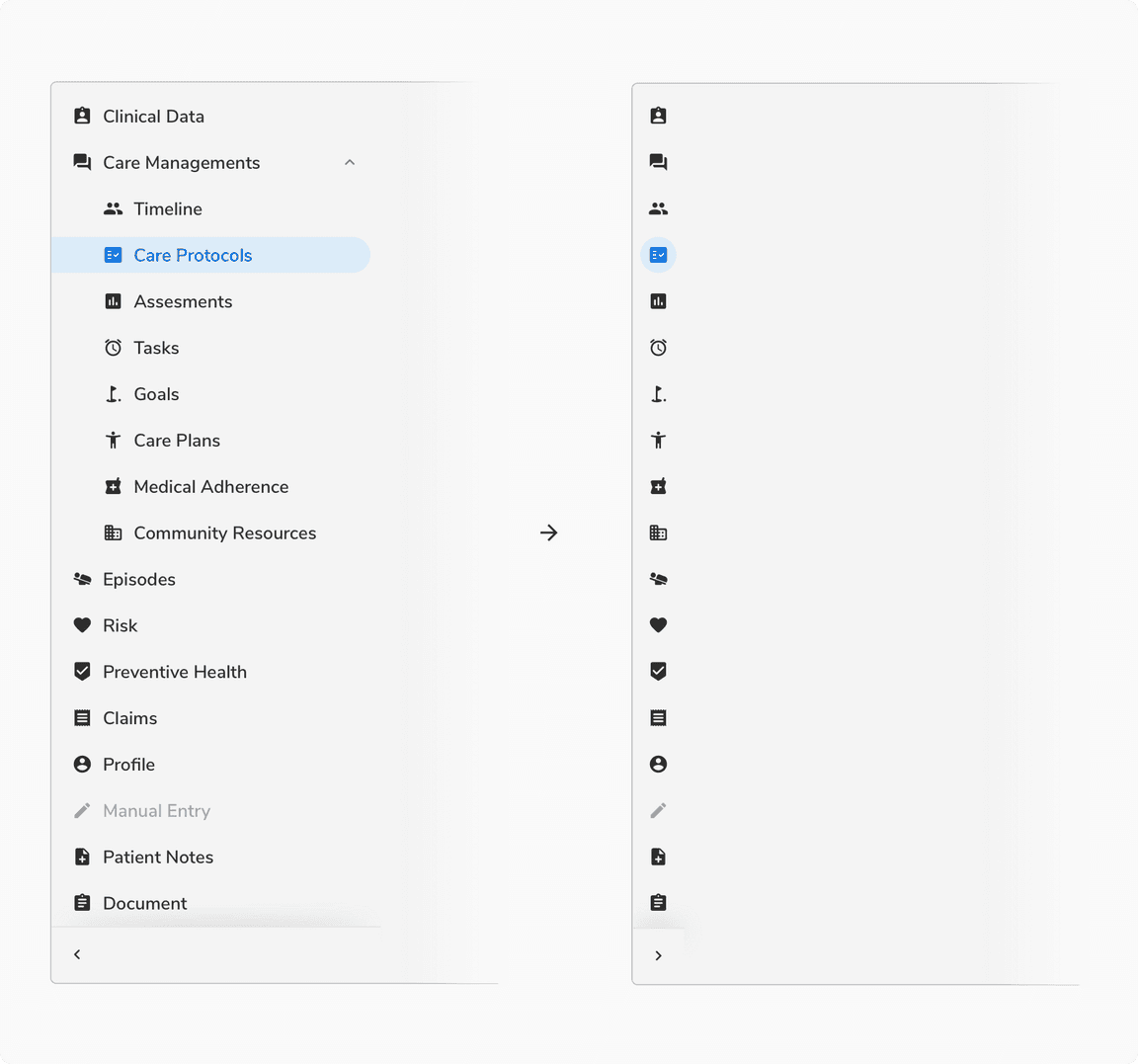
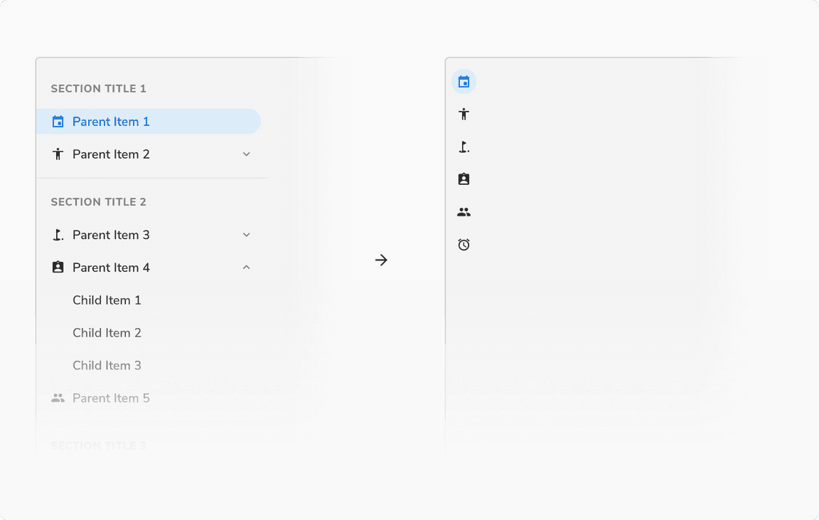
Parent Item - With Icons
 Parent Item - With Icons
Child Item - Without Icons
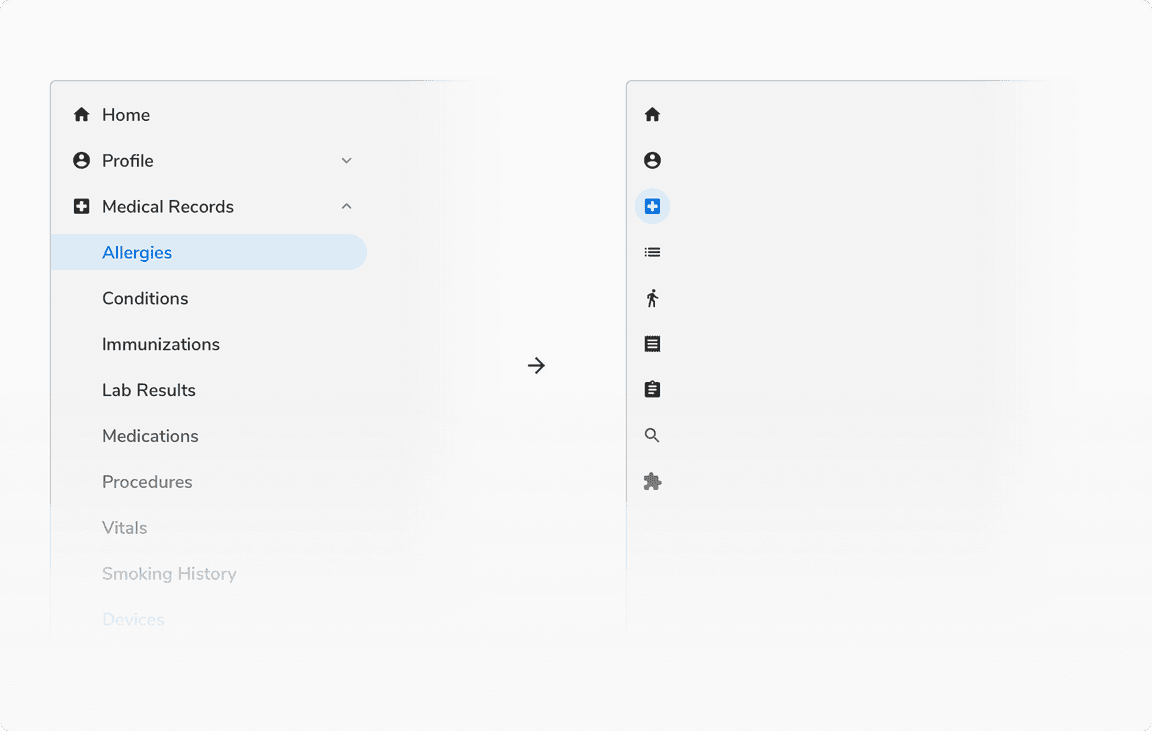
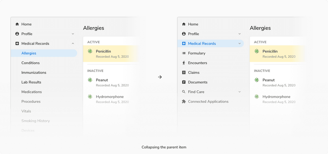
In this case, the panel will collapse to the icons of the parent items. In the collapsed view, the parent having the selected child will be shown as active.
 Child Item - Without Icons
Child Item - With Icons
The icons of children will be visible in the collapsed panel only if the parent was initially expanded.
 Child Item - With Icons
Hover on Collapsed Panel
Hovering over the collapsed panel expands it in overlay mode.
Scrolling When the Nav Overflows
The toggle panel button is differentiated with a shadow and a divider if the content inside the nav panel becomes scrollable.
 Scrolling when the nav overflows
Grouping
It is possible to group navigation items into categories. Grouping is restricted to the parent level, to keep the navigation simple.
Parent Item - Without Icons
Example 1:
As the parent items do not have icons, the panel will be non-collapsible.
 Parent Item - Without Icons
Example 2:
As the parent items do not have icons, the panel will be non-collapsible.
 Parent Item - Without Icons
Parent Item - With Icons
In this case, the section title and the subsequent divider will disappear when the panel is collapsed.
 Parent Item - With Icons
Secondary Nav Panel
The width of the nav items here will be decided on the basis of the grid that the particular screen size supports.
Just like the primary navigation panel, the secondary navigation panel also supports up to two levels of navigation.
The secondary panel will be non-collapsible for all the cases.
Inside a Card
If the secondary navigation panel is used inside a card, the nav items used will be having a flat left edge.
Floating Panel
If the secondary navigation panel is floating, the nav items used will be having rounded edges.
Note: The width of nav items here is derived based on the grid.
Expand/Collapse Parent Item
Clicking over the collapsed parent item for the first time will expand the particular parent item. Clicking again will collapse the parent item.
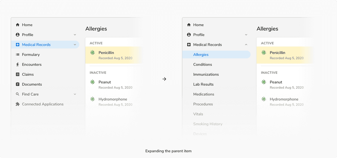
Note: If a parent item having an active child is collapsed then after collapsing, the parent will be in the active state.
Custom Panel
The navigation panel can be customized to accommodate content other than the navigation items. In case of collapsing such panel, only the collapsed navigation items will be shown.
 Custom panel
Dynamically Adding a New Item
Navigation items can be added dynamically to the panel on the go. Add item component always appears in the bottom.