
Progress Indicators
Progress indicators are used to show progress of an ongoing process.
Progress indicator is a key part of any user interface screen. It helps users become aware of the loading progress of different components in the application.
Types
Progress Bar
Goes from 0 to 100 linearly.
Progress Ring
Goes from 0 to 100 along the circumference.
Spinner
Spins endlessly to show indeterminate progress unlike progress bar and ring.
Skeleton Loader
Skeleton loaders are used if there is a defined template for the data that is going to be displayed. This type of loading state should be used for container-based components(like avatars, lists, and so on) and data-based components(like tables).
Sizes
Progress Bar
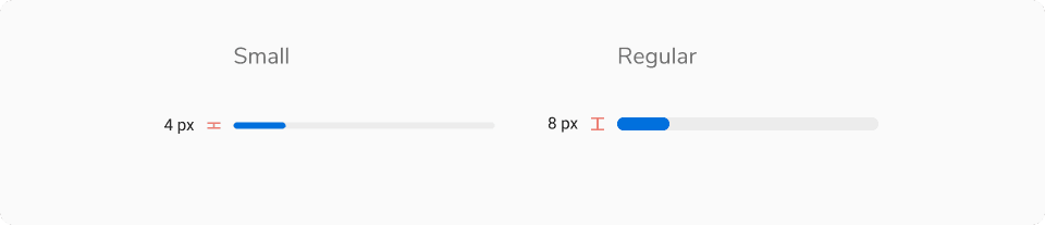
Progress bar comes in 2 sizes - small and regular.
 Progress Bar - Size
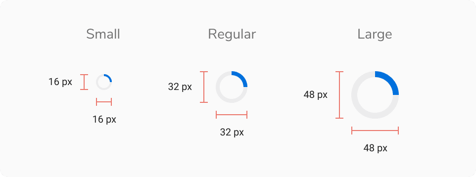
Progress Ring
Progress bar comes in 3 sizes - small, regular and large.
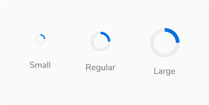 Progress Ring - Size
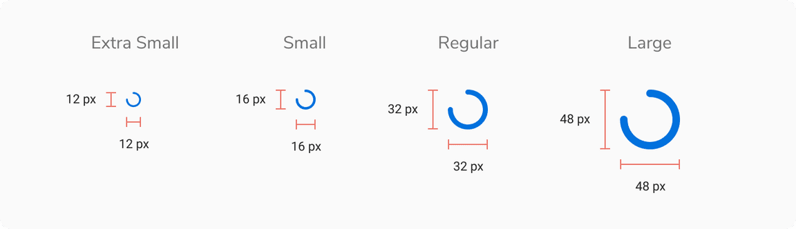
Spinner
Progress bar comes in 4 sizes - extra small, small, regular and large.
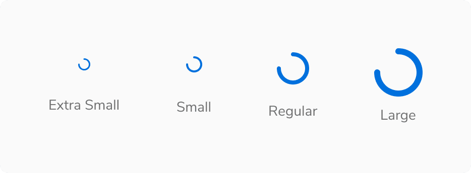 Spinner - Size
States
Progress Bar
Progress bar comes in 2 states - default and indeterminate
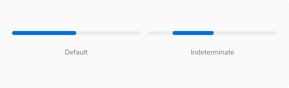 Progress Bar - States
Shape
Skeleton Loaders - Image
For images, skeleton loaders come in 2 shapes - round and square.
 Skeleton Loaders - Image - Shape
Structure
Progress Bar
| Property | Value(s) |
|---|---|
| Height | 4 px (Small) |
| Progress Percentage (Indeterminate state) | 32% |
| Corner radius | 4 px |
Progress Ring
| Property | Value(s) |
|---|---|
| Height | 16x16 px (Small) 32x32 px (Regular) 48x48 px (Large) |
Spinner
| Property | Value(s) |
|---|---|
| Height | 12x12 px (Extra small) 16x16 px (Small) 32x32 px (Regular) 48x48 px (Large) |
Configurations
Progress Bar
| Property | Value(s) | Default value |
|---|---|---|
| Value | <value> | - |
Progress Indicator
| Property | Value(s) | Default value |
|---|---|---|
| Size |
| Regular |
| Value | <value> | - |
Spinner
| Property | Value(s) | Default value |
|---|---|---|
| Size |
| Regular |
| Value | <value> | - |
Usage
Nature of the Process
Determinate
When the time taken to load a process is determinable.
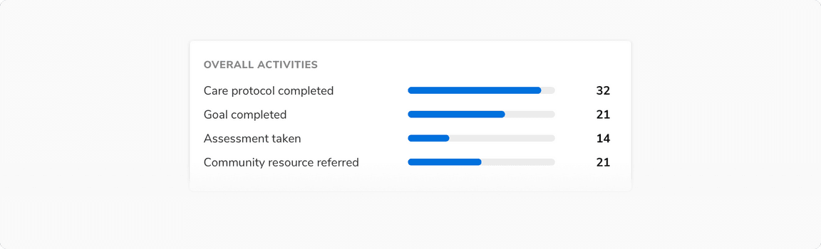 Showing progress using progress bar
 Showing progress using progress ring
Indeterminate
When the time taken to load a process cannot be determined.
 Showing loading state using skeleton loaders
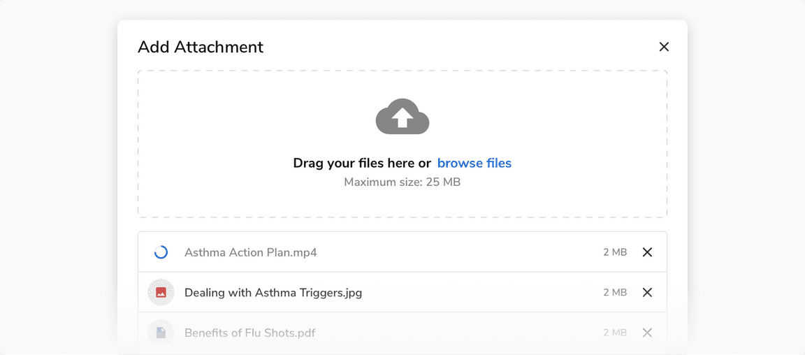
 Showing loading state using spinner
 Showing loading state using spinner in button
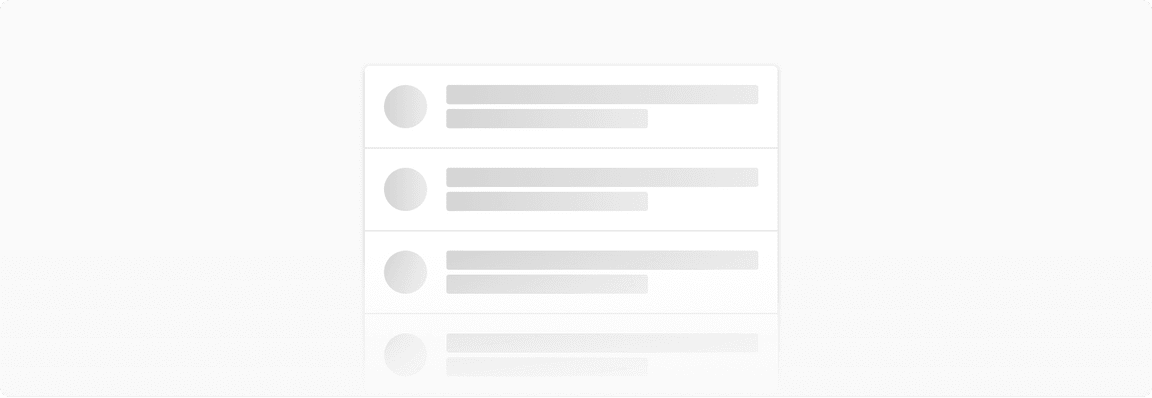
Skeleton Loaders
Visual Structure
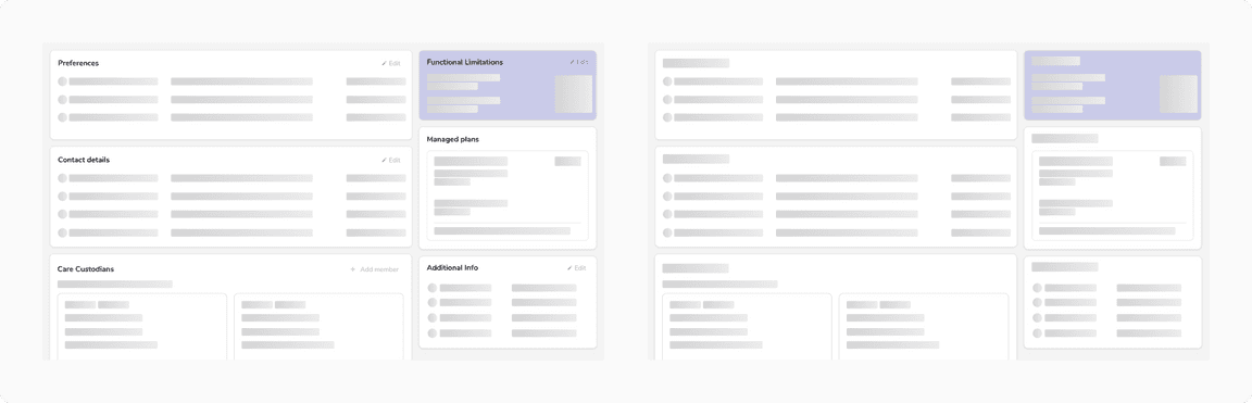
Skeleton loaders imitate each component of a cell separately at the time of loading, to create a perception of decreased loading time.
 Visual structure of skeleton loaders
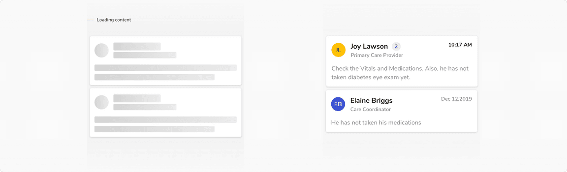
Page With Static vs Dynamic Content
 Static vs Dynamic content
Using a spinner based on size
Spinners are used differently depending on their size.
Skeleton Loader vs Spinner
A typical process starts with loading the app first. Refer to the table below and the examples to have a better understanding:
Progressive Loading
Progressive loading is a technique that loads the page in chunks i.e. from the simplest view to the most detailed view. Table in the above section demonstrates the step-by-step loading of a page.