
Select
Select offers multiple choices in a compact way.
Select displays a list of options for users to choose from. It provides the option to let users select a single option or multiple.
Variants
Button Variants
The custom button for select comes with a few variants -
Standard
The standard variant consists of just text which changes its state when one or more options are selected.
With Icon
This variant comes with an icon in the left, preceding the text to provide additional cues regarding the type of the options.
Inline Label
This variant comes with a label preceding the text and can be used at places where there is a space crunch.
Option Variants
The options in a select can be single select or multi-select. They come with a few variants -
Standard
This variant comes with just text.
With Icon
This variant comes with an icon preceding the text.
With Sub Info
This variant comes with sub-info beneath the text.
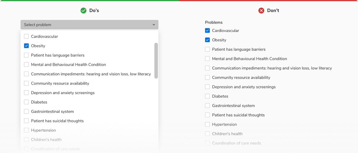
With Checkbox
This variant comes with the support of checkboxes to select multiple options. The options here can also have sub info just like the previous variant.
Add Option
This variant allows you to add an option to the list in select.
Sizes
Select trigger comes in 2 sizes - small and regular.
States
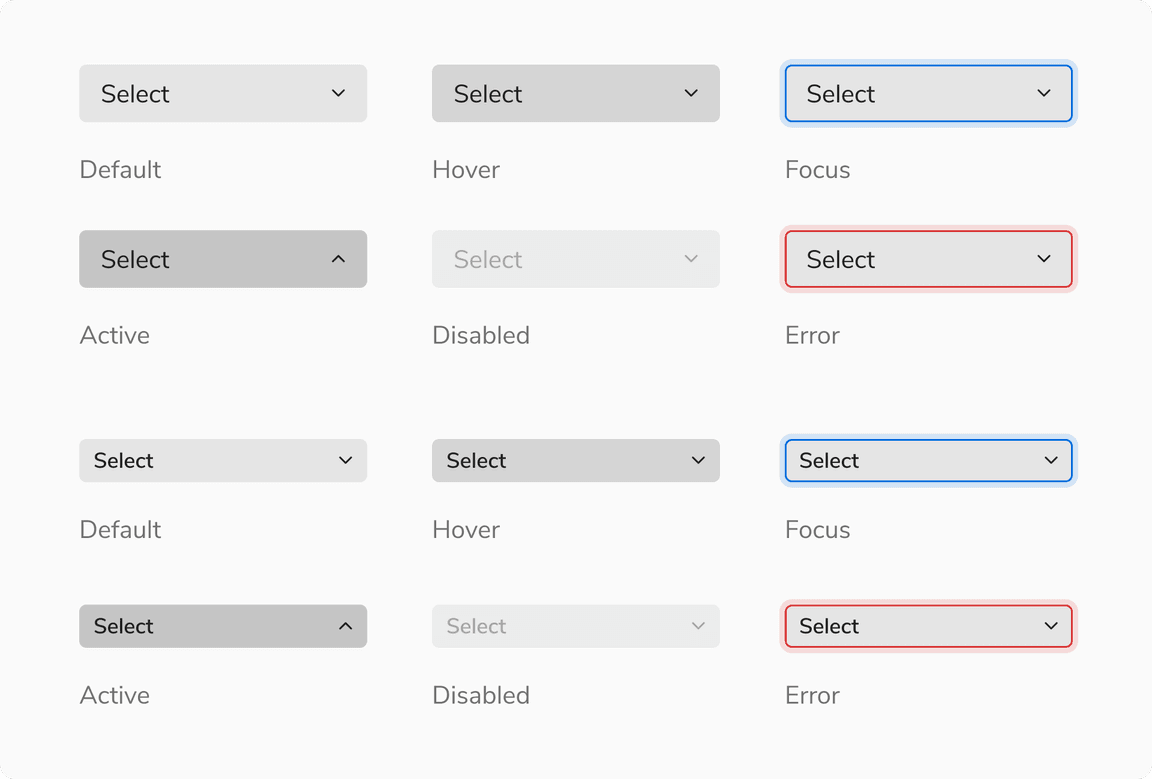
Select Trigger
The select trigger comes in 6 states - default, hover, focus, active, error and disabled.
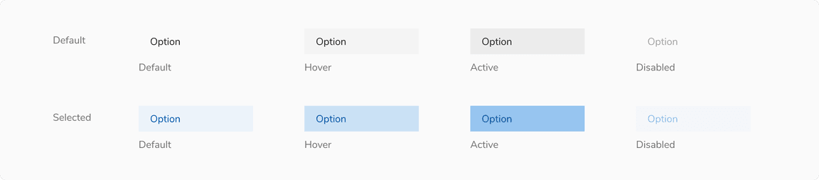
Option Item States
Option items come in 5 states - default, hover, active, focus and disabled. In addition to the aforementioned states, option items also have the selected-default, selected-hover, selected-active, selected-focus and selected-disabled state.
Note: Users can also use the up/down arrow key to traverse the options.
StyleType
The select trigger comes in 2 Style Types - Fill & Outline. It’s recommended to use Fill and Outline selects based on visual emphasis. Their prominence shifts with the background — what draws attention in one setup may fade in another.
Fill
Outline
Structure
Select is made up of 2 key components - a custom button which acts as a trigger and a popover which acts as a container for the options.
Trigger (Select Button)
| Property | Value(s) |
|---|---|
| Height |
|
| corner radius | 4px |
Option Item
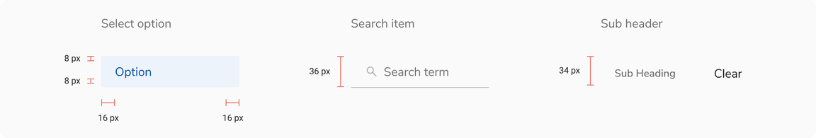
| Padding | Value(s) |
|---|---|
| Top and Bottom |
|
| Left and right | 16px |
Configurations
Trigger
| Property | Value(s) | Default value |
|---|---|---|
| Width | <Width> | 176px (Customizable) |
| Size |
| Regular |
| Placeholder | <placeholder> | Select (Customizable) |
| Selected Value | <selected value> | 3 selected (Customizable) |
| Left icon (optional) | <icon name> | - |
| Inline label (optional) | <label> | - |
| StyleType |
| Fill |
Option Item
| Property | Value(s) | Default value |
|---|---|---|
| Label | <label> | - |
| Size |
| Compressed |
| Icon (optional) | <icon name> | - |
| Sub info (optional) | <sub info> | - |
| Checkbox (optional) | <Checkbox> | - |
Popover
| Property | Value(s) | Default value |
|---|---|---|
| Width | <width> | 176px (Customizable) |
| Max height | <max_height> | 256px (Customizable) |
| Min height | <min_height> | - |
Usage
Search
Select can be offered with a search functionality. In that case, the search input appears at the top.
Overflow Behavior
Trigger
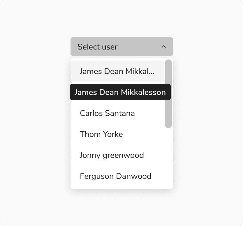
If the label exceeds the available space, it will be truncated and can be seen in a tooltip upon hovering.
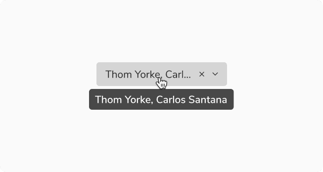 Overflow behavior of trigger
Option Items
If the label exceeds the available space, it will be truncated and can be seen in a tooltip upon hovering.
 Overflow behavior of option Items
Width of Popover
While the popover’s width is flexible and can vary, it is advisable to maintain a size that is equal to or larger than the trigger of select.
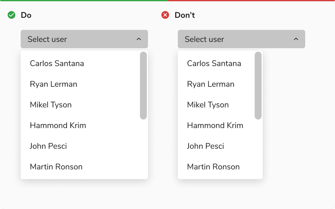 Width of popover
Showing Items Inside Select
The select popover can showcase an unlimited number of items. However, for better user experience when dealing with a large number of items, it’s advisable to adopt best practices such as integrating a search feature for effortless navigation to handle a large number of options efficiently.
Grouping Options
Select options can be grouped under a section using a sub header, if needed.
 Grouping options under a sub heading
Label Position
The label provides a better understanding of what kind of selection is expected. Labels can be placed either on the top of the select or can be placed inline with the value or placeholder of the select.
Help Text
Help text can be provided beneath the select trigger to add context regarding the type of input required just like the input fields.
Actions in Footer
Using network resources on each checkbox selection in a select can be quite expensive. Select offers the option of incorporating actions in the footer in case of multiple selection, thereby facilitating a single API call upon clicking the Add/Apply button.
Custom Options
Select can also accommodate custom options inside it.
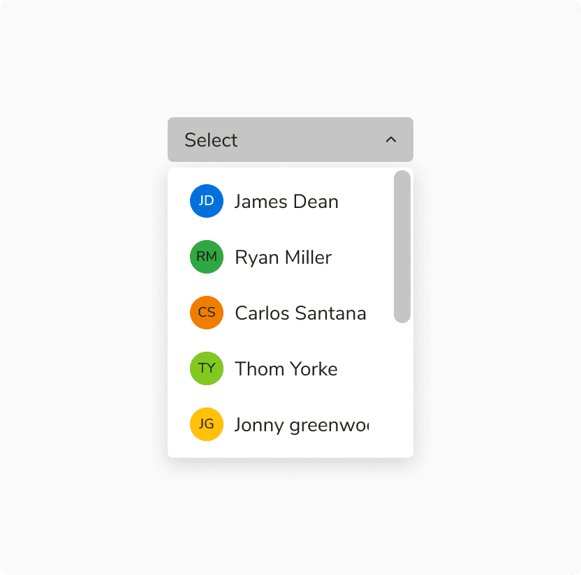 Custom options in select
Select vs. Checkbox
It is recommended to use select if the number of multi-select options exceeds 5 or if the space is limited, to better utilize the space. Checkboxes should be used if the options are fewer than 5 and there are no space restrictions.
Adding Option in Select
In certain cases select allows you to add your own option to the list, even if it isn’t available yet but will be needed in the future.
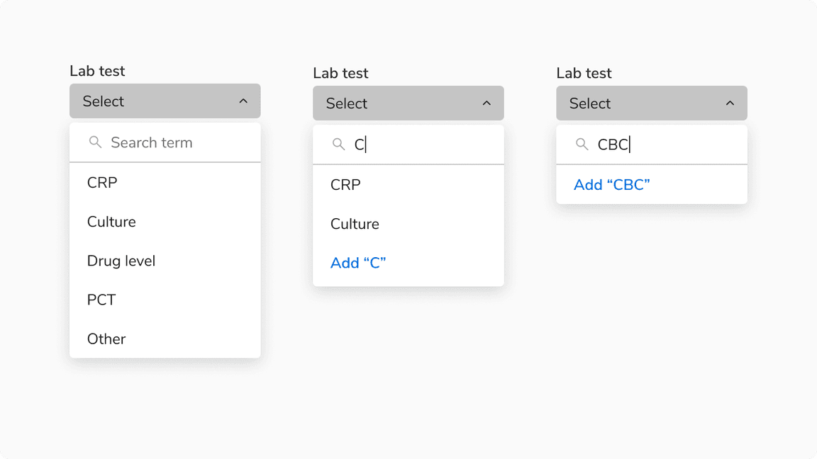 Adding option in select
Adding Option in Select vs Input in Combobox
It is recommended to use select when the users are encouraged to exercise caution and be mindful when adding options whereas in combobox the users are allowed to type in their value without any obstruction.
Note: Using select is a preferable choice when adding medication to a database to ensure accuracy and discourage users from creating their own abbreviations or names, promoting mindful selection.
Created option in select vs Input in combobox
Error & Empty States
These states are used to inform users about the status of the data that is being loaded in the select. Note: It is recommended to avoid using an image or illustration in these states due to the limited real estate available within the select.
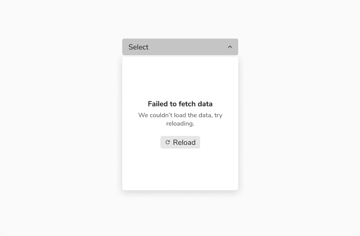 Select having error in loading the options
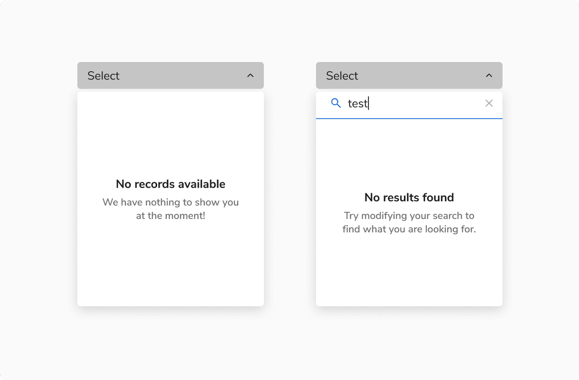 [Left] No options vs [Right] No results found after search
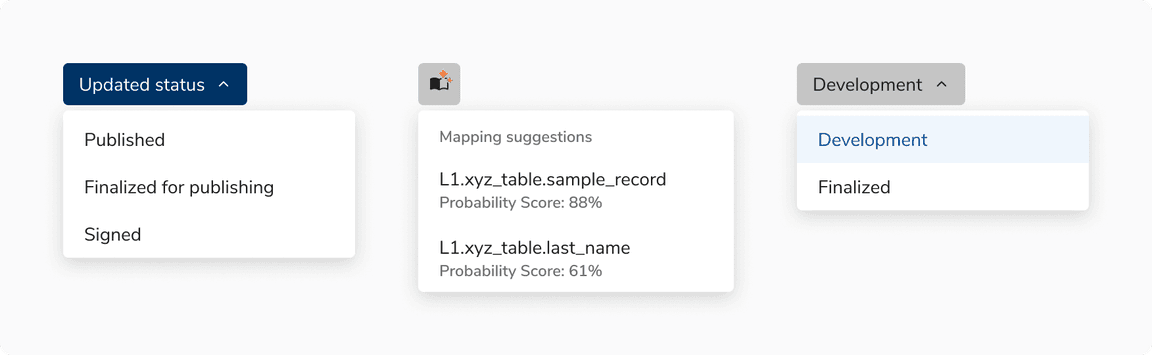
Custom Trigger in Select
Select can also be triggered by other components, primarily by buttons and icon buttons. The basic behavior of the select remains the same.
 Examples of custom triggers in select