
Status Hint
Status hint is used to highlight the status of an item.
Usage
Code
As the name suggests, Status Hints can be used to highlight the status of a resource in tables, lists, headers, etc.
Appearance
Status hint comes in 5 Appearances -
Info
Warning
Success
Alert
Default
Sizes
Status hint comes in 2 sizes - regular and small.
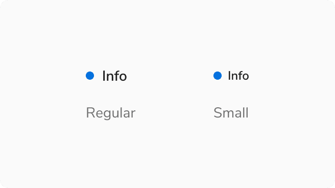 Sizes in status hint
Structure

| Property | Value(s) |
|---|---|
| Label Size |
|
| Spacing between Indicator and Label |
|
| Size of indicator | 8x8 px |
Configurations
| Property | Value(s) | Default value |
|---|---|---|
| Appearance |
| Default |
| Label | <label> | - |
Usage
Status Hint vs Badge
Status hint is used to display the status of a resource while a badge is used as a label to tag entities.
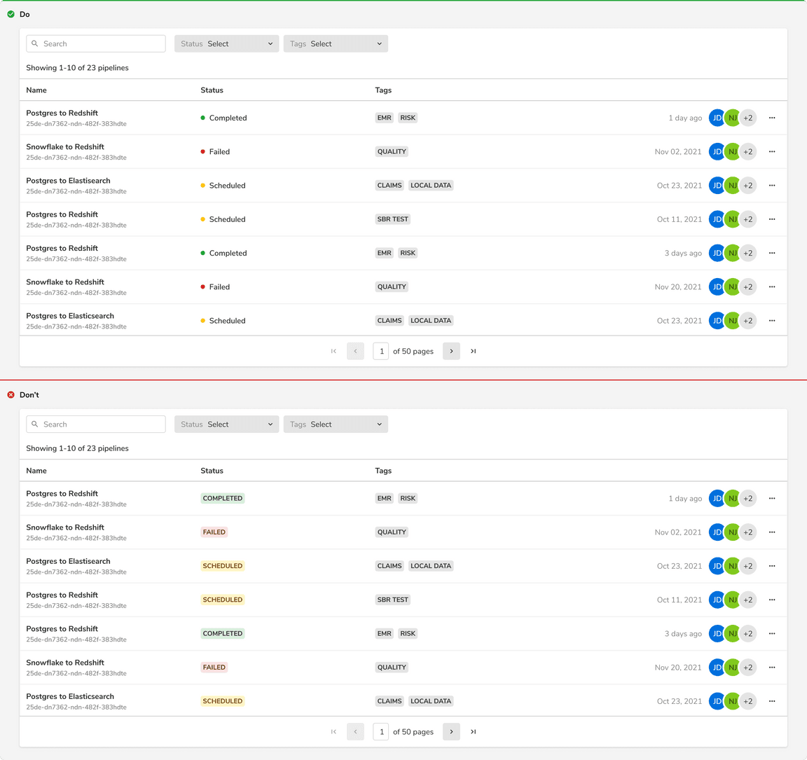 Status hint vs Badge
Overflow Behavior in Status Hint
In case of overflow, the items will get truncated and can be viewed inside a tooltip on hover.
Was this page helpful?