Toast
Toasts are used to notify users about the outcome of their actions without disrupting the ongoing user workflow.
Appearances
The appearances of our toast are goal oriented.
Alert
Alert variant is used to convey an error state or failure which blocks a process. It should be used when the goal of the user hasn’t been met.
The error may be generic like - ‘User not found’, or failure of a process like - ‘Could not create users’, ‘File items could not be uploaded’, and more.
Info
Info variant is used to convey information to the users. This information is neutral in tone and is not associated with a connotation.
This info may be generic like - ‘In progress’, or ‘new updates available’, and more.
Success
Success variant is used to convey the success state of a task/process. It should be used when the goal of the user has been met.
Successful completion may be in the form of - ‘Mail sent successfuly’, ‘User deleted successfully’, ‘Mobile number verified successfully’, ‘Meeting scheduled successfully’, and more.
Warning
Warning variant is used to convey an interrupted state which delays or partially prevents a process from completion.
The warning may be generic like - ‘1 file could not be downloaded out of 50’, or ‘80 assignments uploaded out of 100’, and more.
Structure
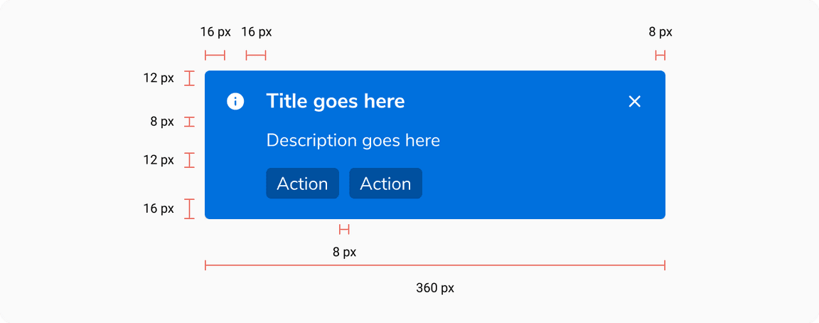
| Property | Value(s) |
|---|---|
| Width | 360 px |
| Corner radius | 4 px |
Padding (top, right, bottom, left) | 12 px, 8 px, 16 px, 16 px |
| Spacing between actions | 8 px |
Margin (bottom, left) | 32 px, 32 px |
Configurations
| Property | Value(s) | Default value |
|---|---|---|
| Appearance |
| Info |
| Title | <title> | - |
Description (optional) | <description> | - |
Actions (optional) |
| - |
| Timeout |
| 5 seconds |
Usage
Positioning of Toast
They appear at the bottom left of the screen and overlay any content.
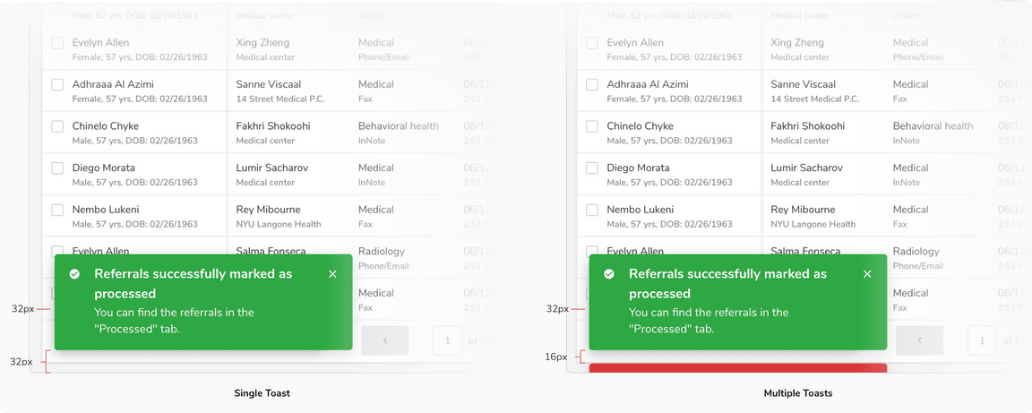 Positioning of toast
Timeout
Toasts will close when the close button is clicked, or after a timeout – the default is 5 seconds. It can be Customized through in case of critical notification to ensure the user has enough time to read and acknowledge the message.
Toasts With Actions
Use toast with actions when you want the users to take an action after reading the message. Also, make sure the same actions are also available elsewhere on the page.
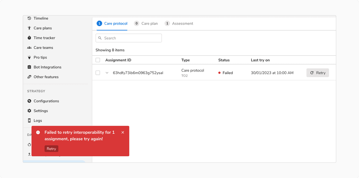
Here the action in the toast is also available in the table row so that users can take the action comfortably even if they clone the toast.
Toast Without Description
Multiple Toasts
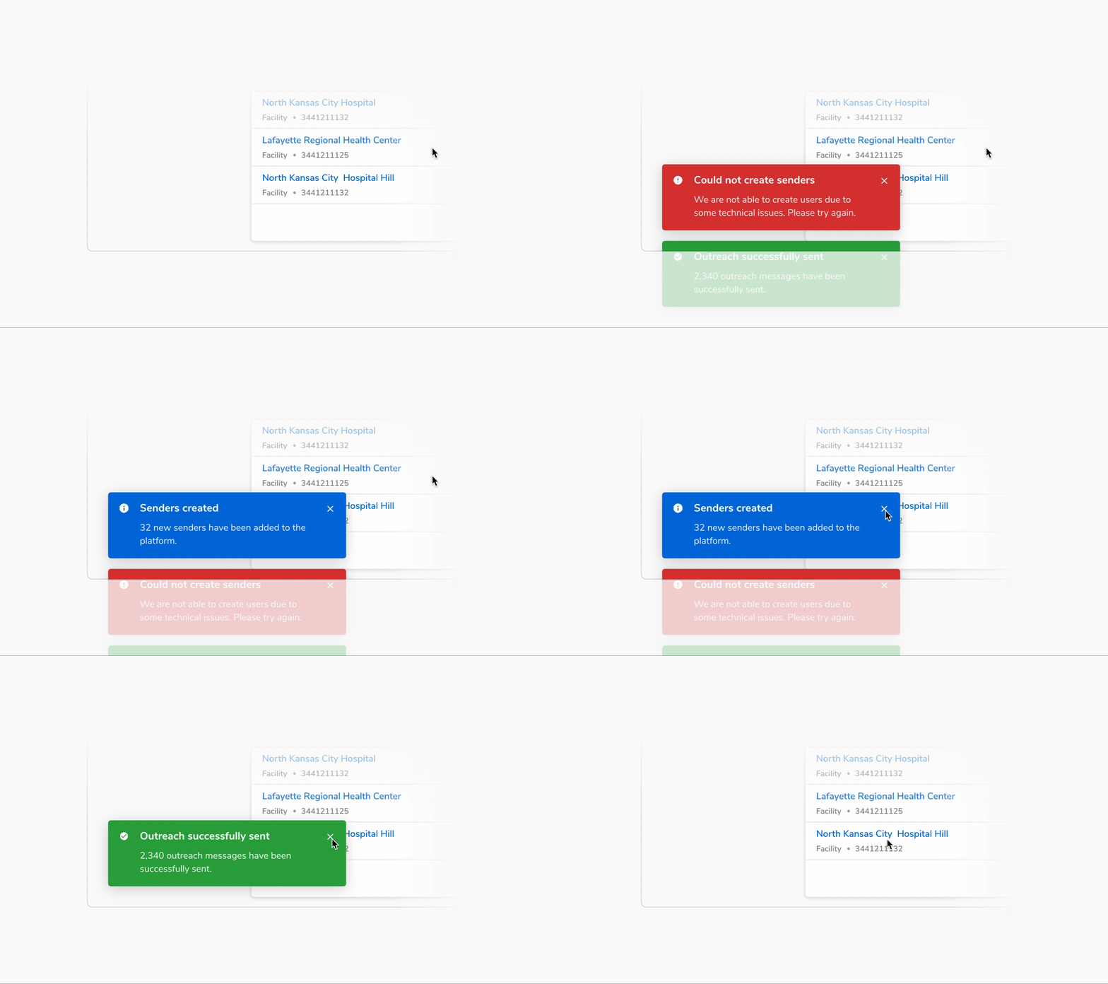
Only one toast is displayed at a time. Subsequent toasts get stacked with a margin of 16px with the latest one on top.
Overuse of Toasts
It is recommended to not use toasts when the user interface is enough to provide feedback.
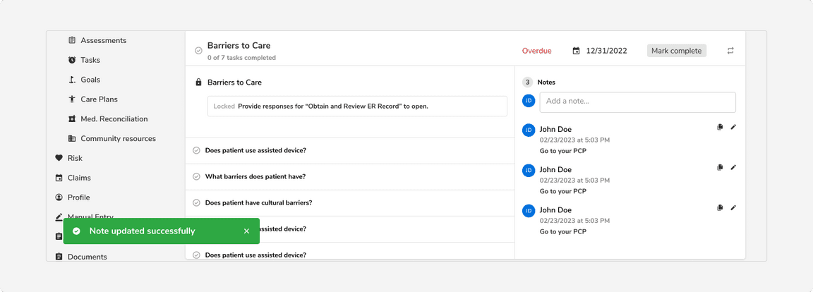 Toast is not needed here because users can already see the updated note in the right section.
Toasts vs Messages
Toasts are temporary notifications that appear on the screen to provide brief, unobtrusive feedback to the user whereas messages are used for important information and are integrated directly into the content of the interface.
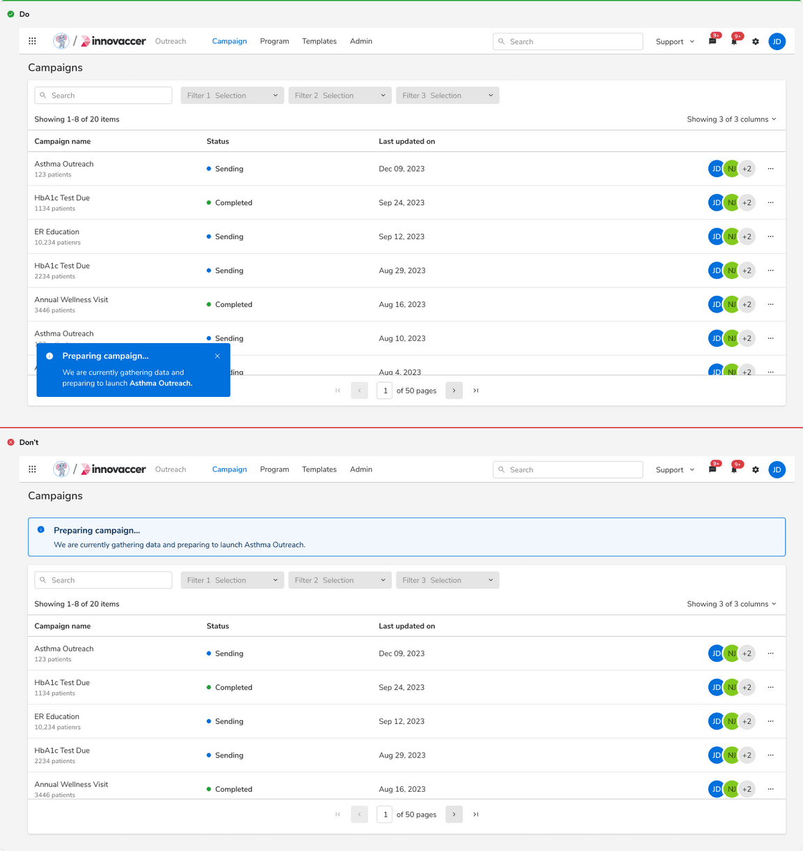 Toasts vs Messages
Toast vs Message vs Modal
| Factors | Toast | Message | Modal |
|---|---|---|---|
| Severity | LOW | MEDIUM | CRITICAL |
| Feedback | Feedback or update after an action has taken place | Information or feedback that aids users in completing their action or flow | Critical information that requires user input or interaction |
| When to use | After an action has taken place | Before or after an action has taken place | Before an action has taken place |
| Information detail | Concise | Concise | In-depth |
| Intrusiveness | Unobtrusive | Attention demanding | Disruptive |
| Duration | Persists for 5 seconds (Default), can be customized in case of a critical notification | Persists but can be removed from the view upon resolution of the error. | Persists until user interaction or input is received. |
