
Tooltip
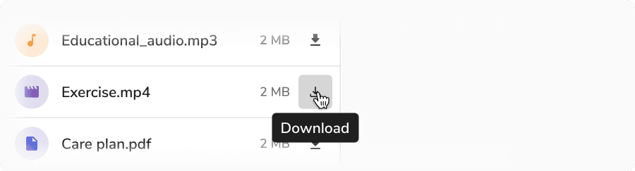
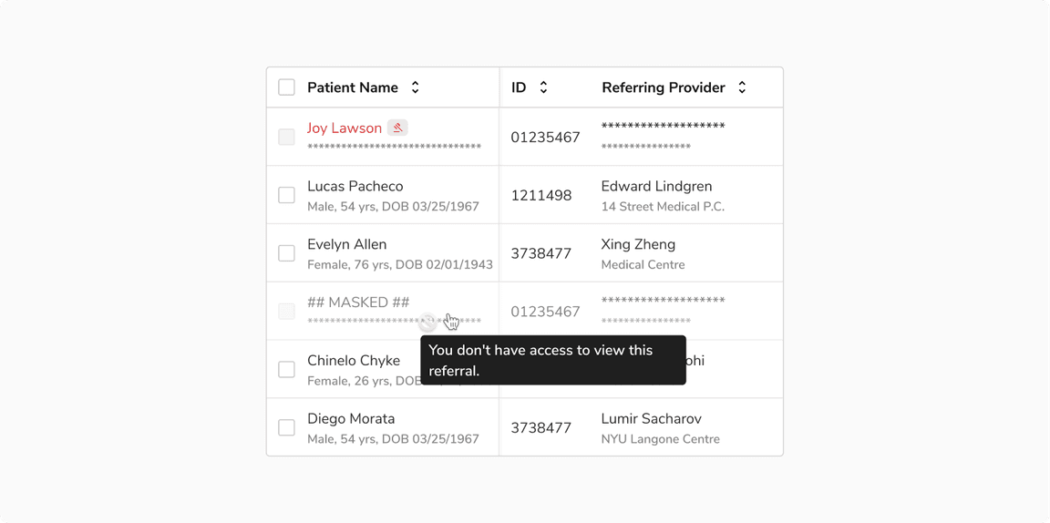
Tooltip is used to display content in relation to a target when that target is hovered.
Usage
Code
Interactions
Sizes
Tooltip comes in 2 sizes - regular and small.
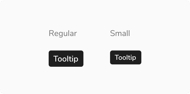 Sizes in Tooltip
Structure

| Property | Value(s) |
|---|---|
Text Size |
|
Padding (top, right, bottom, left) | 4 px, 8 px, 4 px, 8 px |
| Spacing from trigger | 4 px |
| Maximum width | 256 px |
Configurations
| Property | Value(s) | Default value |
|---|---|---|
| Position |
| Bottom |
Usage
Positioning
Default Position
The preferred and default side of tooltip is the bottom of the trigger.
 Default position
Tooltip Overflow
Tooltips should be as concise and clear as possible. Exceeding the max width will make it wrap to form another line.
 Tooltip overflow
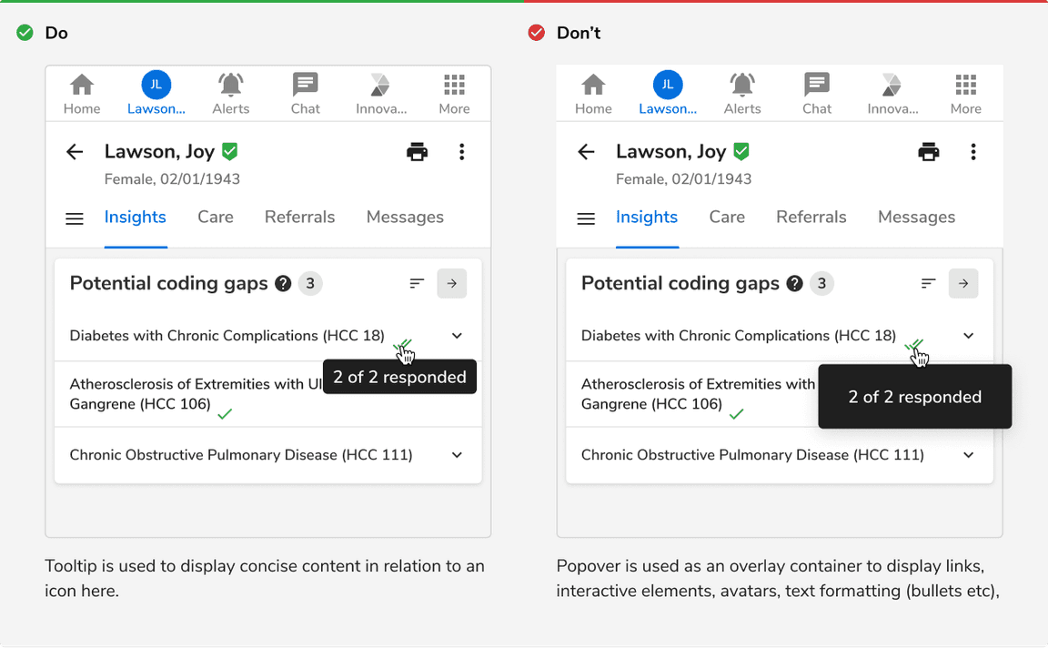
Tooltip vs Popover
Tooltip is used to display concise information in relation to a target whereas popover is an overlay container used for displaying links, interactive elements, avatars, text formatting (bullets etc), meta data.
 Tooltip vs Popover
Avoid Errors in Tooltips
Tooltip should not be used to provide essential information and collective feedback like errors, warnings, etc that require the immediate attention of the users.
Was this page helpful?